Followers

Tuesday, January 31, 2012

Colouring with two Copic Markers

Hello, dear Copic friends,
Hallo liebe Copicfreunde,

today I want to show you two techniques that can help you, when you have only two shades of a colour. We do always recommend to use three Marker to achieve a nice blending, but sometimes this is just not possible.
heute möchte ich euch zwei Techniken vorstellen, mit denen ihr euch behelfen könnt, wenn ihr nur zwei weiter auseinanderliegende Farbtöne zur Verfügung habt. Wir empfehlen ja grundsätzlich, für einen schönen Farbverlauf drei Marker zu verwenden, aber manchmal ist das einfach nicht möglich.

The combination of BG70, BG72, BG75 and BG78 is one of my favourite blue-greens, but the difference between BG70 and BG72 is very strong.
Die Kombination von BG70, BG72, BG75 und BG78 ergibt einen meiner liebsten Blau-Grün-Töne, aber der Unterschied zwischen BG70 und BG72 ist ziemlich groß.

In my swatchbook I marked BG70 with an additional pencilmark, because you can hardly see the difference to white.
In meinem Swatchbook habe ich BG70 mit einer zusätzlichen Bleistiftmarkierung gekennzeichnet, weil der Unterschied zu weiß kaum sichtbar ist.

At first, I coloured the other parts of the image (Sweet Blossom by Sylvia Zet for Wee Stamps) and applied BG70 on the legs, the dress and the hairband.
Zuerst habe ich die anderen Teile des Motivs (Sweet Blossom von Sylvia Zet für Wee Stamps)coloriert und BG70 auf die Beine, das Kleid und das Haarband aufgetragen.

The first technique for two Markers I used, is just to apply several layers of colour.
Die erste Technik, die ich mit zwei Markern angewendet habe, ist einfach mehrere Farbschichten aufzutragen.
That's what it looks like with only one layer:
So sieht es mit nur einer Schicht aus:

And this is my image after applying additional colour to the side of the legs:
Und so sieht mein Motiv aus, nachdem ich Farbe auf den Seiten der Beine aufgetragen habe:
Repeat this until you are satisfied with the result.
Den Vorgang wiederholen, bis die gewünschte Schattierung erreicht ist.

The second technique you can use is called palette-blending. This technique is similar to a painter's using oil or acrylic colour, a palette and a paintbrush.
Die zweite Technik, die ihr verwenden könnt, nennt man Paletten-Technik. Sie ist ähnlich wie bei einem Maler, der Öl- oder Acrylfarbe, eine Palette und einen Pinsel verwendet.

You have to apply a bit of the darker colour onto something with a glossy surface. I used an acrylic block and scribbled some of my darker colour BG72 onto it.
Man muss etwas von der dunkleren Farbe auf einen Gegenstand mit einer glatten Oberfläche auftragen. Ich habe einen Acrylklotz verwendet und etwas Farbe mit meinem dunkleren Marker BG72 aufgemalt.

Then I took some of this colour onto my lighter Marker BG70, using it like a paintbrush ...
Dann benutze ich meinen helleren Stift, BG70, wie einen Pinsel, um etwas von der Farbe auf dem Klotz aufzunehmen..
...and "painted" it onto my paper.
...und sie auf das Papier zu übertragen.

I used this technique on the dress.
Ich habe diese Technik beim Kleid angewendet.


This is my coloured image:
Das ist mein coloriertes Motiv:

I hope, my tutorial has been helpful, but if there still are questions, please do not hesitate to ask here in the comments or write an e-mail!
Ich hoffe, mein Tutorial war hilfreich, aber falls ihr noch Fagen habt, zögert bitte nicht, sie hier in den Kommentaren per oder E-Mail zu stellen!
Liebe Grüße vom
Kreativmonster


Monday, January 30, 2012

Copic Class

Dear All,


As already announced, we are having a Copic Class

on Friday, 3rd February 2012
in our premises in Wiesbaden,
Berta-Cramer-Ring 14 - 16
65205 Wiesbaden.

The class will be a combined Copic Certification-/Copic Certification Instructor Class, which means that those who have not yet participated at a Copic Certification Class can become Instructor by participating at the class on Friday (but must send some projects afterwards to Diny to receive the corresponding "Instructor Certificate").

n.b. for the Benelux and Germany we don't need more Instructors, only for some other contries. 
From every country you can apply for the Designer Class.

Those who only want to become Copic Certified participate at the class and receive the "Copic Certified Designer-Certificate" right after the class.

The class, which will be held in English, starts at 9.30 and ends at around 16.30 h/17.00 h and costs EUR 150,00.

Snacks, Beverages and Lunch is included. Manual, technique book and material for practising will be provided.

The participants learn

§         how the Copic Colour system works,
§         how to use Copic markers (different techniques)
§         how easy you can achieve good results with Copic markers
§         how to airbrush with Copics
§         how to use the blender
§         and get many useful tips and tricks about colouring.

As it would be great to have in each country at least one "expert" for Copic techniques who can teach shops and end-users and spread the knowledge about Copic, we really would be pleased to receive your last-minute sign-ins.

In case of any questions, please don't hesitate to contact us.

Looking forward to hearing from you.

With kind regards,

Britta Rumpf 

An lovely card from our Guest Brenda


Hi everyone,
Hallo Ihr,
I'm going to show you my second card I made as a guest designer for this blog.
ich zeige euch meine zweite Karte, die ich als Gastdesigerin für diesen Blog gemacht habe.

I used a image of KennyK, it’s the first time I worked with this stamps, and I love it. Especially the hair! beautiful long hair to colour. I chose to work with no more than 2 colour groups, orange and red/brown, in total I used 11 Copic sketch markers including the skincolors.
Ich habe ein Motiv von KennyK verwendet, es ist das erste Mal, dass ich mit diesen Stempeln gearbeitet habe und ich liebe es. Besonders  die Haare! Schönes langes Haar zum Colorieren. Ich habe mich entschieden, nur mit 2 Farbgruppen zu arbeiten, Orange und Rot-Braun, insgesamt habe ich 11 Copic Sketch Marker einschließlich der Hauttöne verwendet.

This time I made an easel card, it’s a card that folds out and leans on the little flowers to hold it upright.
The background behind the image is a nestabillitie from Spellbinder.
Dieses Mal habe ich eine Easelcard gemacht, das ist eine Karte, die man aufstellt und die von den kleinen Blumen aufrecht gehalten wird.
Der Hintergrund hinter dem Motiv ist mit einer Nestabilitie-Schablone von Spellbinders gemacht. 


The paper I used is from Bo Bunny, a gift of love
For the text labels I use a die called Xcut from Docrafts the text stamps are from Forever friends
Das Papier, das ich verwendet habe, ist von BoBunny, a gift of love. Für das Textschild habe ich eine Xcut-Schablone von Docrafts verwendet, der Textstempel ist von Forever Friends.

I used a lot of paper flowers, a ribbon, and plastic flowers where the top of the card is leaning on.
Ich habe eine Menge Papierblumen, ein Band und Plastik-Blumen verwendet, an denen sich das Oberteil der Karte abstützt.

 If you open the card completely you will see I put on a swirl to decorate that part of the card
Wenn man die Karte ganz öffnet, sieht man, dass ich einen Schnörkel als Dekoration auf diesen Teil der Karte gesetzt habe.

As you can see in the close-up image I gave the image eyeshadow colour, I have never seen it before on a stamp, I really love it as makes the image more alive.
Wie ihr auf der Nahaufnahme sehen könnt, ich habe dem Motiv farbigen Lidschatten aufgetragen, ich habe das noch nie auf einem Stempel gesehen, ich mag das sehr, weil es das Motiv lebendiger macht.


I used 2 main colours groups, 
Ich habe zwei Hauptgruppen an Farben verwendet
E09, E19, E08 for the red/brown colour/für die rot-braune Farbe
YR24, YR23, Y21 for the orange colours/für die orange Farbe
and the E11, E01, E000 and R20 for the skin colour/für die Hautfarbe


Thank you for watching, I hope you enjoy watching my card.
Danke fürs Anschauem, ich hoffe ihr hattet Spaß dabei.
Loving greetings , Brenda


Sunday, January 29, 2012

Little Red Riding Hood

Hi Everyone,
hallo zusammen!

Have you seen the new artist at Crafts and Me????? Her name is Zindy Nielsen and she has the most amazing life images.  I have used Red Riding Hood and coloured the image in black and white with only her hood in red.  I'm loving black and white colouring at the moment.
***
Habt Ihr die neue Künstlerin auf "Crafts and Me" gesehen?????? Ihr Name ist Zindy Nielsen und sie hat wunderbar lebhafte Motive. Ich habe Rotkäppchen verwendet und das Motiv in schwarz und weiß coloriert. Nur Ihr Umhang ist rot. Momentan liebe ich Schwarz-Weiß-Colorationen.

I would normally match my papers to my copic chart to pick out the colours I am going to use but as I have used mainly black cardstock and white papers, it didn't matter which colour markers I chose to work with, but I was looking for a strong red, so went for R35, R37, R39, R89 and C7 for the darker shaded areas.
***
Normalerweise würde ich meine Papiere mit meiner Copic-Farbkarte abstimmen um die Farben auszuwählen, die ich verwenden werde. Da ich aber hauptsächlich schwarzen Cardstock und weiße Papiere benutzt habe, war es nicht wichtig, welche Marker ich verwende. Aber ich wollte ein kräftiges Rot und habe daher R35, R37, R39, und R89 sowie C7 für die dunkler schattierten Bereiche verwendet.


I have used most of the Cool Greys. I coloured her dress using C3, C1, C00
***
Ich habe fast ausschließlich kühle Grautöne verwendet. Das Kleid habe ich mit C3, C1 und C00 coloriert.

The tress in the background have also been coloured with the same combination.
***
Die Bäume im Hintergrund sind mit der selben Kombination coloriert.


I have used C1, C00 on her face with only a touch of C3 for the shading areas.  I didn't want her face to look dirty. For the trees in the foreground I have used C5, C3, C1, COO and for her hair I have used C7, C5, C3.  By using different combinations of the greys I have tried to make the image contrast rather than appearing flat by using one combinatiion everywhere.  Hopefully you can see this.
***
Für das Gesicht habe ich C1, C00 und für die schattierten  Bereiche einen Hauch C3 verwendet. Ich wollte ja nicht, dass das Gesicht schmutzig aussieht. Für die Bäumeim Vordergrund habe ich C5, C3, C1 und C00 und für die Haare C7, C5, C3 benutzt. 
Dadurch, dass ich verschiedene Grauton-Kombinationen verwendet habe, habe ich das Motiv kontrastreicher gestaltet. Hätte ich die selbe Kombination auf dem ganzen Motiv verwendet, hätte es flach und ohne Tiefe gewirkt. Ich hoffe, das kann man erkennen.

Ingredients/Zutaten:-

Red Riding Hood Image by Crafts and Me
Snowflake Vellum Embossed paper by papermania
Magnolia Doohickey Die
Square Doily
Snowtex

Friday, January 27, 2012

Tutorial: Doodling Pattern ... with AnNa


It is Friday …
and looking forward to the weekend …
just quiet, relax and easy.


So I made a simple tutorial to make your weekend not so hectic
 yet keeping your creative mojo alert …
something that I used to do a lot as child –
Doodle
… the last pages of my notebooks were just full of "whatever" images, names, swirls.
And the character Snoopy and gang was just my old time favorite.
I wished I kept them.
Doodles are simple drawings for fun but it can also have meaning … an interpretation that only you will know.
Es ist Freitag…
…und ich freue mich auf das Wochenende…
…einfach nur ausruhen und es ruhig angehen lassen.
Daher habe ich für Euch ein "Tutorial" für ein ruhiges Wochenende gemacht,
…das aber trotzdem Euer kreatives "Muse" wach hält…
…es ist etwas das ich als Kind oft gemacht habe -
Doodle
…die letzten Seiten meines Aufgabenheftes waren immer voll mit irgendwelchen Designs….
…und Snoopy und seine Freunde waren immer meine Lieblinge
…ich wünschte, ich hätte meine Doodles von damals behalten…
Doodles sind einfache Zeichnungen, gemalt zum Spaß aber manches Mal können sie auch eine Bedeutung haben…eine Interpretation die nur Ihr kennt…

 
so enjoy your cup of coffee and …
Let's doodle … simple swirls to add as a design to the image.
also, geniesst eine Tasse Kaffee…
…und last uns doodlen…einfache "Kringel",  die zu jedem Design dazu gefügt werden können


After coloring the image, let it dry then start doodling...
Nach dem Ihr das Bild gefärbt habt, fang an zu "doodlen"

let it swirl, twist, circle it ... anything ...
….macht "Kringel", "Kreise" – was immer Ihr wollt…

make it small, large, medium ... anything ...
….macht es klein, gross, oder mittelgross….


do some dots, lots of dots, small and big ... make it different ...

…macht ein paar Punkte, ein paar mehr, kleine und grosse…

   
Be bold and fun ... make it beautiful!
... gewagt und lustig ...macht es schön!


aren't you enjoying it? 
no rules ... just letting it go with the flow ...
…macht es Euch keinen Spaß? Keine Regeln…macht einfach was Ihr möchtet


Cute Little Anna
Stampavie – Penny Johnson Collection
Hair(Haare) – E59, E53, E50 / E99, E97, E09 / W3
Face/Arms/Legs(Haut)- E000,E00, E11, BV00
Hat(Hut) – YG0000,YG00,YG95,YG97,YG99,W3
Shawl(Schal) – V0000,V000,V06,V04,V17,V99
Others – Sentiments (Rhonna Designs Kiss Me Collection)

Easy Peasy …
Happy Weekend … doodlers!


www.jingvanopstal.com

Thursday, January 26, 2012

A Birthday Wish with Lili of the Valley

Hello Copic fans!
Hallo Copic-Fans!

This is going to be my first post for the Copic Marker Europe blog and I couldn't be more excited (and slightly nervous). I really hope you like what I made for you today with the pretty Little Dot "Birthday Wish" by Lili of the Valley stamps:
Das ist mein erster Beitrag für den Copic Marker Europe Blog und ich könnte nicht aufgeregter sein (und leicht nervös). Ich hoffe wirklich, dass ihr mögt, was ich heute mit dem süßen Motiv Little Dot 'Birthday Wish' von Lili of the Valley  für euch gemacht habe:
Isn't she absolutely adorable in her gorgeous blue dress and her pretty stickled up golden wings. Because of the card design (a Double Dutch Fold) I had a little difficulty taking a picture of the total card. Here is a close up of the top of the card so you can see the Copic colored image better:
Ist sie nicht absolut bezaubernd in ihrem niedlichen blauen Kleid und ihren hübschen goldenen Flügeln, auf denen Stickles aufgetragen wurden. Aufgrund der Kartenform (eine  Double Dutch Fold) hatte ich Probleme, ein Foto von der ganzen Karte zu machen. Hier ist eine Nahaufnahme des oberen Teils der Karte, damit ihr das mit Copics colorierte Motiv besser sehen könnt. 
Copic Markers:
Face/Gesicht: E11, E00, E000, E0000
Cheeks/Wangen: R22, R20, R00
Hair/Haar: YR24, YR23, YR21, YR20 (and then I decided I wanted it to be a bit more brown so/und dann habe ich beschlossen, dass ich es etwas brauner wollte): E35, E33, E31, E00
Dress/Kleid: B97, B95, B93, B91
Flowers Hair/Bumen im Haar: B93, B91
Shoes/Schuhe: E49, E47, E44, E42, E40
Wings/Flügel: E87, E81
Butterfly/Schmetterling: B95, B93, B91, B0000, CB
Giftwrap/Geschenkpapier: B91, CB and for the flowers/und für die Blumen R27, R24, R22, R20
Flowers/Blumen: YR09, Y19, Y15
Label: E44, E42, E40, CB
Shading/Schatten: W5, W3, W1, W00

Hope you didn't fall of your chair :). My favorite thing about the Copic Markers is that they blend so beautifully and I love to blend until I have exactly the shade I had in mind. I first color the wings with E81 and then go over the tip of my E87 marker with my E81 marker to get a shade between those two, then I blend again. Since the new release will bring us more E8. colors this will not be necessary in the future. The giftwrap was colored with just a small amount of B91 very well blended with my Colorless Blender. I love this heavenly blue shade.
Ich hoffe, ihr seid nicht vom Stuhl gefallen :). Ich liebe an den Copic Markern ganz besonders, dass man so schöne Farbschattierungen damit erstellen kann und ich liebe es, solange daran zu arbeiten, bis ich genau die Schattierung erreicht habe, die ich mir vorgestellt habe. Ich habe die Flügel zuerst mit E81 coloriert und habe dann mit die Spitze meines E81 Farbe von E87 aufgenommen um einen Farbton zwischen diesen beiden zu erreichen, dann habe ich die Übergänge verwischt. Das wird zukünftig wohl nicht mehr nötig sein, da bei den neuen Farben weitere E8er dabei sein werden. Das Geschenkpapier habe ich mit ganz wenig B91 und ganz viel Colorless Blender coloriert. Ich liebe dieses Himmelblau.

Since I used a lot of color in the image I decided to keep the papers very basic so just one sheet of Magnolia Design Paper and white cardstock. Some embossing, some pretty white flowers and a gorgeous golden ribbon and that's it. The sentiment comes with the stamp and the only things that I added there were some Papermania Shimmer Dots.
Da ich beim Motiv viele Farben verwendet habe, habe ich beschlossen, die Papiere sehr einfach zu halten, nur ein Blatt Magnolia Design Paper und weißer Cardstock. Ein bisschen Embossing, ein paar hübsche weiße Blumen und ein niedliches goldenes Band, das war's. Der Spruchstempel gehört zu diesem Motiv und das einzige, das ich noch hinzugefügt habe, waren einige Papermania Shimmer Dots.
When you don't know my blog you may not know that I usually paper piece my images in 3D. Here is a side view of my card so you can see the depth and also the model of the card better:
Wenn ihr meinen Blog noch nicht kennt, dann wisst ihr auch noch nicht, dass ich meine Motive meist in 3D aufbaue. Hier ist eine  seitlichere Ansicht meiner Karte auf der ihr sowohl die Tiefe als auch die Kartenform besser sehen könnt.
On my personal blog I always share the little pieces that the image was made of. Since this is my first post here I thought I'd show them as well.
Auf meinem persönlichen Blog zeige ich auch immer die kleinen Teile, aus denen das Motiv zusammengesetzt ist. Da das hier mein erster Beitrag ist, möchte ich das hier auch zeigen.
I do hope you like my card! Can't wait to read what you think.
Ich hoffe, ihr mögt meine Karte! Ich kann es nicht erwarten zu lesen, was ihr denkt.

Hugs,

Tuesday, January 24, 2012

no lines technique with Copic tutorial

Hello dear Copic lovers and welcome on our Blog!
***
Hallo liebe Copic-Freunde und willkommen auf unserem Blog!

Recently the "no lines technique" is becoming quite common. I am not the one that came up with this technique/idea but I want to show you today how to use your Copics for this technique to create an image that looks like handdrawn.
***
In letzter Zeit wird die "Keine-Linien-Technik" immer bekannter. Ich bin nicht diejenige, die diese Technik erfunden hat, aber ich möchte Euch heute zeigen, wie Ihr diese Technik mit euren Copics ausführen und somit Motive erstellen könnt, die wie handgemalt aussehen.

You need:
***
Ihr braucht:

a ver light stamp pad - really doesn't matter which kind
ein sehr helles Stempelkissen - absolut egal welcher Art
a stamp/Stempel
the paper you use for coloring/das Papier, das Ihr immer fürs Colorieren verwendet
a piece of normal white paper/ein Stück normales, weißes Papier


Stamp your image on your coloring paper, using the light stamp pad. I know, usually you can't use water-based inks with your Copics but here your lines will disappear during the coloring just because they are so light and so it doesn't matter. Use whatever light color you have (even grey or blue work).
I went with Blush Blossom by Stampin'Up, which is a very light pink.
I also stamped the image on a scrap piece of regular white paper. During the coloring it might be hard to really see the details on your stamp so it might be good to have a good image to refer to.
In gerneral I suggest to use a quite simple image with bigger areas for your first try on this technique. I did my very first one using the tiger image from the newest collection by Magnolia and this is so much detailed - it was really hard to color!
***
Stempelt Euer Motiv auf das Papier, das Ihr fürs Colorieren benutzt. Verwendet zum Stempeln ein sehr helles Stempelkissen. I weiß, normalerweise können mit Tinte auf Wasserbasis gestempelte Motive nicht mit Copics coloriert werden aber bei dieser Technik sind die Linien beim Colorieren sowieso nicht mehr sichtbar, so dass es keinen Unterschied macht. Verwendet, was immer Ihr zu Hause habt - sogar hellgrau und hellblau funktionieren.
Ich habe hier mit "Blush Blossom" von Stampin'Up, einem sehr hellen Rosaton, gearbeitet. 
Ich habe außerdem das Motiv einmal mit schwarzer Tinte auf ein Stückchen normales, weißes Papier gestempelt. Während des Colorierens kann es schwer sein, feine Detail zu erkennen und dann ist es gut, das Motiv einmal klar erkennbar vor sich zu haben, um sich daran zu orientieren.
Generell empfehle ich Euch für Euren ersten Versuch dieser Technik ein relativ einfaches Motiv mit größeren Flächen. Ich habe für mein erstes Mal den Tiger aus der neusten Magnolia-Kollektion verwendet und er ist so detailiert - das Colorieren war sehr schwer!

Before we start now I want to mention, that it was so hard to get a crisp picture of coloring the skin parts. The contrast just wasn't good enough so some of the pictures might seem a bit blurry. This is only for the skin parts, it got better when I did the clothes but of course I wanted to share the skin color pictures as well.
***
Bevor ich nun weitermache möchte ich noch bemerken, dass es leider sehr schwer war, annehmbare Fotos vom Colorieren der Haut zu machen. Der Kontrast war einfach zu schwach, so dass diese Bilder etwas verwaschen wirken. Das war nur bei den Hauttönen der Fall und beim Colorieren der Kleider hat es problemlos geklappt. Aber natürlich möchte ich Euch auch diese Bilder zeigen

When doing the no lines technique the most important thing is contrast or your image won't look nice when you're finished. I like to start with a middle tone, work on with the ligher colors and add the darkest last, using the other again to blend it all.
So first I used an E51 applying color to the areas that I want to be the darkest. I want the light to come from the top middle so the darker areas are on the sides.
***
Beim Colorieren mit der "Keine-Linien-Technik" ist das wichtigste, mit viel Kontrast zu arbeiten, sonst sieht Euer Motiv hinterher nicht realistisch aus. Ich persönlich fange am liebsten mit einem mittleren Farbton an, mach dann mit den hellen weiter und füge die dunkelsten am Schluß hinzu um alles dann mit den helleren Farben zu vermischen.
Ich habe also zuerst E51 auf die Stellen aufgetragen, die am dunkelsten sein sollen. "Mein Licht" soll von mittig oben kommen, so dass die dunklen Stellen seitlich liegen.
Next I used the E30 to add more color, going over the E51 color I applied before.
***
Als nächstes habe ich E30 aufgetragen und bin dabei auch über die zuvor mit E51 colorierten Bereiche gegangen.


Next color was E000.
***
Weiter ging es mit E000


Now I am going to add the darkest colors, starting with E13.
***
Nun werde ich die dunklen Töne hinzufügen und mit E13 beginnen.


Of course I also want to add some red cheeks which I use R20 and R22 for. 
I also used E11 next to the E13 before I took the picture.
***
Natürlich soll mein Motiv auch roten Backen bekommen - dafür habe ich R20 und R22 verwendet. 
Außerdem habe ich, bevor ich dieses Bild gemacht habe, auch E11 direkt neben den Bereich verwendet, bei denen ich zuvor mit E13 Schatten hinzugefügt hatte.
And now I used the middle and lighter skin tones again to blend the colors together. I didn't take a picture of each step here to not have 1000s of photos in this post. 
After applying these colors, the finished skin areas looked like this:
***
Nun habe ich nochmal die mittleren und hellen Hauttöne verwendet, um alles zu vermischen. Ich habe hier nicht von jedem Schritt ein Foto gemacht, sonst wäre dieser Post endlos.
Nach dem Vermischen und Hinzufügen aller Farben sehen die fertig colorierten Hautstellen so aus:


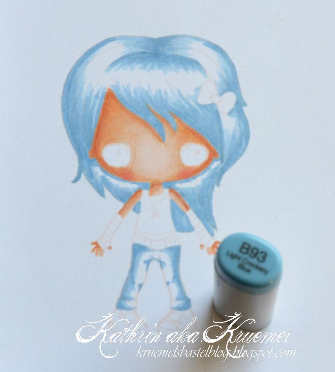
 Next I am going to color the hair and the jeans. I am using blue for both of these areas - just love blue hair for this image.
I am using the same technique like I explained for the skin tones, starting with my middle tone B95.
***
Als nächstes coloriere ich die Haare und die Hose. Ich habe für beides Blautöne gewählt - blaue Haare finde ich für dieses Motiv einfach toll.
Ich habe nach der gleichen Methode gearbeitet, die ich Euch bei den Hauttönen gezeigt habe, und habe hier mit dem mittleren Farbton B95 begonnen.


Next I added B93...
***
 Anschließend habe ich B93...


...and then B91.
I want to have a very good reflexion of light on the hair and so I left a little area white.
***
...und dann B91.
Ich möchte auf den Haaren eine starke Lichtreflektion haben, darum habe ich einen schmalen Streifen noch nicht coloriert.


B99 ist the darkest tone I am adding now...
***
B99 ist der dunkelste Farbton, den ich nun hinzufüge...


 ...and then I continue with B97.
***
...und dann mache ich mit B97 weiter.


Next I used the middle and light tones again, to blend all the colors together. I also added just one layer of B91 to the area I left white before.
***
Als nächstes habe ich wieder die mittleren und hellen Blautöne benutzt, um schöne Farbübergäng to schaffen. Nun habe ich auch eine einzige Schicht B91 auf den Bereich aufgetragen, den ich zuvor weiß gelassen hatte.


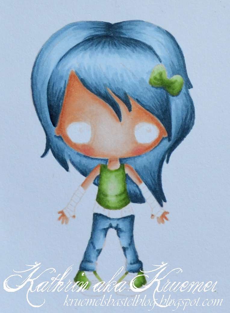
For the shirt, bow and shoes I went with green. I started with a middle YG25...
***
Für das Shirt, die Schleife und die Schuhe habe ich grün gewählt. Ich habe mit dem mittleren Farbton YG25 begonnen...


...went on with a lighter YG13...
***
...habe mit einem helleren YG13 weitergemacht...


...and added my lightest YG11 then.
***
...und habe anschließend den hellsten Ton YG11 verwendet.


For the shadows I added the YG67 first...
***
Für die Bereiche im Schatten habe ich erst YG67 verwendet...


...went on with YG17 ...
***
habe mit YG17 fortgefahren...

 ....and finally blended it all together with the middle and lighter tones to get this result:
***
...und habe anschließend alles mit den mittleren und hellen Tönen vermischt, um dieses Ergebnis zu erhalten:


Using the same way of coloring I used C5, C3 and C1 for the shoes, belt and cuffs:
***
Nach dem selben Verfahren habe ich mit C5, C3, und C1 die Schuhe, den Gürtel und Armstulpen coloriert:


For the shadow around the image, the bottom and the belt buckle I used E43, E42 and E41. The shadow around the image has been softened a bit using the blender pen.
***
Für den Schatten um das Motiv, den Boden und die Gürtelschnalle habe ich E43, E42 und E41 verwendet.
Den Schatten um das Motiv habe ich mit dem Blender Pen etwas sanfter gestaltet.


Next I used a silver Spica Pen for the lines on the cuffs and a black Copic Fineliner for the shoelaces. A little later I also added the necklace with the same fineliner.
I also used a black Prismacolor pen to add just a very little of color to the darkest area. This just helps to define the image a little. 
***
Als nächstes habe ich mit einem silberfarbenen Spica Pen die Linien auf den Armstulpen nachgezeichnet und für die Schnürsenkel einen schwarzen Copic Fineliner verwendet. Etwas später habe ich dann mit demselben Fineliner auch noch die Kette des Motivs wieder dazugemalt.
Zudem habe ich einen schwarzen Prismacolor Stift benutzt und nur eine winzig kleine Menge Farbe auf die dunkelsten Stellen aufgetragen. Dies definiert die verschiedenen Bereich etwas.


As a last step you now need to add the eyes and mouth.
I used a brown inkpad and my Stamp-a-Majig stamping guide to add the eyes but of course you can also handdraw them.
You will still be able to see the pupils and I used these to referr how and where to stamp the eyes to. I only added ink to the eyes and made sure there is no ink on any other part of the stamp.
***
Als letzten Schritt müssen nun noch die Augen und der Mund hinzugefügt werden.
Ich habe ein braunes Stempelkissen und meinen Stamp-a-Majig Stempelsetzer für die Augen benutzt aber natürlich könnt Ihr sie auch mit der Hand zeichnen. 
Man kann immer noch die in hellrosa gestempelten Pupillen erkennen und ich habe diese als Anhaltspunkt benutzt um zu wissen, wo und wie die Augen gestempelt werden müssen. Dann habe ich nur auf die Augen Tinte aufgetragen und mich nochmal vergewissert, dass nirgends sonst auf dem Stempel mehr Tinte ist.


For the mouth I used my Stamp-a-Majig again but stamped it with a very light pink and handdrew it afterwards again using a red Prismacolor pencil.
And this is the finished image:
***
Für den Mund habe ich wieder den Stamp-a-Majig benutzt, habe die Lippen mit hellem Pink gestempelt und sie anschließend per Hand mit einem roten Prismacolor-Stift aufgemalt.
Und so sieht nun das fertige Motiv aus:


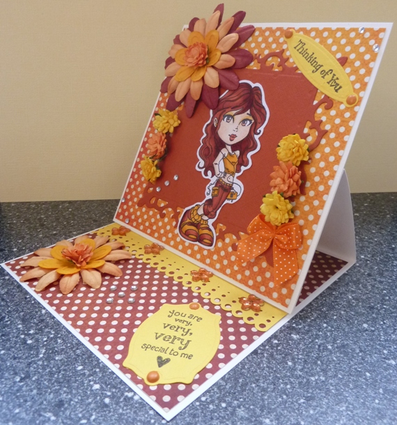
 And here it is used on a card - I really like the look of this technique and I think it is amazing, how those lines - or missing lines - change the look of a colored image:
***
Und hier ist das Motiv nun auf einer Karte - ich finde den Look dieser Technik wirklich toll und finde es faszinierend wie Linien - oder eben keine Linien - das Aussehen eines colorierten Motives verändern:


Before I am ending this post I am sharing another picture of all the Copics used today:
***
Bevor ich diesen Post nun beende, zeige ich Euch noch ein Bild von all den Copics, die heute zum Einsatz kamen:


Papers I used on my card are by Magnolia and My Mind's Eye, the text is by Stampin'Up.
***
Die Papiere, die ich auf der Karte verwendet habe, sind von Magnolia und My Mind's Eye, der Text ist von Stampin'Up.

Hope you are going to give this technique a try and that my tutorial helps you to get a nicely colored no lines image.
***
Ich hoffe, Ihr probiert die Technik einmal aus und dass Euch mein Tutorial hilft, ein schön coloriertes "Keine-Linien-Motiv" zu colorieren.

Hugs,
liebe Grüße