Followers

Friday, August 7, 2015

Challenge #42: Splashing around!

Hi everyone!

Deborah here for you with the super fun NEW challenge #42!
Thank you for all who participated to our latest challenge, it will be a hard time to choose a winner!
There are so many great entries!
The winner will be announced on August 9th. 

Our new challenge is:
Splashing around!

Every card with water is good!  Think summer stamps with a beach/ pool. Underwater stamps, rain,... So many options!

And here's my inspiration card for you. I've used this cute boy from the set "Welcome to the world" by Kraftin' Kimmie Stamps.


I've used the no lines technique to colour this cutie. He's taking a bath with a cute little duck. He can splashing around!

I also added a little glitter to the bubbles.


Here are the colours I used:
skin: E13, E11, E00, E000, R20
Hair: E35
bathtub: N7, BG18, BG13, BG1,BG10/ W7, W5, W3, W1
duck: Y17, Y15, Y11, Y00
YR07, YR04, YR02
bubbles: BG49, BG13, BG11, BG10, YG00, YG03
Shadow behind: W1
ground: W7, W5, W3, W1


To enter visit our Challenge page and enter your link in Mr Linky
before the end of September 4
The winner will be announced on september 6.

We are looking forward to see your creations!
Hugs
Deborah

Thursday, August 6, 2015

My favorite to do in the summer

Hello everyone.
Today it´s my turn, Rozzan to inspire you!

I like summer very much, partly because it is warm, but also because I like to gather mushrooms.
In Sweden we have a lot of good mushrooms to pick,but my favorit is the Chanterelle.
But there are also some of the nasty variety, toadstool...


Usually coloring, I just use red on my Christmas themes. But it is fun to color in red even in summer, this red is perfect for this fungus, I think. There are so many different shades of red, it's just trial and error as you find your own favorite combination. 

The dark red, R89 can be used for most combinations of red. If you do not have a dark red or R89 can you please try to get some black pen, NTW or C for a lighter red to get a dark contrast.

On the white spots I used Liquide pearl to get some height on the dots.
The image is from Magnolia.


Colors I have used:
Red: R24,37,89
White: T0,1,2,4
Green:G43,94,99
Snail:E81,84,87

Have a good time
Hugs from Rozzan


Tuesday, August 4, 2015

Adding interest to your colouring

Here is a little montage of ways you can add a bit of fun to your colouring!

Lets start with a simple stamp
I have used
Say it Loud! by Art Impressions


It's OK like this, but a bit boring don't you think!!

So to jazz things up a bit I started by stamping it out on Copic suitable card stock using 
Memento Angel Pink, so that I could use the no lines technique
and cut it out using a stitched circle die by Lil'inker Designs


Now I started by creating a background using my "Squiggly Wiggly" method!
Basically you start with your base colour, in this instance B0000 and cover the whole area using the standard Copic circular motion.

You then add squiggles of a darker shade, in this case B000, going over it with the lightest colour to soften the squiggles if necessary. 

Don't get heavy handed with this, light, delicate squiggles work best.


 I finished with a layer of B00 squiggles, softened by B0000 applied in a circular motion as before.


A - B0000 applied in a circular motion
B - B000 squiggles applied to three quarters of box, softened with B0000 
C - B00 squiggles to top left of box
D - Squiggles softened with B0000 applied in circular motion

This technique works best with the palest shades in any of the colour families.

Now the real fun begins.......
time to play around with your image!


I started by giving each word a 3D appearance, achieved by simple shading, but hey, it's still a bit boring and I like to have fun when colouring.....


I'll show you a close up in a minute, but here is a list of the colours I used for each word

SING: B21, B23, B24, B26
DANCE: B01, B02, B04
LAUGH: B91, B93, B95, B97, 0
LOVE!: B12, B14, B16
shadows applied using N1, N2, N3


DANCE: random dots applied using darkest colour B04
LAUGH: spots created using 0 to remove colour 
LOVE!: Stripes drawn using B16 and B14 mindful of the 3D colouring

I hope you have found this tutorial interesting and whether you try the Squiggly Wiggly background or add a pattern to your images, above all have fun when using your markers!!

Happy Colouring

Sunday, August 2, 2015

Aries Shion, fan art by Suki Manga Art

Dear Copic friends, are you enjoying your summer holidays? I will start mine very soon  \(^O^)/

But before to take a long break I have tried to finish one of my last illustrations on time.

This is my fan art inspired on "Aries Shion" 

He is a character from the anime/manga series "Saint Seiya", author: Mr.Kurumada Masami.

I created for the first time a sky with blue nebula as background, I hope you like it:


I used many colours to create this illustration.

This is the list of them:

Skin: E000 - E00 - E21
Hair: G14 - G17 - BG09 - 100 - Y08
Eyes: V12 - V15 - V09 - BV08
Armour: C7 - BV08 - V15 - V12 - V09
Cape: 100 - C7 - C5 - E71 - R32
Background: C7 - B99 - BG01 - B45 - E00

I also used a white ink pen for little details.

Would you like to watch the videos of the work in progress of Aries Shion?

Just clic on these links:


***   (Video nr.1)  *  (Video nr.2)  *  (Video nr.3)  *  (Video nr.4)  ***


See you soon!

Bye!   (^____^)/


Suki Manga Art


Saturday, August 1, 2015

Little Pink Riding Hood


Hello everyone! It's Delphine here today to share a 100% Copic scene. For that scene, I combined a Make It Crafty background with a digi by Paperbabe Stamps.


This cutie is called Mayleedee Little Red Hood and I added the Tree on Hill digi by Make It Crafty to have a pretty background for her. I cropped both images using Word, printed my scene and coloured it starting with the sky, then the tree, hill and finished with my character. I decided to avoid colouring my Mayleedee using reds, just for a change since I always want to colour Little Red Riding Hood in those obvious colours, so I went for a pale pink (RVs) shaded with BVs. I also gave her blond hair which I don't do that often, I usually go for brown or black.


Sky and cloud: BG000, BV20, C0, 1
Tree: E30, 33, 35, 39, 59, G24, 28, YG01, 03
Grass and path: E40, 41, 42, YG01, 03, 17, 67
Skin: E000, 00, 11, 13, 71, R20, 22
Hair: E55, YR21, 24, Y21
Hood: BV0000, 000, RV000, 00, 02
Apron and dress: BG000, 00, 01, W0, 1, 3, 5
Basket: E30, 33, 39, 59, E40, 41, 42


Thank you very much for your visit, have a lovely weekend! Hugs,
Delphine xx

Thursday, July 30, 2015

Christmas in July

Hello Copic lovers!
Christina here! Are you enjoying your summer? We have the perfect weather! For Copic coloring that is. Grey and rain, some days we even have a storm. So what can you do? Bake, clean and color, not necessarily in that order.

Have you started with your Christmas cards yet? Usually I make two cards per month but this year, so far, I haven't made a single one. Well now I have. I just love making Christmas Cards but it's no fun when it´s stressful, that is why I'm starting now in July.

I have chosen a stamp from Magnolia - Frosty - not much coloring you would think, since he is white...


I just love these Frosty stamps! He is soo cute! I have masked Frosty and the snowflake-circle together and the image gets quite big and I think a clean and simple card is perfect with a slightly bigger image.


There is a lot of white areas on him and to make it look white I have used some W-pens. Except from the hat, where I have use N-pens.


The background around Frosty I have used the Confetti-technique, mixed BGs and Ws dots.

Here are the pens I have used

Hat/scarf/mittens - BG75-72-(71)-70
White - W5-4-2-0-blender / N2-0-blender
Confetti BG72-70-W3-1-0

Have a great day!


Tuesday, July 28, 2015

Summer fun

Hi copic friends, 
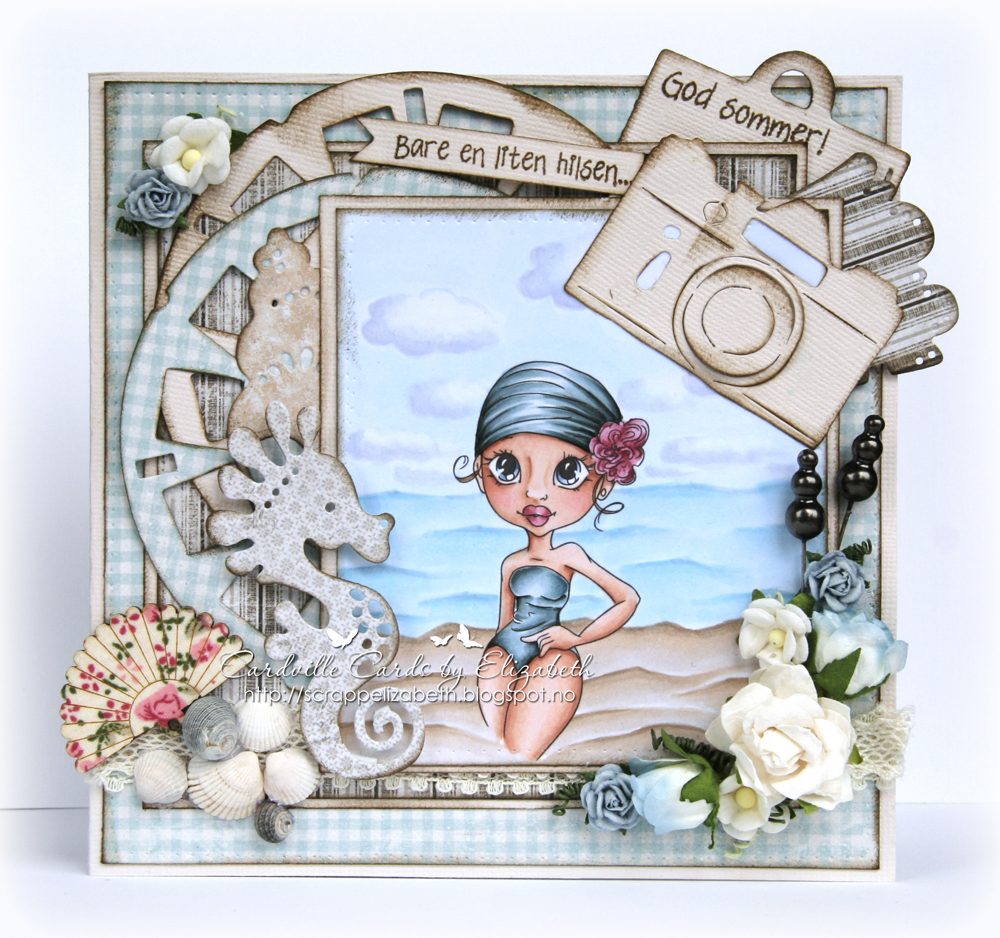
Elizabeth here with today's copic inspiration for you. I hope you are enjoying wonderful summmer days, whether you are on vacation or at home. We spend a few weeks at our summer cottage every year, and I always bring my copics markers for those rainy days! Here's one of the images I colored, I put her on a summer card!

 I used Maja Design Papers and lots of dies and flowers. My daughter and I picked small sea-shells at the beach for me to use on my cards. I used some of them here.


I created a little scene using Delphine's tutorial on how to color sand HERE. I added water and clouds to create a whole scene around this cute Saturated Canary image called Vintage Swim.
Copic colors used: 
Skin: E13-11-21-000, E93, R20, R81 (cheeks) and E93, R20, R81- 83 (lips)
Swimsuit and bathing cap: BG75-72-71 (homemade)-70, BG11, W7
Flower: R89-85-83-81
Sand: E43-42-41-40, E30-31
Sea: B000-00-01, B21, B91 and BG000
Clouds and sky: C00-01-03, B91, B60, BG000, B000-00


Hope you like it! 

Keep enjoying your summer! 

Crafty hugs, 
Elizabeth 

Monday, July 27, 2015

How to add detail to your Copic colourings

Hello there, it's Jane again,
I thought I would do something with a real summery feel this time!

So here is Wryn from Tiddly Inks enjoying a day at the beach.


Sweet treat Wryn & Wryn Beach Bonanza - Tiddly Inks

Copics
Sand - YR30, E40, E41, E42, E50, E51, W0
Sky - B0000, B000
Brolly - E70, E71, E74, B34, B32, B60, B41, N3, N2, N1, N0
Cone - E50, E51, E41, E42
Ice cream - R30, R20, R21, R22, G0000, G000, G00, W0, W1, W2
Bucket - N0, N1, N2
Shell/Fish - BV20, V20, YR21, YR24, E11, E01, R11, R12, E31, E30, E00, YR12, E08, T0, T1, T2, N0, W0, W1, R00
Hair - E40, E42, E43, E44, R89, R83
Flowers/Sandals - E33, E37, R11, R12, W1, R00, R01, W0
Girl - E0000, E000, E00, R20, V20, B41, B45, W7

Enhanced with coloured pencils

Sometimes when using Copics on small fiddly images you can't quite add the detail you would like to.  That is when additional coloured pencil enhancement can make all the difference!
I use Caran D'Ache Pablo's and Luminance pencils - and they are especially good for adding definition to hair.
Just remember to have a can of fixative to hand as the smooth cardstock usually used for Copic work is not overly suitable for pencils and it tends to rub off/smear if you don't seal your work.
(I use Winsor & Newton Professional Fixative)

Thanks for dropping by

Saturday, July 25, 2015

You're Wonderful


Hello! Good Morning!
I'm Cristina Valenzuela and this is my card for Copic Europe.

I love Japanese typical images, especially of Geishas.
This time I did not want to use lilac colors, they are my comfort zone.

This digital stamp is from Digistampatelier, called "my butterfly".
I have a great time working with realistic images.


Copic colours I used:
Skin: E000, E00, E01.
Cheeks: R30.
Eyes: E23, E13.
Lips: R30, R35.
Hair: N1, N3, N5, N7.
Butterfly: RV91, RV95, E70.
Kimono: E40, E70, E71, E74.
Pattern of kimono: YR24, YR21, YG91, YG93.
Obi: YR24, YR21, YR20.
Lotus flower: E40, R30, E00.

I hope you liked it!
If you are on holiday, enjoy a lot! Hugs.

Thursday, July 23, 2015

Lines Versus No Lines


Hi Everyone, it's Faye here today :)

With the No Lines Technique being as popular as ever, I thought it would be interesting to compare the same image, both With Lines and Without Lines, to see how very different both Techniques could make the same Stamp look. I've used the adorable, Wee Stamps Peggy. She is soooooooo cute!

 So, here goes:


Peggy, With Lines...

She pops off the page, and you can see clearly all the little details the Artist has added.


Peggy, No Lines...

She looks much softer, similar to an illustration you may see in a Children's Storybook. The details are still there, just added with colour.

Both Techniques allow you to bring your stamped characters to life in different ways, so you can make the same image look very different and get the most out of your Stamps. 

With all these Peggy's lying around on my desk, I thought I had best made a card with at least one of them!


Copics Used...

Skin; E000, E00, E21, E11, E70, E71
Hair; E23, E25, E27, E29
Ground; E41, E42, E43 
Bird; E30, E31, E33
Turquoise; BG53, BG57, BG75
Yellow; YR31, YR23, YR24
Pink; R81, R83, R85, R39
Orange; YR12, YR14, YR18
Green; YG41, YG45  

Thank you so much for stopping by... Have a great day

Faye xx

Monday, July 20, 2015

Bubbles!

Hello everybody Copic lovers!

Franz from Italy again with a new little paper crafting project.

I create a clean and simple card for a lovely Mo Manning image, a cute ethnic fairy called Tabia:


I used different bright colours for her wings and her dress because I liked making her shiny!
I also used my white gel pen on the wings, on the stars and on bubbles to try to achieve this effect.


I used some papers in rainbow colours to make my card, i thought they was just perfect with this cute and bright image!


Here is the complete list of Copic Markers I've used:

Skin: E00, E11, E13, E15, E18
Hair: E13, E15, E18, E29
Dress: B0000, BG000, B01, B02, B04, B05, B06, B37
Wings: V000, V1, V4, V6
Background: BG10, BG11, BG13, B00

 Thanks for stopping by,
 Have a lovely day everybody :*
Franz.

Saturday, July 18, 2015

Notebook for a great Teacher

Good morning everyone, Sarit is here today for another Copic inspiration.

The school year is over. Summer vacation is here yepeee !!!!!
I want to share with you a thank you gift I made for my daughter's teacher.

I took a notebook, cover it with DCWV papers, add some dimensions with Distress ink and Martha Stewart punches for the border. Inside the front and the back inside cover, I made pockets for her to use. Teachers always have many notes; we do not want them to disappear. (sooooory forgot  to take pic of the inner sides ) 
 The tag was left blank so the teacher will write anything she want.


I wanted the notebook to be magical and the "Silver fairy" from Wee Stamp was perfect for it. 
For the dress, I used the soft red. The olive green as leaves for the hands & legs go well with the dress color.


After I finished coloring the wings, I cover it with VersaMark pen and add some glitter embossing powder & heat it with embossing heat tool.
The background used with B, BG and blender.
  

Here is the Markers I used for this beautiful woman:
Hair: E11, E13, E15, E18
Flower on the hair: Y19, YR15, B02
Body: E000, E00, E04, E11, E21, R20
Dress: R81, R83, R85, R89,
The leaves: YG93, YG95, YG97, E43
Wings: E50, E51, E53, B0000, B000, B00, R81, R83, R85
Ground:  EE31, E34, E35
Background: B00, BG000, BG0000, Blender

Wishing you a beautiful day


Hugs, Sarit

Friday, July 17, 2015

Enjoy your day at the beach

Hello everyone!

It's my turn to inspire you with a creation, Today i will share a very summery card with you all.
Who doesn't love the sea, sun and beach? Because that means for most people they can relax on their Summer Holiday. The summer is really my favorite time of year.

 I'm really fond of the sea, sun and icecream.
And in a few weeks, I can enjoy it all during my holiday
in Tenerife.

 
I have been using the following colours:

Skin: E00-11-13-15
Hair: Y21-YR23-YR24
Eyes: BG01-BG05
Lips: R21-R22
Swimwear: BG000- BG01-BG05-BG09
Icecream: Y15-19-E31-E33-E35-R35-R37
 
The papers are from the Dutch  brand "Light Studio".
The image is by "Saturated Canary".

Thank you very much for your visit, have a great "Summer Holiday"!

Tuesday, July 14, 2015

Scooting By

Hello everyone!
It's Vili here today, sharing my tiniest card ever.
I've said many times that my older daughter is into synchronized swimming for 10 years. Now she's already a grown-up girl and decided to stop competing. So, today's card is an addition to the gift for her coach. I chose Tiddly Inks' Wryn - Scooting By because it gives the feeling of a change.


I coloured the scooter in the classic red and white and Wryn - in bright yellow, so as to be contrasting.


Copics used:
Skin: E50, E51, E53
Hair: E31, E33, E35, E37, E79
Dress: YR20, YR21, YR23, YR24
Scooter: R32, R35, R37, R39, E40, E43, W3, W5

Have a lovely day and thanks for stopping by!
Vili M. xxxx

Monday, July 13, 2015

Easy peasy...vegetable squeezy background.


Hi everybody!
Daria is here :) 


Today I would like to continue talking about backgrounds.
I heard several times in a past that real background stamps are not very practical - they usually cost the same as a whole stamp set but you use it very rarely.
Well - fair enough...:) But you know what?! You don't really need to spend a lot to create great backgrounds!
And I will prove my point today! :) Lets do it together actually.

All you need is ANY stamp set and your Copic Markers of course! 

As to me - I decided to create a very sweet gift pocket. 
First I took WRMemory Keepers Board and punched future package.
(In such case it will be easier to create your background as you will not need to color those pieces that will be cut off.)
I used Hampton Art - Jillibean Soup - Fresh Vegetable Soup Collection. Started with most "massive" image - onion. Stamped several times. To make it looks more "professional" sometimes I stamped image "off the edge". Then it was carrot and finally pea.


I coloured each image and then outlined them with grey markers to add "dimesion" and interest.


Finally it was time for sentiment and decor.....aaaaand here is my final project:


I stamped two image of a beet, coloured one of them, cut both out and glued them together with Bakers Twine in between. That brought real fun to this clean and simple gift pocket...don't you think?! :))

BTW I used the same background to create thankful card - you can see it over HERE.
So as you kinda guess this method can be used not only for gift bags... :)))

Anyway the key numbers are:
Carrots - YR0000, YR20, YR12,YR14, YR04,YR18
Onion - W00, E50,E81, Y23,Y32
Peas - YG0000, G0000, YG00, G21, G40,G82,G85, YG91
Beet - RV0000, BV00, V01,V04, V06, V93, RV17,RV04
Background - C00, C1


Wishing you a great day and very creative mood!