Followers

Sunday, February 26, 2017

Magical Dragons!

Hi everyone!


This time I made an interactive card made with Copic markers only.
I've used a stampset by My Favorite Things called "Magical Dragons" and the castle is from a stampset by Kraftin' Kimmie Stamps "Unicorns and Rainbows".


I just love magical creatures and it's so much fun to make a card with them. I first coloured the dragon in the green Copic colours (You can see all the colours below) and then I added some structure to his skin. I stippled with the same colours over the colouring.


I wanted that the princess was dreaming about her prince on a dragon.
I coloured the clouds and the sky first and after that I've coloured the grass.
I worked from dark to light and dotted a bit on the grass to give it some structure as well.
The big dreaming cloud was drawn with my Copic marker and cut out with my scissors and I coloured the sides of it.


After that I've used a die for the slider  and added it with some 3D tape and glued the rest all together. So here's my finished slider card! It was my first ever but I can't wait to do the next one 😉


Here are all the colours I've used: 
skin: E04, E11, E21, E00, E000, R20 (blush)
crown + hair: E37, E35, YR23, Y21
pink: RV69, RV17, RV55, RV52
castle: E47, E44, E43, E41
metal: C7, C5, C3, C1
dragon: G28, YG17, YG13, YG11
E49, E47, E44, E43
red: E29, R46, R24, R22
sky: B00, B000
clouds: C3, C1, C0
grass: G07, YG09+, YG06, YG03

Thank you for stopping by, see you next time,
Deborah

Saturday, February 25, 2017

A basket full of love, for a best friend!


Hi Everyone, it’s Sandra from Portugal.

Today I am showing a card I made to send to my best friend who’s in China. (Shh, don’t tell her, it’s going to be a surprise!) She is one of the women I admire the most. She is smart, caring, adventurous and sassy, and she has always been there for me, even at a great distance.  I feel very blessed to have her in my life! 💗

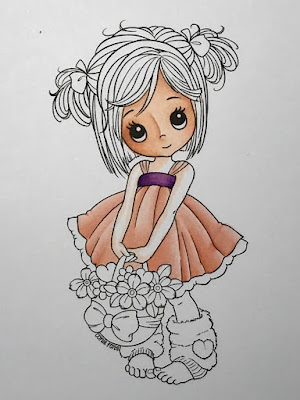
I chose one of Conie Fong’s digi stamps: “Molly’s basket of love”. I love Conie’s drawings: I find her folds and pleats very easy to colour, everything falls in the right place and no mismatched folds, if you know what I mean.

My favourite skin combination is E000/00/11/21/93 and I started by mapping the shadows with the lightest marker, assuming a light source from the upper right.


I thought my mapping made sense so I went over it with the darkest colour E11 and blended it with E21. And blended again with E00 and finally E000 leaving the nose cane lighter. Finally some E93 on the cheeks and Molly’s make up was all done ;)


I couldn’t decide which colour for the dress, peach or green, and after bugging everyone around the house, I ended up picking my oldest son (and mine) favourite combination – peach.
Once again I coloured dark to light, mapping the shadows first.


Colouring dark to light happens to work best for me because I tend to overblend and usually my highlight is gone in the blink of an eye. This helps me not to overextend shadows. Even so, as you can easily notice, I overextended the right fold shadowing. This was supposed to be lighter as it was closest to the light source. I later retouched it with R0000.  I know lots of people grab their 0 marker for lightening colours when needed, but you will find you’ll get better results if you use the lightest marker available in that colour family instead. I reserve my Colourless Blender for texturing and pushing in strokes that fall outside the drawing  lines.

Peach is such a soft colour, and so close to the skin tone I chose, that I decided to pick a complimentary one for the dress ribbon. I went with V12 /15 /17 because they are an easy and clean blend. Picking complimentary colours (which are colours opposite on the colour wheel) will pop the colours of any project and make it more visually appealing.


 I then finished colouring the skin, once again dark to light.


At this point I was still colouring two images at the same time – the green and the peach - and “team green” was stronger, so I was colouring the peach as extra fun (because it was my favourite) and went along without step by step pictures, thinking I would take them on the “green Molly”. 


So, sorry for not showing a step by step of the basket and the leg warmers.


I shadowed the white skirt pleats with N0. I used E31/33/35/37 for the basket and some light warm greys for the leg warmers. To get the fluffy and comfy look on the leg warmers I used a technique called dotting or stippling, colouring really tiny dots with the tip of the marker. Be careful not to ruin your nib when you do this, and don’t forget to have dots of different colours and sizes to create a 3D look – darker dots where the shadows are supposed to be and lighter and smaller for transitioning to the highlights. 

I coloured the basket bow and moved to the hair.


Conie’s drawings usually have pretty defined hair strands. I like to colour each one of them with one or two single thin lines of colour ranging from dark, light to dark. 
I start with the darker closer to the hair roots and pigtails.


And then extend it progressively into lighter, trying to have it very light where highlights are supposed to be.  


It’s very time consuming and requires your nib to be clean and sharp. I usually have a cotton swab with alcohol by my side to keep cleaning the pigment that builds on the nib tips. But the result is usually awesome (I think). And if your nib (not you) happens to make a bolder smudgy line, it will still be ok in the end.
See?


After using my Colourless Blender to clean some out of place colouring, I coloured the pigtail ribbons and the headband.

And then, all that was left to colour was flowers, leaves and hearts.
I coloured some flowers with the feather blending technique to have two-toned petals.


Finally, I placed some cast shadows. Cast shadows are not my “forte”, I know they need to be there but I am always afraid of ruining my work. :p


I then assembled the card.


Oh, I nearly forgot, here is a list of all the markers I used:

Dress:  R 00/ 01 / 11/ 12 and N0 for shading white

Ribbons: V12 /15 /17

Skin: E 000/ 00/ 11 / 21 and 93 for cheeks 

Hair: E49/57/ 55 / 53

Flowers: Y 06 /08 / 35 /38 and G000/00 BV000/ 00 R 20/21

Leaves: G20/40 and YG11

Basket: E31 / 33 /35 / 37

Hearts: R 20 / 21 / 22

Leg warmers: W00 / 0 / 1 /2 and V 000 / 000 / 01

Cast shadows: W00 / 0 / 1 /2

I hope you like it!

I will put this in the mail next week, I don’t know how long it will take to Beijing, but I am sure my friend will be quite touched to get it. She values handmade things!😍


Hugs Sandra x

Thursday, February 23, 2017

Spring Scene


Hello everyone! It's Delphine here today to share a spring scene I made, with a few step by step photos. Here is the whole scene and card:


For this scene I combined a Tiddly Inks character called Thanks Fairy Much with a Make it Crafty background called Country Fence. I flipped the background and added my fairy in MS Word. 


I started by colouring the sky (B000, BV20, C0, 1) and created some hills using YG01, 03, 05, 17, 67. 


I continued with the branches (E21, 25, 59), using some pinks for the flowers to make my image pop (RV04, 09), coloured the bird (B93, 95, W3, 5) and coloured the fence (E40, 41, 42, 43).


And I finished with the fairy. Here is the complete list of colours I used for the whole scene:

Sky: B000, BV20, C0, 1
Grass: YG01, 03, 05, 17, 67
Branches: E21, 25, 59, RV04, 09
Bird: B93, 95, W3, 5
Fence: E40, 41, 42, 43
Fairy Skin: E000, 00, 11
Fairy Hair :100, BV04, C7, 9
Fairy Wings: BG000, BV000, V000, YG0000
Fairy Dress: BV04, RV02, 04, 06
Sunflowers: E31, 34, 37, Y11, 15, 19

And to finish off the card, I stamped a Kraftin' Kimmie Stamps sentiment from the Hello Spring set.


Thank you very much for your visit, enjoy the rest of your day! Hugs,
Delphine xx

Monday, February 20, 2017

Angels are among us

" Although you may not see them
you are always in their sight

they bring the gift of love and guidance
it is called the Angel light.."

This is how a lovely poem about angels start, I really love it and it suits the image I have coloured very well...(unfortunately I was not able to find the name of the author,).
The image I used for today is by Meadowhaven. 


 I started with a thin layer using the E50. With the E51 I add my shadows and I do not worry about blending out the colours smoothly. With the BV00 I add some more shadows.

I slowly build up the layers adding more colours.


After adding the BV00 I blend all layers together with the E000. As you can see the colours look more smoothly blended now. In the end I decided to add some W1 for more shadow. 

 If the skin colour looks too cool you can add some extra E00. I prefer a more cool skin colour.  I like to start with a layer of E50, using the warmer skin tones (E00, 000) on the cheeks and nose. 
The best way to find out what works best for you is to make some samples using different Copic combinations. 


I decided to do the wings blue. Orange is the complimentary colour of blue  (they are opposite each other in the colour wheel) that means if you blend blue and orange you will get mud, but combinations of orange and blue look fabulous. So there has to be some orange in this colouring. I decided to use orange hues for the hair and the little angel's dress. 

I used quite a variety of colours for the hair YR15,20,21,23,24,27 and E08.
I used the YR Copics first, starting with the darkest one...in the end I thought the hair looked too pale and I added some E08 to make it a bit brighter. 
For the dress I used the YR 14, 15,16 and 17.


I enjoyed colouring the feathers. I started with B39. Like the hair I start with the darkest colour working my way back to the lightest colours. I used B 69,79,63,66, 60 and 39. In the end I added a tiny bit of the RV06.

For the dress and the little angel's wings I used FBG2, BG02, 05, 07 and 09.


I made an art journal page in my black journal, using some lovely Pronty feather stencils as well


See you next month

Miranda

Thursday, February 16, 2017

Hey there...

Hello everyone,
Sue here today with my first project for 

I am so happy to be here, it is a great honour to be part of such a wonderful and talented Design Team.

For my first project I chose one of my favourite digital images - Wryn - Watcha Doin? by Tiddly Inks.
I had such fun colouring this as I used a great Copic technique to create the pink background.
Before I coloured Wryn, the first thing I did was use my Copic marker R81 to colour the background all around her.  I used the brush tip for the detailed parts.
...and I used the chisel tip for the rest of the card.  (We don't get to use that nib very often but this is a good time to use it)!
Then I dipped a small piece of sponge into some colourless blender.  The sponge only needs a small amount of blender on it so it is a good idea to blot off the excess onto a separate piece of card.
I then dabbed the sponge all over the pink background. You can see the colourless blender bleaching out the pink colour.
It is fine to dab the sponge over the stamped image so that the effect goes right up to the edge of it.  The colourless blender will dry and you can carry on and colour with your Copics as normal.
This is what the background looks like when the colourless blender has dried.  Isn't this a lovely effect!

I hope you have enjoyed my tutorial.  It would be great if you could try this technique and show your cards to us at Copic Marker Europe on Facebook.
To find us just follow the link
I have coloured Wryn with some of my favourite Copic combinations. 
Skin - E71, E21, E00, E50
Hair - E70, E74, E77, E79, E29
Clothes - R32, R35, R37, R39, T5
Background - R81, Colourless Blender Refill, Sponge
Ground T1, T3, T5
Thank you for popping by.

Happy Copic colouring!

love from
Sue...xxx


Monday, February 13, 2017

Changes in the Design Team

Hello Copic-lovers,
recently we had some changes in our DT. Faye will still stay as a member, she will check the language of the non native speakers. Her work as an Instructor for the UK is very time consuming, therefore she takes a time-out. Faye thanks for all your inspiring posts.

New kids on the blog;
First I will say welcome to Sandie Dune from Ireland.


Here is what she wants you to know about her.

"My name is Sandie Dunne and I live in Ireland. I started crafting about 11 years ago, starting with scrapbooking. I was an avid admirer of all the wonderful cards I would see on blogs and eventually purchased my first image stamp. Then I discovered Copic markers and the rest, as they say, is history. 

I am a stay at home mom to school going children, and I am lucky to get to be creative most days. I am thrilled to be on the Copic Europe design team and am looking forward to bringing my own touch of inspiration to the colouring community."

Here are some beautiful cards she made


The second new member to welcome comes from the UK
Her name is Susan Hastead,
Hello lovely Copic friends, it is so exciting to meet you all here at Copic Europe.

I am Sue from Gloucestershire, UK.  I am wife to Nigel and Mum to my two wonderful grown up sons Ian and Alan.  I also have two beautiful dogs, Ruby and Phoebe.  I have been crafty all my life and discovered the wonderful world of Copics when I retired in 2012.

I really enjoy spending time colouring with my beloved Copics.  I have completed the European Copic Course and have my Copic Certification.

My favourite Copic colour combinations are nearly always red and I love creating Copic backgrounds.

I am looking forward to sharing my love of Copics with you all.

Thank you Diny and Copic Europe for inviting me to join this amazing and talented team.

Here some art work from Sue


Sandie and Sue, we hope you have great time with us and we look forward to your work.
Please say hello to the new ladies.

The Copic Marker Europe team
Diny Administrator