Friday, May 14, 2021
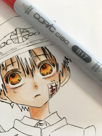
Toilet-Bound Hanako-kun.
Monday, May 10, 2021
Pretty in Pink Slimline Card
Friday, May 7, 2021
Time for Mermay / Mermaids!
Hello everyone! It's Delphine here today some mermaid inspiration! May is the month for mermaids so I picked a cute mermaid from The Greeting Farm Sparkle set and thought I would share the colouring and how to create an underwater scene for a mermaid - and a bit of boldness in my choice of colours! Copics have such vibrant colours, it would be a pity not to use them :)
Here is my final card:
I have recorded the whole Copic colouring process, which you can see below:
The only things I added after the video ended are touches of white and gold in gel pens here and there, a sentiment, and a few hearts in Copic multiliner next to my sentiment.
Below you can find a recap of all the colours I used:
Skin: BG000, BV00, E000, 00, 11
Hair: RV14, 25, 69
Tail: V04, 06, 09
Sea background: 0, B18, BG01, 13, 15, 49
Sand: E35, 41, 43, 47
Rocks: C3, 5, 7
Seaweeds: B18, 39, BG01, 05, 49
That's all from me today! Thanks for your support and for stopping by! Hugs,
Delphine xx
Monday, April 26, 2021
Spotlight on Copic Yellows & a Tiddly Inks video!
Hello everyone! It's Delphine here today to share some Yellow inspiration! At the end of every month, I post a card featuring one colour family and I picked Ys for today's post. I really like focussing on one colour family, I am clearly NOT a Yellow person and rarely use them, so it's nice to push myself out of my comfort zone!
There are 12 Y Ciao and 20 Y Sketch markers. My card today uses Y02, 06, 11, 15, 21, 35, 38. You don't need to have ALL markers to get good results, just pick a few and use them for different parts of your image, or just by changing one marker in your combo:) Here is my final card:
The image I used is by Tiddly Inks, called Wryn Ducky Dance. Of course, thinking of yellows, my first thought went to ducks ;) I printed my image and die cut it with an MFT die, then coloured it in Copics. The DPs I used are by Doodlebug.
You can see the whole colouring process below:
Just a few tips and remarks:
- Note how I shaded my Yellow with a light BV on my ducks, a purplish colour works well for shading yellow.
- I put a bit of yellow here and there to have some harmony in my whole image: a touch of yellow on her boots, as if they were slightly tinted by all the yellow around, a bit of Y21 in the background, of course a yellow umbrella with some markers already used for the ducks (Y38, and Y15 replaced by Y35) and a couple more for a nice slight difference (Y06, 02). I also put a touch of yellow highlight in Wryn's hair.
- I matched my yellow markers with BV markers, yellow and purple are complementary so will always work well together. You find complementary colours on the colour wheel, they are opposite each other;)
- For the rain, don't be afraid to add a few strokes of any light blue colour across your image - it's a bit scary, but you will get a nice suggestion of falling rain. Also, you can add a few lines with a white gel pen, which I did in the bottom part of my image to suggest rain, and I also added a bit of white on the ground if you look closely :)
Here is a close up on the image and the list of all Copics I used:
Rain: B60
Thursday, April 22, 2021
Cicci color a horse
Hi Friends
Cicci here posting from Sweden.
Today Im going to make a little horse. It was a very little horse a drew and it was a long time that I did such a little drawing. Sometimes I think its so much easier to color big with Copic Markers!! Ok lets get started- I try the best I can with this little little horse:0))
I did a horse in grey some years ago and you found it in the blog, and that was in A4 size!
Copic Combo
E53 E51 Y21 E95 E99 E00
Step 7
Blend all over with Y21
Step 10
Sunday, April 18, 2021
Happy Day
Hi Everyone, it's Faye here today :)
I decided I would like to colour this bear from the Colorado Craft Company Happy Day set on kraft card. I love the effect of copics on kraft card, they look much 'dirtier' and more grungey than when you use white card.
Aside from this, there are a couple of things to note...
Firstly, when you use copics on a cardstock with a loose weave such as kraft card, the card is thirsty! You will literally feel the card 'suck' the ink from your marker. Take this into account when laying the ink if you are normally quite heavy handed when you colour.
Secondly, wait for the ink to dry before you decide if you need to add more layers of shading. The ink really changes colour when it has dried on kraft card. When it's wet, it will look darker than you would normally expect. But you also can't see the graduation of shading as much as you would be able to notice on a lighter card. Wait. Let it dry. Then adjust. If you go for it while the ink is still wet, you won't be getting an accurate judgement and you may find you keep adding and adding shading that you don't need, which you will then need to correct when it has dried and you see what you've been left with.
You can watch me colour this bear on my You Tube Channel by clicking the logo below...