Followers

Showing posts with label Sandra Catarino. Show all posts

Tuesday, August 15, 2017

I'm always here for you!


Hello everyone it’s Sandra from Portugal.

What do you think of these two lovely mischievous pandas? Kind of remind me my younger boys: they always get along great when they have an opportunity to misbehave.

The image is a digistamp from The Paper Shelter, called “Team Work”.

I had to colour it and ended up turning it into a friendship card.

I started by outlining the die cut shape I would be using in the end, setting some boundary to the image so I could know where exactly to colour the sky and ground.

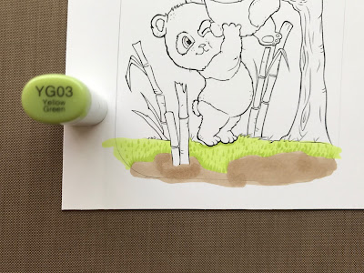
I then designed the ground with YG01 (layer for grass) and E43 (layer for soil). 


I used very fine flicks on an upward motion, from earth to sky, from lighter to darker greens allowing some drying time in between to avoid blending: YG03/25/17/67. I finished the grass flicking again all over again with YG03. 


To colour the soil I dotted E81/84/87 and then E44/47 and some E43 all over it to smooth it all a little bit. To colour the sky I layered B0000 three times.


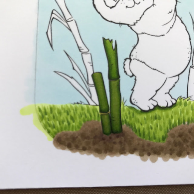
For the bamboo sticks, I picked YG67/25 and 93 (to dull it in the end), with YG91/93 in the junctions. You can see the upper right bamboo piece with just YG67/25, it's so much brighter than the other ones:


And compare it with how it looked like after I toned it down with YG93:


I coloured the leaves  with YG67/25/23 and some YG95 at the leaves tip.


To colour the pandas “white”, I chose W00/0.


I coloured their "black" with N3/5/7/9. I then used R20/21 for the tongue and R20, E93/95 to finish their paws. But I guess YR61 would work great for the paws too, I just figured it out after I did the colouring.


 And finally the tree, with no leaves, was “asking “for a dull brown, so I chose E43/44/47/49.


I die cut the finished work:


And then assembled it onto a kraft card:


Here is a full list of all the markers I used:

Grass: YG01/YG03/25/17/67
Soil: E43/E44/47/81/84/87
Sky: B0000
Bamboo sticks: YG67/25 /91/93
Bamboo leaves: YG67/25/23/95
Pandas: W00/0,  N3/5/7/9 and R20/21 E93/95

Tree: E43/44/47/49

I hope you like it!

Have a great summer!

Hugs,

Sandra

Saturday, July 15, 2017

Taking a break on an adventure!

Hi everyone,

It’s Sandra from Portugal. I hope you are having a great summer!

This month’s card can be used for several different occasions: birthday, travelling, inspirational quotes, it all depends on the inscription one writes inside the card. 😊


I used a Paper Shelter digi stamp called “Where're We Goin'?”.

I started by choosing the card papers and probable layout, because that would help me picking which markers to use. I have a beautiful paper pad from Bo Bunny – Felicity Collection, and I decided I would go with one of it's papers.  

I die cut a frame with one of the papers and picked some markers to match the collection’s colours:


I started by colouring the suitcase, using E55/57/59 for leather, Y00/11/15 and YR23 for the metal parts, and E44/47 for the straps.


I chose BG72/75/78 for the shorts:


And coloured the coat in salmon, layering R11 and then mapping the shadows with R20.


I coloured over the mapped shadows with R22.


And blended from R21 to R20. This is what the finished coat looks like:


I used E40/41 for the shirt and E000/00/11/21 for the skin. I coloured the eyes with YG11, and the nails and lips with R32/35. 


To colour the sandals I used E40/41 for the bottoms, BG72/75 and Y11/15 and YR23 for the straps, and R20 for the flower. The green eyes were "screaming" for a red hair, which I coloured with YR23/27 and E59.


To finish I coloured the hat with E40/41/42 and BG72/75. This is the finished image framed:


And the assembled card using one of the papers from my favourite paper pad:


Now all the markers listed:

Hair: YR23/27 and E59
Skin: E000/00/11/21 and E93 for cheeks
Nails and Lipstick: R32/35
Eyes: YG11
Hat: E40/41/42 and BG72/75
Coat: R11/20/21/22
Shorts: BG72/75/78
Shirt: E40/41
Sandals: E40/41, Y11/15 and YR23, BG72/75 and R20
Suitcase: E55/57/59, E44/47 and Y11/15 and YR23

I hope you like it!

Have a wonderful summer, full of adventures!

Hugs,

Sandra

Thursday, June 15, 2017

A tree house – and different colouring techniques for foliage

Hello everyone, it’s Sandra from Portugal.

Today I am bringing you a lovely tree house postcard, and some alternative techniques to colour foliage.


The image is a digistamp from Just Ink lined called “Tree House”.

I am a super messy colourist, jumping from one section to another before completing the first, but I will try to show you how I coloured this image.

I started by drawing and colouring the ground with YG01/03/23 and then colouring the sky with BG000.

I had to go over the sky a few times to make it evenly covered.

Then I had to decide how to colour the foliage. There are several techniques we can use but the most common are stippling, scribbling, and smooth colouring. 


Let me elaborate a little bit on each:

Smooth Colouring


Smooth colouring is a well known technique. It is quick and easy to colour the bush and gives you a perfect finished look. You might want to choose carefully your markers so you can easily achieve a nice blended gradient. Also you’ll get smoother results if you colour quickly between layers, not allowing the ink to dry in between layers.

Stippling


Stippling is a nice and quick way to build dimension just by layering random dots, or tiny tiny flicks, on your image.  In order to avoid a blended result, don’t choose markers too closed together in colour tone. I like to layer the base first (that's completely optional) and then start stippling from light to  dark. But you can try yourself and find out what works best for you. In the picture above I used YG01/03/05/23/17. I just added random tiny flicks, darker and closer together where it's further away from the light, and lighter and more spaced where I wanted the highlight. 

Scribbling


Scribbling is another technique that adds dimension. It is a bit messier, in my opinion, and requires that you control well your copic nib in order to get a very fine line and an harmonious finished work (try grabbing the marker closer to the nib).  As with stippling, don’t choose markers too close together in colour tone, to avoid a blended outcome. You’ll get better results/thinner scribbles if you scribble faster and holding your pen straight vertically, but you may find it harder to control the outcome. In the picture above I used YG01/03/05/23/17. I just scribbled randomly, darker and closer together where it's further away from the light, and lighter and more spaced where I wanted the highlight.


Both stippling and scribbling are very common and useful techniques to colour also curly hair, scales and even fur, please try it! 😊 To get crispier results, allow the ink to dry between layers, otherwise you’ll end up with a blended result, and will lose dimension. If this happens, jut repeat all scribbling or stippling again, only this time, allowing for drying time. Also know that different base layers will get you different results for the same combos (see further bellow).

Eventually, I chose to colour the foliage by stippling because I thought it would better match the loose leaves on the lower branches.

To add some dimension and the illusion of distance I coloured several “tree bushes” in different combos: brighter and lighter for the foliage upfront and duller and darker for the foliage that, in my perspective, would lay a little bit behind or further away from the light source.   
I set the tone with the base layer. So, if we label the bushes 1, 2 , 3 , 4 and 5, the base layers used were YG61 for bushes 1, 2 and 3, YG01 for bush 4 and YG00 for bush 5 (this last one was a huge mistake if you ask me, because it toned the bush too yellow, and I had to spend extra time to disguise it with the remaining combo).


The other markers I used for stippling, (yes, I know, as always I overdo it) were:


Bush 1 and 3:
YG21/23/25/63/67, FGY02, and G46/99 

Bush 2 and 4:
YG21/23/25/17,  FGY02,  and G07/29

Bush 5:
Same  as above but with less YG07 and with no G29


I immediately coloured the tree branches with E53/55/57 and the lower leaves (G46 on the left and YG07 on the right) to  get an idea of the finished “ensemble” and this is what it looked like:


Notice how you can get different results just by changing the base layer colour. Bushes 2 (YG61) and 4 (YG01) are an example of it.  Tweaking the colour combos just a little bit also results differently, see Bushes 1 and 2, for example.
Isn’t this fun? 😁

I then finished colouring the tree with the same combo, and the house foundations with E33/35/37.  I added a cast shadow behind the tree using YG17 (closer to the tree) and YG23, and coloured the ladder steps with E33/35.  


It took me some time to decide on how to colour the house. I took some inspiration from Pinterest – girl tree houses.
After drooling over a bunch of them (and dreaming with some of them just for myself), I finally decided to colour this house in lavender tones, so elegant!

So, I picked BV25 and BV29 for the roof, and V20/22/25 for the walls.  I coloured some details in E33 and E35 to make a connection with all the brown in the remaining drawing.


And finally decided on E40/41 for the door, window frame and shades. I coloured the door knob with BV25/29, the glass with B000, and the plant on the vase with YG03/05.


As a last minute detail, I also tried to add a cast shadow to the ladder, but I missed it so much, that I disguised  it behind some grass I coloured with YG17/23, FGY2 and G19. I also toned down the fence on the left using W0 and then going over with E41 again. I think it looks better now. And, that flower vase was missing some flowers!! So I added some tiny pink dots with a gel pen.
I am pretty happy with how it all turned out! :)


What do you think?


Copics used:
Sky: BG000
Ground: YG01/03/23
Grass: YG17/23, FGY2 and G19
Tree trunk: E51/53/55
Tree foliage: YG00/01/07/17/21/23/25/61/63/67, FGY02, and G07/29/46/99
Ladder: E33/35
House foundations: E33/35/37
House roof and door knob: B25/29
House walls: V20/22/25
Glass windows: B000
Brown details on house: E33/35
Fence and house door: E40/41 and W0

I hope you like it.

Thanks for visiting and bearing with me, in such a long post. 😉

Hugs from warm and sunny Portugal,

Sandra

Friday, January 27, 2017

Believe in Magic

Hello everyone.
This is my first post at Copic Marker Europe and I am making a card that lights up.


Most of my cards are gifted to my kids’ friends, so I end up designing towards children. This one, though, I may keep it to myself 😁

To build the circuit I mapped the card on an extra piece of cardstock exactly the same size as the final card (stamps placed exactly on the same spots to ensure the wand led would be exactly beneath the star).  I used it as a base for my card and assembled the led circuit using Chibitronics leds and copper tape. This is how the circuit looks like when finished:


I then placed a frame around it using strips of 2 sheets of foam that I had glued together with double sided tape. This frame will help me position the card front exactly on top of its base.


Then, I coloured the card itself.  I started with the skin using E000/00/11/21 and E93 for blush.
I coloured the tutu dress with BG000/01/45/07.  Because the drawing is so tiny, I coloured dark to light, but first I mapped the shadows on the pleats using the lightest marker.


And after a few strokes the tutu dress was coloured:


When it was time to colour the leggings, I noticed that I had mistakenly coloured her right one. Lucky for me, Copics are very forgiving when it comes to light colours. A few light strokes of Colourless Blender and the legging was ready to go RVs. I used RV10/11/13:


I coloured her en pointe shoes with the same BGs combo I used on the tutu dress.


Then, couloured her hair with YR31/24 and E35.


To finish, I  used RV0000/000/00 on her wings and Y11/15 on her wand's star.
I lined her wand flourishes with atyou spika pens and finished the image.


When I glued the card to the the base I had assembled before, I was in for bad surprise: the glue showed through the card and I had a dirty spot. So, as any crafter would do, I creatively hid these malfunctioning parts: I die cut pink stars, coloured them with clear wink of Stella for some shimmer, and placed them around the card frame. I needed a big star to mark the “Press here” spot, so I chose one with a tail to hid the dirty mark.
Finally, I randomly glued some blue Martha Stewart’s iridescent stars sequins.
The final result:


And when we press it:


The lights are so much nicer when it's a bit darker, but then the photo will not be quite as good.

Again, I am not gifting this one 😉

I hope you like it!

A list of all the markers I used:

Skin: E000/00/11/21 and E93
Tutu dress and pointe shoes: BG000/01/45/07
Leggings: RV10/11/13
Hair: YR31/24 and E35
Wings: RV0000/000/00
Star: Y11/15

Be sure to check my blog for a list of all the used materials, and to see how I assembled the circuit : www.thismomlovestocraft.com
Thanks for stopping by.
Hugs Sandra x