Followers

Tuesday, September 30, 2014

butterflies

"we delight in the beauty of the butterfly, but rarely admit the changes it has gone through to achieve that beauty "


hi dear COPIC friends, today it's my turn again. 
And I have another art journalpage for you...you already know by now how much I love making backgrounds with stencils and stamps, so I couldn't resist making another one


The background is made with Dylusions ink and Dutch Doobadoo stencils (flowers, clouds and Alphabet 2).
The image is by Prima Marketing and those new heads are fabulously big...and so much fun to colour. The other butterflies are by Impression Obsession.

All the butterflies and the girl are coloured with my copic markers and I used the following colours:

V15,17, 28
BV00
FY1
Y19
YG03,17,23
E000,00,04,11,21
R20
BG07.18,75
FBG02
and 100 (black)

All the colours that I used for the girl (expect the skintones) I used for the other butterflies as well.

I found the quote on the internet and thought it was so pretty that  I had to use it on my page.

have a wonderful day 
see you next month

hugs


Miranda

Sunday, September 28, 2014

Autumn Song

Hello everyone!

It's Vili here today and I want to show you that almost every stamp can be put on an autumn card.
I love the fall, especially the way it looks in my region - on the Black Sea's coast.
Here it is warm and sunny, the leaves which fall from the trees are orange and fly,
carried by the gentle wind.
I never miss the opportunity to make an autumn card and I'm sure the proper decorations
can turn almost every card into an autumn one.

For today's card I chose Mo's Digital Pencil's Shall I Play for You,
a stamp, which brings a lot of positivism and high spirits.
I added some yellowing leaves and dry twigs.


 For the colouring of the stamp mostly used were the autumn tones - browns and greens,
and the sky is made with blue and grey:


Copics used:
   Skin: E11, E50, E51, E93
Clothes: E11, E13, E17, E18, E70, E71, E74, E77, E79
Hat and Stole: YG91, YG95, YG97, YG99
Drum: YR16, YR20, YR21, YR27, BG000, W5, W7
Background: BG10, E40, W1, W3, Colourless Blender

Have a lovely day and thanks for stopping by!

Vili  xxxx

Tutorial: Colouring wood

Hi everyone!

Today it's me, Deborah, and I have a tutorial for you!
This time I wanted to show you how I colour wood with a little structure.

This is a funny image from Kraftin' Kimmie Stamps and I wanted to give that cute little girl a wooden chair to sit on. 


The first thing to do, is colouring the entire chair with E31 (the lightest colour for wood)


When you've done the whole chair, you have to flick (tiny little stripes) with your E37 where the darkest parts have to be. Just like you colour hair. 


After that, you have to flick with your E35 over the previous flickings for a little blending. Leave enough space between the flicks, you still have to see the E31 peeking through.


Now you need to blend the lines with your E33 marker by flicking again over the previous parts.


Now it's almost ready but we need a little more depth in the wood.
And you can do that with your E59 marker by just flicking where there have to be shadows.
Now the chair really pops.


I hope you had something on this tutorial. If you have questions, please let me know I'll answer them!

Here's my card I've made with this cutie:


Copic colours:
skin: E13, 11, 00, 000, R22, 20
hair: E29, 25, 23, 1 
red: R59, 37, 35, 22
blue: N7, B29, 26, 24, 32
green: W7, G28, YG67, 63, 61
yellow: W3, 1, Y17, 15, 11
eyes: YG17, 13, 11 


See you next time,

Deborah

Thursday, September 25, 2014

"Cup of tea?" card from Daria Myagkikh

Hi everybody!

Hope September went well and all of you are in a great mood!
For today post I decided to create a card that illustrates cozy mornings (or evenings) of warm autumn.
And for this project I used images from A Day for Daisies.


So I thought...how nice it would be to get up in the morning.... go to kitchen...and see a true miricale - breakfast made by this cute little fairy. That would be really great - to seat next to the window and drink this tasty tea...agree? :)
For this project I used accetate as a body (as usual), vellum as a background, 3 images from A Day for Daisies, a lot different shiny stuff - ranger stickles, reinstones and ZIG wink of stella - and a little piece of thread for tea beg. Basically all card made with copic markers only :) 


The key numbers for image are:

            Skin  - E000, E01, E11, R11 (for cheeks)
Hair  - E53, E44, E47, E49
Clothes
 - BV00,BV02,BV08, BV11
Wings,Sentiment,Flowers
 - V0000, V000, V01, BV00
Botlle - G0000, G40, BG10,BG70
Tea bag -  E50, E53, E34,
Cup and Jar - Y00,Y11,Y04,Y19


Wishing you a great day and very creative mood!

Tuesday, September 23, 2014

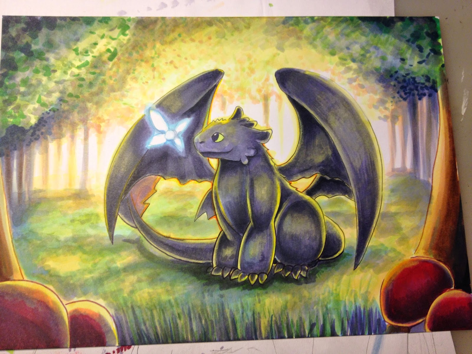
The Dragon and the Fairy


Hello my dear Copic-Fans,
I was quite busy the last month and had the pleasure to show my skills at several live demonstrations.
So some you might know this picture ;)

I'm quite nerdy and love a lot of movies and video-games.
How to train your dragon is one of my favorite animation-movies
and Zelda - Ocarina of Time- my most favorite game.
So I decided to draw a crossover.
The dragon Toothless and the fairy Navi.

Unfortunately I don't have much work in process pictures of the first version
and I total forgot which colors I used because I had drawn the live on a convention.
But don't worry, I've drawn a 2nd version at home only to show
you step by step pictures and to tell you the colors.


Digital sketch


Outlines


2nd version on Deleter Kent Paper

Copics I used

BV31, BV29, BV25, BV23, BV20, BV17, BV11
B99,B95, B39, B60, B12,B00
BG75,BG18
E55,E53,E51. E21,E01,E57, E27, E25E11, E000
C5
Y35, Y32,Y11,Y00
YR61
YG93, YG63,YG23, YG21,YG13,YG11,YG06,YG00
G43, G46, G20, G17,G21
R89, R46, R34R32
RV93

Version 2 on Perfect Colouring Paper


Comparison between version 2 and 1


I hope you like my picture.

Kind regards
Yunu

Sunday, September 21, 2014

Coloring snow

Now it´s time to start with some christmas card so I will be ready to december.
I really love the winter with the snow och Santa Claus.
To coloring the snow with a good effect is not always that easy
Im trying to add a contrast in the outer edges of the subject to get a deep in the snow,
but still keep the snow white, so the light color is overwhelming
I have been using the color C1,2,5 + blendern.
On the hat i have been using the same coloring, C1,2,5
but not the blender and used  more of  C5 to get a black hat.

You can instead use other colors, BG or T or W.
The imagination is the limits.


Been using:
Snow: C 1,2,5,+ blender    Hat: C 1,2,5     
Scarf: BG 0000,00,53,57
Nose: YR 000,12     Cheek: RV00
Berrys: R 24,27   Leaves: YG 61,67

Saturday, September 20, 2014

Autumn fairy by Suki Manga Art

Dear copic friends,

Autumn is very close and it is a lovely season. I love to see the street full of autumn leaves with beautiful colours.

Colours relative to this season inspired me to create this new illustration, I hope you like it  ^_^


This is the final result:


I used:

Skin: E000, E00, E11, RV10
Hair: YG11, YG06, G17, BG09
Wings: E50, E000, R000, YG11
Clothes: Y08, W-3, R29, R59, R20, E04, C3, C5, C7


Do not hesitate to contact me for further information.
See you soon with a new entry  (^___^)/ 
Suki Manga Art


Contact:
Facebook fan page: Suki Manga art
Deviantart: Suki Manga Deviantart
Twitter: @Suki_Manga


Friday, September 19, 2014

Challenge Anything goes extended one month

Hello dear Copic friends,
our challenges was from the beginning of our blog hosted by Barbara Schmattula, now she is not able to do this anymore because of her job.
I want to thank our Barbara for all the work, the ideas, the motivation for the challenges. Dear Barbara from all of us a big thank you. Hope we will stay in contact.

The current challenge Anything Goes will be extended for one month to help our new Challenge girl Deborah to become incorporated. Hope for your understanding. 

There are already a lot of entries, but we can handle more as you know.

Regards Diny  

Thursday, September 18, 2014

Gorjuss Little Rabbit


Hello everyone! It's Delphine here with a Gorjuss Girl post in brown today. I love Gorjuss Girls and these stamps being quite big, I thought I would completely put the focus on her.


This Gorjuss Girl stamp is called I Love You Little Rabbit. I stamped it in Memento Tuxedo Black Ink and coloured it all in Copics. I started with the background using different shades of brown without trying to blend it all - an idea and technique first used by my friend Zoe - and then coloured my image, using some of the same colours I used for the background. I then added Distress Inks Tea Dye and Vintage Photo around the borders. 


Skin: BV20, E000, 00, 01, 11, 23
Hair: 100, B41, C5, 7
Dress: E41, 42, 43, 44
Stockings: 100, C5, 7, E41, 42, 43
Rabbit: W0, 1, 3, 5
Background: E41, 42, 43, 44, 53

Thank you very much for your visit, have a lovely day! Hugs,
Delphine xx

Sunday, September 14, 2014

Tutorial: Combination for skin colors

Good day Copic Fans. 
I'm Sandra from Italy and today I propose a new tutorial for some different skin combinations . 
Some you can find here, but today I have realized some new that I want to show you.
During ECCP classes we study the Copic Color Wheel and we understand very well how to choose the colors "surfing" between the various families. 
Certainly the easiest method to choose our color palette is to remain on colors that are part of the same family.
So, following this simple rule I made different shades of skin, let's see together 
I started with an olive- beige  palette.
And then  I decided for a dark african skin 
The shades that tend to beige-yellow can be used for the skins of the eastern areas 
After I tried a skin shade with a little bit different dark tones . 
Indian people tones.
In fact, I visited India during my summer holidays and I was very fascinated by the skin of people. 
It 'a dark color, but with a shade totally different from African.
The shade is brown with a gray component, I tried to go using two different types of combo.
The first combo
And the second . I'm really surprise about that combo because I find that has a very realistic look.
Finally another little experiment for you that I made with my favorite skin combo of the moment. 
In both images, I used the exact same colors and I colored the same character .
How you can see the final effect is really different! Look like combo of different colors, instead they are the same. 
This example is to explain you that in addition to the combinations we choose to color our characters, what really makes the difference (an huge different ) is our "hand" and how we use Copic to color. 
With "light" hand
With "heavy" hand
And my collection for skin combos , grows !!I
I hope you enjoyed my tutorial, thanks for following me.
Hugs

Copic used 
Swimming wear BV 01-02-04
Lips :R22- 35
Paper: Perfect Coloring Paper


Saturday, September 13, 2014

Baptism card for a girl

Hi copic lover,
Elizabeth here today to give you some copic inspiration. 
This is a card I made for a friend of mine. She wanted a girlie card to give away in a Baptism.

I made the card using a fun fold to make it special. I used Pion Design papers and only flowers by WOC and charms from ebay to decorate. The sentiments are by Norsk Stempelblad AS. 


The image is by Mo Manning (Mo's digital pencil). Copics used:
Skin: E000-00-21-11-13, R20
Hair: E35-33-31-30
Dress: W7-5-3-1-00, C00
Pink: RV00-11-52, R00-20
I tried to create folds by following the lines of the artist's drawing. For the pink jacket I used dots of RV11 and R00 to try to get a soft look. Same with the underskirt, I used dots of the pink colors, and a thin line of W7-3-00 to create a small shadow under the dress. 

 Here's the card base with a sentiment in front.

The card has a gate fold and the image is on a tag. 


Here's the tag up close:) 

Hope you like it! 
Wishing you a colorful day!
Hugs, 


Elizabeth