Followers

Saturday, November 30, 2013

Happy Holidays!


Hello everyone! It's Delphine here with another 100% Copic card today, a winter scene I made combining several images. I used CC Designs digis to make it. I combined Winter Hoodie, Snowy Wall, Winter Tree and Snowy Fence in Word, printed my scene then stamped a sentiment from the Christmas Sentiments II set. I coloured everything with my Copics. 


Sky: B00, 12, 41, 45, 95, 97, 99, BG000, Y00
Tree: C0, 1, 3, G28, YG03, 17
Wall: E40, 41, 42, 43
Fence: E31, 33, 35, 37, 39, 57
Snow: C0, 1, 3, 5
Lamp post: BV23, 25, 29, R35, 37, 89, Y00, 11, 15, 19

Skin: E000, 00, 02, 11
Hair: E49, 55, 59
Outfit: B34, 37, BG02, 05, 07, V01, 04, 06, 09, W1, 3, 5
Y00 and Y11 for yellow accents

Thank you very much for your visit and for the kind comments you leave! Have a lovely day! Hugs
Delphine xx

Thursday, November 28, 2013

Shoot

Hi Everyone,

Tracy here with "Not a christmas card", lol.  I love making christmas cards but it was nice to have a little break and do something different.  Well actually this is very different for me as it is also quite clean and simple which is not my style at all.

This is a birthday card for a 2 year old using an image from Mo Manning. The edges of the papers have been stitched.

The letters for the HAPPY were written by hand using the Copic 0.7 multiliner pen.


Copic Recipe:-
Hair E53, E51, E50
Skin E0000, E000, E00, E11, R20
Reds R32, R35, R37, R59, C5, C3
Black C7, C5, C3, C1,C00

Hugs Tracy x

Follow Me on Pinterest

Tuesday, November 26, 2013

Warm Winter Wishes


Hello, dear Copic Fans,
now nobody can deny it anymore: Christmas is just around the corner!
I have to admit, that I am not in a festive mood at all, the weather is soooo ugly here in good old Germany, but let's wait and see.
To cheer me up,  I used the classical Christmas colours red and green and combined the image with designpaper from Maja Design.

These two sweetlings are a digital image from Sugar Nellie and I just adore them!The image is called "Warm Winter Wishes".
 
I cut the poinsettia with my Craft Robo and tried to add some dimension by working on the backside with a ball-shaped embossing tool.
I used these Copic Markers:
Red: R35, R37, R39
Green: YG93, YG95, W1, W3
Beaks, feet: Y35, Y38
Cheeks: R20
Shadows: W0, W1, W3, W6, W7, W9

Now let's hope for better weather and expect winter to arrive!
Big Hugs
Barbara/Kreativmonster

Monday, November 25, 2013

Christmas gift bag

Hello!
Kjersti here to give you some Christmas inspiration - 
in a few weeks the holiday is here:)
 
I have made a small gift bag with this adorable image from Magnolia. It is just
 big enough to be filled with some candy and perhaps a gift voucher
 
Here are the colors I have used:
Skin: E21,E51,E00,E95,E93
Hair: E47,E44,E43,E42,E41,E49
Brown: E79,E77,E74,E71,E70
Blue: BG75,BG72,BG70
 Apple: T7,E19,E07,E08,R01 


Wish you all a wonderful week -
enjoy the Christmas preparations!

Hugs Kjersti:)

Sunday, November 24, 2013

How to color synthetic materials with Copics.


Hallo Copic fans,

Today it is Sunday again and time for another tutorial.
First I want to tell you how I got the idea to do this.
When you are enthousiast you can say things of which you are not happy about afterwards. Also this time.
We were on vacation and Rob’s daughter Vanessa was also with us. Because she has MS (multiple sclerosis) she sits in a wheelchair.
Her chair had black spoke protectors. One day when we sat outside she told us that she loves to have spoke protectors with butterflies and beautiful colors. As you can expect thinking of a new Copic project I got enthousiast and told her that it would not be a problem to realize such a thing. “I’ll do that just for you!”


First Rob let them spray with white paint so I had a good background to start with. Thereafter I choose some beautiful stamps of flowers and butterflies. Then I made masks. When that was done I could start with stamping. That went very well.


So far so good and the two protectors were ready for coloring. I didn’t made the protectors identically.
Now I needed more masks for airbrushing the background in the desired color.


The edges on the outside and inside are first airbrushed with dark blue. There against to follows an edge one shade lighter.


On the above picture spraying with the airbrush is ready and the masks can be taken off.


But problems started when I took my Copics for coloring the stamps. That was not possible. The first layer remained streaky and when I tried to color the second layer, the first one just disappeared.
What I tried, it didn’t work, al lot of efforts without any result.
So I tried to make the floral hearts with dots, that went well and the result was reasonably.


Before it looks like on the above picture it took a lot of time.
To try to color the flowers otherwise I made new masks and started working with the activator in another way. From a sponge I made little pieces. To give more depth I did the desired color and activator on the little sponge and dabbed the color with sponge and my tweezers on the protector.


I did all flowers in this manner. After that I glued little hot fix stones on the floral hearts of the red and purple flowers.

Now a little film follows in which I show how the little butterflies are colored. For this I used three Copic colors, the activator and a water brush. Before starting I poured the activator, which normally is in a sprayer, from the bottle in a small bowl so it is easier to put the sponge into the activator.
Before that I tried all kind of materials for coloring, but the before mentioned combination worked best.


On the above picture the final result on one of the spoke protectors is shown. I must say that it took a lot of research, many try outs and also lots and lots of energy and frustration.
But still I am proud on the result. Especially when on inquiry is said that it is impossible to work with Copics on synthetic materials. But I did it anyway!


Above a close up so you can see the hot fix stones and stickles in the floral hearts.
For the finishing touch we had to cover it with several thin layers of varnish. After a long search and inquiring we used a varnish based on turpentine. Before spraying the varnish I tried out several manners on the back of the protector. For instance, when I rubbed the varnish with a cotton swab the colors started bleeding. 


But it is the result that counts and Vanessa is very happy with her colourful spoke protectors. She gets lots of compliments, so that’s good.

In this manner we can color all kind of other materials other than paper. I hope that you got new ideas through this tutorial and if you want to try it I found out how to do it (I invented the wheel for you!).


Saturday, November 23, 2013

Clean and simple...

Hi everyone,

Ã…sa here again with some more Copic inspiration.
First I wan´t to thank you for all the lovely comments on my tutorial.


Today Im going for a little more clean and simple look.
I love this style, but at the same time it´s hard.
It´s important to make the image 'pop'.
To do that I allways do an extra grey shadow around the image, it makes the feeling a little more 3D.


Here comes a close up on the little Mo Manning cutie.

I have used the following solours:

Skin: E11-21-00-000-R20-11
Hair: E49-57-55-53-51
Pink: RV97-95-93-91
Pot: W3-1-0
Floor: E43-42-41
Shadow: W5-3-1-0

Hope you all like it.

Have a wonderful weekend!

Thursday, November 21, 2013

a christmas tag

Hello everyone!
This is Kathrin here today sharing a christmas tag with you:


I just love this little group of penguins hanging up a christmas banner. They are just too cute, and the stamp is both image and saying. This image is by Lili of the Valley.

The edges of the designer's paper and around the image I added some white and shabby blue Frantage Embossing Powder. I love the look this gives especially to winter cards. Like falling snow - or like ice covered windows. 
The banner underneath the image and the snowflake have been cut from white glimmer cardstock and goes great with the image because it shimmers like fresh fallen snow that the sun shines on.
Underneath the bows I've added two stars and a snowflake shaped brad. And I also had to add a little silver bell. What would be christmas without bells?

The coloring was quite easy to do and you only need a few Copics to get a great result: 

penguins:N 9, N7, N5, N3
feet and beaks: YR9, YR 23, Y17, Y13
branches and chairs: E44, E42, E40
snow: BG10, BG000
banner: C3, C1, C00
shading: B91

Even if there hasn't fallen any snow yet here where I live, I am anxiously awaiting it to get in the right mood for christmas season. Till then I am looking at images like this and dreaming of a white christmas...

Have a great day everyone!
Hugs


Wednesday, November 20, 2013

And the winner is...

Hello Copic Fans,

It's me again, Barbara/Kreativmonster
for the Copic Marker Europe Blog Challenge.

And here she comes, the winner of
Challenge 22, "Classic Halloween" is....

Congratulation, Tove! Please send an email to copiceurope@gmail.com
with your request for 3 Copic Sketch markers.

Hugs
Barbara/Kreativmonster
for
CME team

Tuesday, November 19, 2013

Life...every day!

Hello Hello everybody, it's Franz from Italy again!


I've to share a card with a Saturated Canary girl this time, one of the latest characters drawn by Krista Smith that I loved at first sight:

 
I used some papers from the latest  Maja Design autumn collection and some other ones from the summer 2012 collection that I loved really sooo much!
 

  I tried some new colour combo for me to give her a look a little distressed, so colours are quite soft and not so bright as I often use.

 
Here is the complete list of Copics markers I've used:

 Skin:
 E0000-E000-E00-E11+R20 and prismacolor pencil for cheecks;
 
 Hair/Broom/Shoes:
  E02, E11, E13, E15, E18;

 Outfit:
Warm Grey: W1, W2, W3, W5;
Old Rose: RV91, RV93, RV95;
Blue/Violet: BV000, BV01, BV02, BV13, BV23
 
I hope you liked it,
thanks for stopping by,
Franz.

Sunday, November 17, 2013

Tutorial on colouring folds...

♥ Hi there Copic friends 

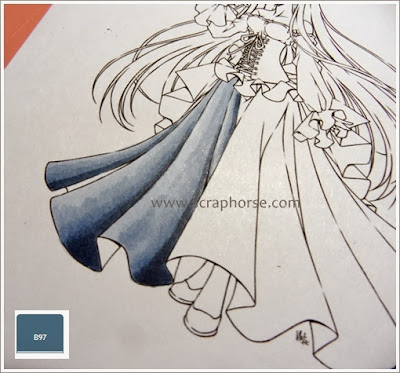
Ã…sa here today with a tutorial on how I colour folds.
* so Im warning for a picture heavy post *


Im using a stamp from Make it Crafty, and Im using my Copic colours B97-95-93-91.


The first thing I do is to choose where my light source comes from.
Then I start with two to three folds at a time, and I always start with my lightest colour.
I do this because it gives me a guideline on how my shadows should be, and it´s easy to correct if it doesn´t feel right, just because Im using the lightest one.


In the next step I go in with my darkest colour, just on the darkest areas.
I also tries to follow the lines in the dress/folds to make it look natural.


With my next colour Im overblending the transition from the darkest colour. I do not colour over the whole dark area, just the transition! And do not colour to far with those dark colours. Then the whole area tends to be all to dark in the end...


In the next step I use my second brightest colour and work it the same way, just over the transition. If you work it this way you are going to get very smooth and soft transitions between the different layers/shades.


And for the 'final' step i use the lightest colour and use the same technique, and colour out the rest of the area.

Well, you could descide to stop here and be satisfied with the result.
But I wan´t more depth in my image, so I do it all over again.


I start with the darkest colour again. Be careful and don´t go to far with your darkest ones.
We wan´t to keep a broad spectrum from light to dark.
So you don´t want it to be all dark.


Then I continue the same way with the next one.
You still need to be a little careful, not going to far.


Then the second brightest, and not all the way.
Remember to work only the transitions between the layers for nice and smooth blending.


And finally the lightest one, and work out the rest of the area.

Now you can see a more smooth and wide result, with more depht.
Now Im satisfied and moving on to the next one...


I start the same way as the first ones, with my lightest colour, to guide myself.
Remember that you need a little shading on both sides on this fold.
But you need more dark on the right side, due to your light source.


Then I move on with my darkest colour, being all a little careful again.


Here I have moved on with my second darkest.
At the same way, working over those transitions, and not going to far.
You can also see that Im trying to keep those shades a little smaller on the left side.


And moving on to the next one.
Not all the way.


And 'finally' the lightest colour to fill out the rest of the area.

But, as before, Im not really satisfied here...


...so Im doing it all over again.
Just in the same way.
But remember to be careful with those dark ones.

If you compare the two pictures above, you can really see the difference between them, and the effect the last layers gives.


Now just continue the same way with the rest of the folds.
Go in and guide with your lightest colour...


...and then continue with the rest of the colours.


And then finally finish them all.


And here are the final image - all coloured up.
Hope you like it.

Here are all the Copics I´ve used:
Skin: E11-21-00-000-R20-11
Hair: E47-44-43-42-41
Bird: N6-4-2-1
Clothes: B97-95-93-91 / V95-93-91


If there are any questions, or something you don´t understand, just ask me in the comments and I will try to answer.

♥ Happy colouring