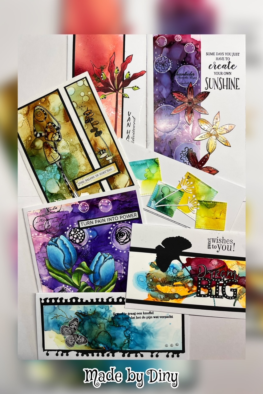
Hi everyone!
Today it´s my (Helen) turn to show what I have coloured since last time.
One late Saturday night I was so excited to get my hands on my new stamps from Colorado Craft Company. The set is called Big love. And what I really like about it is that it´s useful. I can use it for birthdays cards as well as Christmas cards. It´s a really good quality for clear stamps. Not soft as a cheaper one can be, but hard enough to get nice, thin lines even if you´re a stamper that like to press a little harder. Don´t forget to ink your clear stamp and stamp it once before stamping for your image you would like to colour. Sometimes they are a little greasy and you will stamp that off by just make one stamping first on some scrap paper.
So, there I was, just wanted to get some colouring done.
So excited that I forgot to take any pictures. So I thought I should use the image as a sketch and sketched in something to get a feeling of a hole in a wall for my little mouse.
As I sat there looking at it, knowing that I needed to colour it again to document my process I decided that I wanted the wall to be in an angle and I would like it to be made out of wood. So I coloured it and took photos. But as I finished it my mind couldn´t stop thinking of that I would like to have a cast shadow on the wall of the mouse.
So... I will show you how I did that one, my third colouring.
I often colour an image once before the one I end up using. I like to work through the image, learning to know it. See where I failed the first time, trying to get it better on the next image.
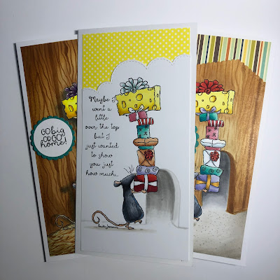
I made a card out of my first colouring, the one where I was so excited.
My second colouring. Here I trimmed of a part I wasn´t happy about as I made the card.
So, for my colouring...
I started up by sketching in the wall with a light grey, C0. After that I made the cast shadow of the mouse, starting with the lightest tint, C3, that also will be the largest area, going to the darkest tint, C5, and this will be de smallest area. I just used two tints for the shadow. I didn´t worried about getting the shadow smooth and I went in with a slightly dark colour, as I knew the next layors of colours would soften it out. If I colour it again, using the same colour as I did in the wood, I will pick a warm grey for the cast shadow instead. I made the contour of the wall with E37.
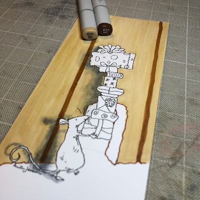
I used E31 for the first layer, just to moister the paper. And I´m not worried about not getting the area smooth and nice. This is just for moister. And a wooden board aren´t even in it´s colour, so it will just make it more realistic. With my darkest colour, E37, I will build up the pattern of the wood, starting with just making some heavy, vertical lines, indicading the boards.
To get the twig marks, I press hard on the nib to get wider lines and I go from light pressure, to harder, to lighter. And scribbeling with an unstable hand to get it more realistic. Using E37.
Scribbeling in the pattern and the only thing I´m thinking of is to not get it even.
The contrast between E31 and E37 can be hard for some, but the next layer will soften it out. And you can see that the lightest colour for the cast shadow, C3, isn´t discernible any longer.
The next layer is with E33. And on top of that I got in with a little E35 in the corners to draw the attention more to the image. Using flick marks and the paper is so wet I don´t have to work with the blending.
For the mouse I applyed C3-C7-C5-B24-C5-B24, in that order. I left a small area in the top of his face in the first layer. Otherwise he would be to dark if that area had been coloured twice. Some blue on his belly, just for some highlights. R11 in the ear and on the nose. E50-E21-E13 on legs and tail.
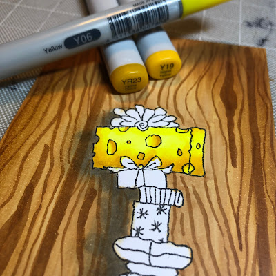
Y06-YR23-Y19 for the cheese.
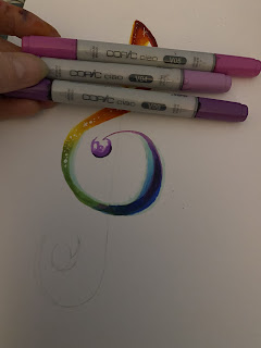
BV31-BV13-BV02, trying to get the light coming from an angle top-right.
R04-R59-R37. Small areas doesn´t always need three shades.
R02-R32.
YG06-YG09-C3-0.
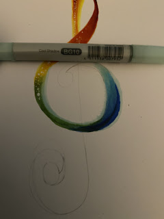
BG11-BG07-BG13.
For bows and ribbons I used from bottom to top:
C3-C0-0
Y32-Y28-YR23
V95-V17-V09
For the ground I used E81-E84. Making it lighter around the mouse. Adding the colour using flick marks and in the same angle as the wall. Inside the hole of the wall I used C0-C5-C3-C0 and made a blending between C0-E81.
I thought the mouse should be in a barn, so I made some flick marks indicating hay.
I used E99-E97-E37, starting with the lightest nearest the mouse and working me out with darker and darker colour. I do this for two reasons. First, the colour will be darker, more saturated, as closer the object is to you, and it will be duller further away. Second, it will frame the image and draw more attention to the mouse. If you hold your pen more upright, you get thinner flick marks, and as you angle your pen they will be wider. I even hold nearer to the nib when I want a thinner line.
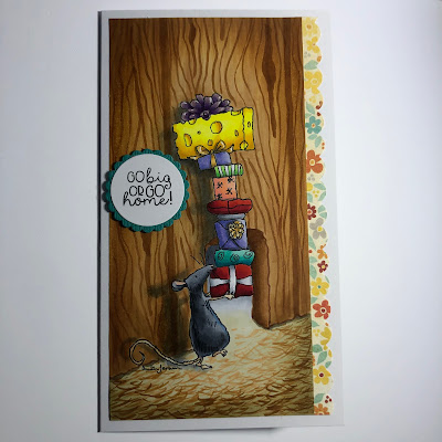
So, here is the finished card.
And I´m happy with my cast shadow, creating the distance between the mouse and the wall.
Hope you enjoyed this tutorial.
If you did, please follow me on Instagram:
Hellenbell.
See you soon!
Love
Helen