Followers

Thursday, March 28, 2019

Scarecrow

Hi everyone! It's Virginia here with a new tutorial. I know it's just Spring but, I'm thinking of holiday and summer so, I've decided to colour a wheat field ready to harvest as my background.

Additionally, many of you know how I do love tales. It is the reason way I've done another bookmark related to a book, 'The Wizard of Oz'. I've used a Saturated Canary Stamp, a really sweet scarecrow.


As usual, here you have the step by step video tutorial. I hope you like it.


The Copic Marker colours I've used are: 

Skin: E13-E22-E00-R30
Hair: E35-E47-E49
Hat and heaters: E39-E37-E35-E33
Trousers and shoes: E44-E43-E42-E41
Shirt: E89-E95-E93-E91
Sky: B0000-B91-C01-C00-Blender
Bushes: BG91-BG95-BG97
Wheat field: Y000-Y23-Y28-E99 

That's all!! I'd be delighted if you leave me a comment.

See you next month!

Tuesday, March 26, 2019

Copics and coloured pencils

Hello fabulous Copic fans, I love my Copic markers but I also love my coloured pencils. So what could be better than combining your 2 favourite colouring tools.

For today's post I chose a colouring sheet by Christine Karron. 


Start colouring the skin with the E50. Add a thin layer with the broad nib of the Copic marker to get an even coverage of colour. Then add BV00 for shadow.  Cover the BV00 with E00 to get a warmer skin tone. Blend all layers together with the E000 and E0000. 


When colouring the eyes I start with the lightest colour first, the YG13. Then add YG17. For the darkest part of the eye I use YG67. Blend all layers together with the YG13. For some shadow in the eyes I use the W3. Use RV10 for her lips. 


For the leaves I use the same colours as for her eyes, YG13, YG17 and YG67. For some highlights I use the FY1. 


I started colouring the rosebuds with the R02, R05, R08 and R29. After I coloured her hair, I thought the rosebuds were too orange so I decided to add another layer of colour, a more rosy red. I chose RV25. 


Her little basket will be brown. Start with E35, then add the E37 and the E39. For the darkest parts I use E49 to give the basket more depth. 


I love roses like this, rosa rubiginosa or eglantine. 
Start with the lightest colour, RV21. Add more depth with RV23 and RV25. 


Use the RV29 for the darkest parts of the rose. Blend all layers together with the RV23 and RV21.
When I started colouring this image I didn't have any clue what colour hair this pretty fairy should have. After I coloured the roses I knew her hair should be pink. When colouring hair I always start with the darkest colour first, the RV29.


After the RV29 I use the RV25, then the RV23 and blend all the layers together with RV21. Sometimes you might want to add some RV29 again, to enhance the colour a bit after blending it with RV21.


For the wings I use YG13, YG17, RV23, RV25, B000, B02 and B04. 

For the background I use YG11, YG13, B000 and B00. 

After all the Copic colouring is done I will add some coloured pencils in similar colours and some gel pen white for highlights. 


I hope you like the end result.


 have a fabulous day and see you all next month,

Miranda

Friday, March 22, 2019

Cicci - Just two blue Copic Markers for the hair

Hi Everyone.
Cicci here, Today I'm just using two Copic Markers for the blue hair ;0)
You don't always have to use a lot of Markers even if that is lots of fun!

I have used an image from the Glimps!!
Love this little reading girl!!

Copic Markers Combo
Hair: B39 and B34
Skin: E51 50 53 11 13 R20 R30 14
Books: R14 39 89 35
Gold: E53 Y28 26 02
Brown: R23 11 E47 49
Blue: B00 000 B39
Shoes: YG00 03 17 G28
Jeans: RV63 66
T-shirt: FY1 FYR1
Background: B000 00 29 26 21 BG49 09 FBG2
White Dots with a Posca pen


Step 1 
Start to fill the lines in the hair with B39

Step 2
Continue to Blend a lot with B34

Step 3
Use B39 again 

Step 4
Blend one more time with B34

Step 5 
Add B39 one more time 


 Have a wonderful day and thank you for visiting us today,

HUGS


Thursday, March 14, 2019

Copic Classes - France

Hello everyone! Delphine is teaching ECCP classes in Paris. All the details can be found on the photo below (click on it to make it bigger) but don't hesitate to email her if you have any questions!


Tuesday, March 12, 2019

Save the drama for your Llama!

Hi  Copic friends,

Can you keep a secret?
Well today I have an absolute preview for you,
after that Kim from Kimmie stamps  has agreed 
I can already show you the newest stamp set called llama drama,
this set will be released in a few days.
It is still top secret but just for you, dear Copic fans I can make an exception and show it.

As you might have noticed Llamas are "hot",
this lovely new clear stamp set has three llamas (or should I say llama's?)
and some fun text stamps too.

I have cut a piece of Perfect Colouring Paper with my MFT die,
and have stamped the stamps with some black ink.
Glad I have a stamp tool it is so easy.

I did some masking of three Lamas and this is the result..


It all began like this.

Please watch the coloring video below..
caution it might have a positive, cheerful effect on you 😉


I had fun colouring and picking some nice and bright Copic colours.


During the colouring process…


The final result!

After colouring I have added some faux stitching with some MFT dies,
added some enamel dots and twine and two sentiments.

On the glasses of the right llama I have added some glossy accents.

Some design papers from my collection..

Hope you have enjoyed this peek..and that your day will be nice , cheery and colourful!

Copic :

lamas : E 40, E 41, E 43
lamas cheeks : RV 21, RV 22
lamas noses: E 55, E 57
sky : B000,B01, B04
blanket : R 37, R 39, RV 04, RV 09
Y 23, YR 26, E 55, E 23, Y 35

PS Do you live in Italy? 

17 MARZO 2019 
ECCP 1-2
ROME

6 APRILE 2019
ECCP 1-2
ALBANO LAZIALE (RM)

New classes ECCP 
( the official Copic certificated coloring classes from the European Copic Coloring Program ) 
can be found  here

Volete frequentare i nostri corsi colorazione Copic ufficiali con attestato 
del programma colorazione copic europeo in Italia, 
potete trovare tutte le date & info   qui

Hugs Blankina

Friday, March 8, 2019

Copic Watercolouring Technique...

Hello everyone!

it's Sue here today with a really easy and pretty technique.

I'm going to show you how to paint with your Copics as if they were watercolours!
I am using a beautiful stamp from Stamping Bella - 
Uptown Girl Melanie - The Modern Bride, a paint palette, a paintbrush, Copic Various Ink Refills E00, YR21, YG63, BV08, BG23, B60 and Colourless Blender.  I also kept a piece of paper towel handy for wiping my paintbrush.

This is such a lovely technique and it is really simple to achieve lovely results.  Here are a few top tips for you!

If you don't have Copic Various Ink Refills you can use Copic Markers by scribbling them onto an acrylic block and using a paintbrush dipped in Colourless Blender to pick up the colour.

Copic Colourless Blender will lighten the colours you are using so you might want to choose darker colours than you usually would and practice on a piece of spare card first to see how the colours come out!

Use the smallest brush you are comfortable with and once you have dipped it into the colour and the blender you might need to just lightly dab the tip of the brush onto the paper towel so it isn't too wet. 

Clean your brush each time you have used a different colour and dry it on paper towel.  

Replace the Copic Colourless Blender as it becomes dirty.
 Put a few drops of E00 and Colourless Blender into the paint palette.  Dip the tip of the paintbrush into the E00 and then into the blender and quickly paint the face, starting in the area of the face with the most shade.  You can repeat this if you want to, until you have a depth of colour you are happy with.  Repeat with the shoulders and arm.  Clean the paintbrush with colourless blender and dry on a paper towel.

Put a few drops of YR21 into the paint palette and repeat the same technique with the hair - dip the brush into the YR21 and then the colourless blender and paint the hair, starting in the part of the hair where there is the most shade.
Put a few drops of YG63 into the palette.  Dip the brush into YG63 and then into the colourless blender and dab some spots of green onto the leaves.
Put a few drops of BV08 into the palette.  Dip the brush into the BV08 and then into the colourless blender and paint the flowers.  You can repeat this adding more colour to the petals where you want them to be darkest.
Dip the brush into YG63 again and then into the colourless blender and dab some spots of green onto the centre of the flowers.
Using B60 add some folds to the frock - you only need a light touch here, if the folds look too dark you can smooth them out by painting with some colourless blender. 
Put a few drops of BG23 into the palette.  Dip the brush into the BG23 and then into the colourless blender and paint the ribbon.  You can repeat this adding more colour to the ribbon where you want it to be darkest.
I had nt tried this technique before, I promise it is really easy to do and It would be great if you could have a go and show us at

Tuesday, March 5, 2019

Colouring Anime

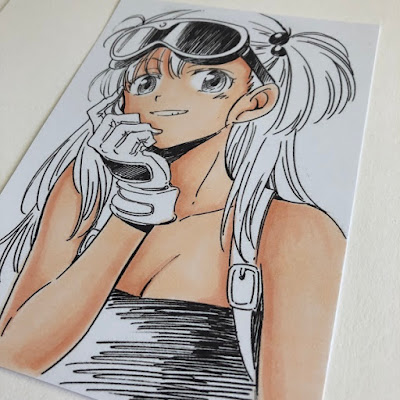
Hi! Today I am sharing an anime image I coloured. I didn't make a card with it, I will be putting it in a frame and hanging it in my craft room.  


The colours I used for the skin are not my usual skin colours, as anime tends to have deeper shading

First I applied a base of  E00 and E000 all over the skin areas. 


I went back and applied more E00 in the darker areas. 


For darker shading I applied R12 and blended it with E000


More R12


For even more depth I used E04 


And finally I pulled the E04 out a little with the R12


For her eyes I used B26, B24 and B21, going from the darkest colour at the top of the eye down to the lightest colour at the bottom of the eye. 


To colour the hair I started off with B000, a very light blue.  


BGO1 is a little darker


Next I applied some B63


My darkest colour is B66. Once I applied that I kept going back in with the other colours until I was happy with the hair. 


On the shirt I used R14, R46 and R89. 


I also used these reds for the glasses. 


Yellows and blacks for the glove -
Y13, Y15, Y17
N3, N5, N7


I used the N3, N5, and N7 again for the straps of her backpack. 


At this point I felt the skin shading needed more definition so I applied some BV01, RV32 and laid down some R12 over them. 


I colouored the whole background in N7 to give the image more of a pop. 


I hope you like today's tutorial and that I've inspired you to take out your markers. 
Sandie
xXx