Followers

Thursday, February 28, 2019

Father's Day

Hi everyone! It's Virginia here, coming up with a new project for you. Today I want to share with you a little piece I've made for a festive day. 

In Spain, where I live, Father's Day is celebrated on the 19th of March and for some of us, it is a significant day.


Every year I make a present to my father. Unfortunately, he passed away some years ago but, I still do something special in order to remember him. This year I've made a little paper bag, with a sweet stamp from Tiddly Inks. Inside, it should be a beautiful present.


The tie that the little girl is wearing, reminds me of the way my father used to dress.

As usual, here you have the step by step video tutorial about colouring this stamp, although this time I don't speak. I hope you like it.


The Copic colours I've used are:

Skin: E94-E13-E21-E000
Hat and shoes: E47-E57-E35-E33
Tie: E39-E37-E34-E32-R39-R29-R24-R14
Shirt: C3-C1-C00-Blender
Hair: E49-E57-E33

Thank you very much for your visit. Have a great day!

See you next month!

Tuesday, February 26, 2019

The whole caboodle

Hi everyone,
for this month's post I have used the new Dylusions stamps, which are so cute and funny.


Start with a layer RV04,
then add the RV09 (as your darkest colour) and blend the colours together with RV06. 


To get a smoother blend I use the RV04 to blend all layers together. 
For the dog's belly and his slippers I use  V04, 06 and V05. I won't be using the head, so I leave that one un-coloured. 


As you can see I smudged my page. It's not a very good idea to colour one colouring sheet while it's on top of your other colouring sheet! Alcohol inks always bleed through and they might smudge the page underneath. But I won't be put off by this. I decided to add more yellow/green and make it part of the way I colour the giraffe. This way it will be a "happy accident". 

Start with a thin layer of BG01.
Add some YG21 (to make the smudge part of the colouring). 
The spots on the giraffe will be blue. For this I use the B26, B28 and B29.


The body of the dog: start with YG21. 
Add the YG25 and blend all layers together with YG23 and YG21. 


For the dog's boots, collar and tail I use the same colours as the head of the giraffe: 
BG01, BG05 and BG07
B26, B28 and B29.


The mane of the unicorn will be like a rainbow.
Start with a thin layer of the following colours: V04, BG01, B26, YG23, Y15, YR15 and RV05.
Add shadows with one hue darker: V05, BG05, B28, YG25, Y18, YR16 and RV06. 


The dress of the unicorn will be blue/green. I start with the lightest colour, the BG01. Add the darkest colour next, the BG07. Use the BG05 and the BG01 to make a smooth blend. 
The underskirt and dots will be green:YG21, YG23 and YG25.
The collar and boots will be purple: V04, V05 and V06.


I use the BG and Y colours to colour the fox. When you blend the BG and Y colours, you will get a lovely green. Start with the Y13 and the BG01.
Add the Y15 and Y18 for the yellow parts and the BG05 for the blue parts. 


For this cute dog I use yellow and blue.
I start with the Y13 and then the Y19. Make a smooth blend with the Y18, Y15 and Y13.
For the heart and boots I use BG01, BG05 and BG07.


To give the owl a warmer hue yellow I add the YR15.  I start with the Y13. Than I add the Y19 and blend all the layers together with the Y18, Y15 and Y13. Finally I add some YR15. 


For the dress, shoes, and the owl's head I start with the RV04. Add the RV09 and the RV06. Blend all layers together with the RV04. 


The cat's belly and shoes will be purple. Start with the V04. Than add the V09, V06 and V05. 


Use the same colours for the rabbit's head, the V04, V05, V06 and V09. 
 I also use the B26, B28 and B29.
And for the ears I use the YG21, YG23 and YG25.


For her skirt and boots I use V04, V05 and V06 
For the yellow stripes on her skirt I wil use Y18, Y19 and YR15.
And use RV01, 06 and 09 for her stockings.


Use Y15, Y18, Y19 and YR15 for the deer.
His nose and ears will be pink with RV04 and RV06.

And this is how my canvas turned out,hope you like it:


Greteings and see you next month,

Miranda 


Friday, February 22, 2019

Cicci Coloring a Cherry

Hi Copic Lovers!
Cicci here posting!! Today I'm going to show you how I did this Cherry


I have used 
Cherry: R32 35 37 39
Leaves: YG03 17 G28 Y02
Background: Various Ink
B000 BG07 R83 R14 Y02 E71
FYG2
Also I used a White posca pen for white details

Step  1
First I  draw a Cherry

Step 2
I add R32 first
Leave some white for the highlights

Step 3 
Add R35

Step 4
 Add R37

Step 5
Add  R39 

Step 6
 Now you can start blend a little with R37

Step 7
Continue to blend with R32

Step 8
 Blend with R35

Step 9
 Add more of R39
Blend with R37

Step 10
Add More of R39

Step 11
Start to colour the leaves with YG03 

Step 12
 Fill with YG17

Step 13
Add more of YG17 and blend With YG03 

Step  14
Oops ...
the marker is up side down!!
 but I hope you can see that it's G28
Here I add G28 

Step 15
 Blend with YG03 Y02

Step 16
Add some nice background colours 
I have used Various Ink for the background


'

DONE!!
Have a great day everyone from the ladies here at the Copic Europa Blog

Please visit anytime

HUGS 


Tuesday, February 19, 2019

A scene with Various Inks


Hello everyone! It's Delphine here today to share some Copic inspiration with you! The Copic range is huge and has the most beautiful vivid colours, so I decided to make a happy colourful scene card using my Copic markers, of course, and my Various Inks! 

I started by creating a background for the base of my card...


I used RV02, Y11, YR04 and 0 to create it. Once I was satisfied with the result, I let everything dry and then die cut a piece I liked with a Lawn Fawn die.


Next I created a little grassy hill using Inks too. For this part, I used YG01, 13 and 67 - and nothing else at all, just my inks and no other alcohol solution. I then die cut a piece of green with the same Lawn Fawn die and with an MFT edge die.

I then stamped and fussy cut a cute character from the Cuddles the Puppy set by Kraftin' Kimmie Stamps and coloured it in Copics. 

Skin: E000, 00, 11 (plus a little Polychromo pencil)
Hair: E33, 49, 59
Dress: RV14, 17, 19
Dog: E41, 42, 43


I then stamped a sentiment in Versafine (had to go back on it a little with a Pitt pen - then I put all my elements together and added a few dots in Posca pens - nothing else to avoid hiding the background too much.


I really enjoyed experimenting with this kind of scene card and will definitely be making more ;)! Thank you very much for your visit, have a great day! Hugs,
Delphine xx

Tuesday, February 12, 2019

A romantic Gel Press Various Ink card

Hi all,

In a few days it will be Valentine's Day, 
so I have made a romantic card to get you in the mood.
Actually I am a romantic type all year long :) .

I have used my Copic Various Inks ( refills )
 together with a Gel Press to make this background.

Did you know there are different sizes and kind of Gel Presses?

For this type of card, a small shape Gel Press will do,
 as I like hexagons to make patchwork cards
 I have chosen a small hexagon shaped Gel press.


Here is a detail of my finished card,
first I wanted to add a sentiment on the front 
but I think it was so romantic and delicate without 
that I have decided to add the sentiment inside instead .


I have started like this…


Here you can see some of the prints I have made..

Perhaps the best way to get an idea
 of the making of this card 
will be to watch my little video,
posted below.

And ?
Might it be something for you to do?

Enough colours to try I would say, 
a fantastic range of 358 Copic Various Ink colours
 are waiting to be used on the Gel press!


I have used : 

Copic Various Ink : R 83, R 85, YG 91, E 34
Gel Press : Petites , Hexagon 3" ( 7.62 cm )
Gel Press brayer
Acrylic paint white 104
stamp Magenta
 die stencil chevrons cut MFT
die flowers Precious Marieke
die hexagons Action
flower foam Leanne Creatieve ( pink )
crystals

Hugs Blankina

Friday, February 8, 2019

Colouring Fur with Flicks!...

Hello everyone,

I really love colouring fur so I thought I would do a tutorial for you!
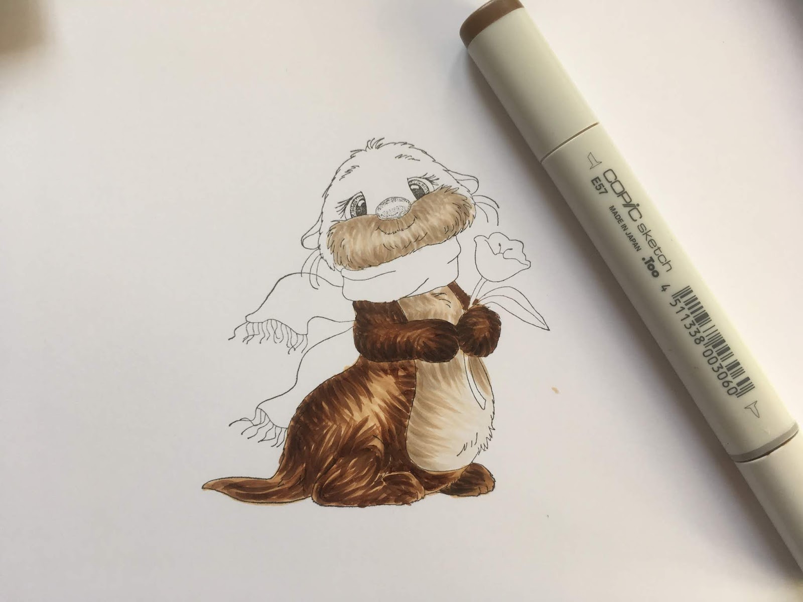
I am using a stamp by Whimsy Stamps - My Significant Otter and Copic Markers
E40, E41, E42, E43, E44, E51, E53, E55, E57, E59

The technique I have used is very similar to one you would use for colouring hair!  Here are a few top tips for you!

It's good to use a flicking motion to apply the ink, this helps add texture.
Always make a flick in one smooth movement.
Always flick in the direction the fur grows. 
Let each layer of ink dry before adding the next so the colours don't blend together

I always practise my flicks on a piece of scrap card before I start colouring my image, this gets my hand used to the flicking action - it might sound silly but trust me - it works!

There are a lot of photo's for this tutorial so please be patient!
To begin, I lightly coloured the otter's tummy with E40.  This does nt need to be too neat or perfectly blended, it is simply a base layer for the fur to sit on.
Then, I started to add flicks in E42, in the darker parts of the tummy area, some of these need to be quite long and go across the tummy to add texture.
Then add more flicks with E43.
 Next I coloured the mask, again with a light layer of E40.
Then, exactly like the tummy, I started adding flicks in E42...
 E43
 and W3, which adds some depth.
 I then moved on to the paw, lightly colouring all of it with E55.
 followed by flicks in E57
 and E59.
I did exactly the same with the other paw, a light layer of E55
 Followed by flicks in E57
 and E59.
 The same technique is then used for the feet (paws)!  E55 coloured all over and followed by flicks in E57
 and E59.
 Then I moved onto the otter's body.  It is a good idea to take this really slowly - do not rush!  You can still break the body down into smaller parts, the tail, the foot and the area under the am and tummy.  I used exactly the same technique as before, colouring the whole body with E55 and then starting to add colour and texture by flicking with E57
 and E59.
 To enhance the shaded parts of the body, where I wanted it to look darker, I added a few flicks of E49.  If you choose to do this you only need a few - do not add too much of this darker colour!
 Next, I moved on to the face and head, colouring the whole area lightly with E55.
 Then I added flicks of E57 around the eyes, down the sides of the muzzle and on the top of the head,
 Followed by Flicks of E59...
 ...and W6
 You might want to go for a break and a cup of tea here, before you start the colouring the last parts of the image! (:
 I coloured the darkest, shaded areas of the scarf in BG32 to map out where my darkest colour would go.  It's a good idea to do this first, in a light colour because if you get it slightly wrong at this stage, you can cover it up later, you have n't ruined your colouring by going straight in with your darkest shade!
 I then went back and coloured these parts with BG49
 and then started blending the colours out to the lightest area with BG13.
 I repeated this, colouring the same darkest part again with BG49, 
then blending BG49 out with BG13
 followed by BG11.

I used exactly the same technique to colour the rest of the scarf.
 I coloured the flower next in BG04
 followed by BG37,
 BG06...
 ...and BG04.
 For the leaves and stalk I used G43, 
 followed by G46...
 G43...
...and finally YG03

I hope you have found this tutorial useful!

It would be great if you could try this technique and share with us on Facebook at 

It's our 30th Wedding Anniversary this weekend and this card is for my lovely husband!

Thank you for popping by
Sue...xxx