Followers

Showing posts with label Miranda. Show all posts

Sunday, October 15, 2017

Girls and cats

Hi lovely Copic friends , I (Miranda) have a very special creation to share.
By the end of this month my first product line will be released by Studio Light and I really wanted to show you how I coloured my images using the Copic Markers. 

I have used several sets to create an art journalpage.


The little cute hearts are coloured with RV02, 04, 06 and 09.
I used the lightest colour first, which is your RV02. Then I used the darkest one, the RV09 and work my way back to the lightest colour with the RV04 and 06. In the end I blend all colours together again with the RV02.

Sometimes the darkest colours get lighter due to the blending with the lighter colours. Then add a little bit of the darkest colour again. 


The colours I have used for colouring the cute tiny flowers are:
petals- V04, 05 and 06
floral heart - Y17
leaves and stem - YG13, 17


Isn't my kitten adorable?
I used green to colour the kitten.
I used G12, 14 and 16. Later I also added some YG13, to get it more yellowish green. 
For the eyes I've used Y17 and R20 and BV00 for the ears. 


For this cat I've used my favorite purples, V04, 05, 06 and 09.
Start again with the lightest colour, the V02. In the next step use the darkest purple V09 for the shades. And then I work my way back again to the lightest colour  using the V05 and 06. 

The green eyes: YG13, G16 and Y17. 


For the pink cat I use the RV02, 04, 06 and 09. Again start with your lightest colour.


I've used quite a lot of different colours.
I start colouring the skin with E50. Then I use the BV00 for shading. For the 3rd layer I use E00. Blend all layers together with E0000. After colouring the hair I decided to add some more E51, E00 and R20 to give the face more colour. And some W3 for more shading. 

The hair I always colour the other way around. I start with the darkest colour first, the G16. Then the G14 and G12. I also added some YG13, because the G -colours turned out to be too blueish green. 

The dress: RV02, 04, 06 and 09.
purple dots: V05 and 06
shading on the apron; BV00 and 0000


And this is my art joburnal page. 
Hope you like it.

See you again soon,
Miranda

Monday, May 22, 2017

making backgrounds with various ink

Do you know that you can make some wonderful backgrounds with the Copic Marker refills (Various Ink)? Let me show you how!


Pick out some nice colours. I've used the same colours as for my image.


Drip some ink on an acetate sheet.


Use a blending tool and a piece of felt. Drip some activator on the felt and press the blending tool lightly into the ink. Move the blending tool over the acetate. Drip some more ink to get a more brighter result. 


Spritz some activator on the acetate sheet and watch what happens. The ink reacts really nicely with the activator. Just play a little with the blending tool, the ink and the activator until you are happy.


To give my creation some more definition I decided to add a border with a thick gloss gel and some sea elements. 
I coloured the gloss gel with mica powders and some black ink. 

The image I used for my creation is by Aurora Wings.
I have used the following colours for this image:

hair: RV17, 19, 55, 66, YR15, 16, Y35, R7, 14
skin: E50, 0000, 000, 00, W1,3, BV0000, 00
eyes; E44, 47, 49
shells: Y21, RV00, R11, 12,  Y0000, BG0000, YR31

have a colourful day

Miranda


Tuesday, April 18, 2017

dreaming

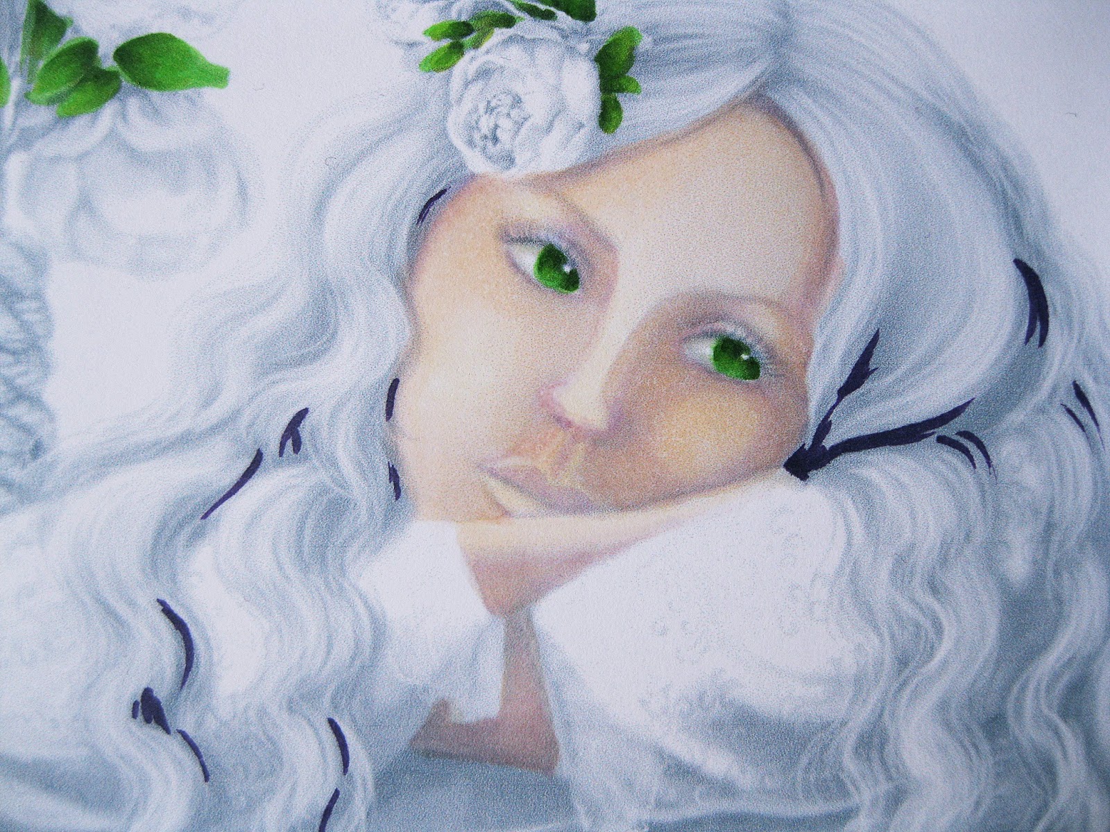
There are a lot of grayscale colouring books available. You can compair this to an oilpainting technique called "grisaille", which is a term for a painting executed entirely in shades of grey or an another neutral colour. It's often used as an underpainting for the original coloured oilpainting. 


I used this lovely digital drawing by Alena Lazareva. I made the print lighter than the bought version , in word you can find this option in colour correction. 


Add a layer of E50 first.


Add BV00 and BV000 for some extra shading. This may look a bit much now, but after adding more layers of E colours you will see that the BV will blend in smoothly. 


Add some more E00 and W1 for more depth and warmth. Blend them all together with the E000 and E0000. 


Than I hopped over to the leaves. I used the YG 06,17,25 and 67. I started with the lightest colour, the YG06 first, than the darkest YG 67 and blend them all together with the middle tone green, the YG17. In the end I thought the leaves look to blue-ish green so I added some YG25, which is more yellow. 


Now I go back to the hair. Start using the darkest colour first, the V09. Than use the  V06, 05 and 04. 
Use these colours for the roses as well. 


The hair doesn't look nice this way. So use the V0000 now and blend all layers together. 


After using the V0000 the hair looks much nicer and all the colours are blended together. 


Now back to the dress.
 I used the V01 for tracing the pattern on the dress. Use BV00, 000 and W5 and 3 for defining the shades a bit more. 


Use E34, 35, 37 and 39 for the ropes and trunk. I used E34, 35 and 37 for the ropes. E35,37 and 39 for the trunk.


Now I am ready for the next steps. Copic work is done, time to make a background. 


After cutting out my image and glue-ing it to my page I decided to add some coloured pencils for more shades and making the eyes look better. 


And this how the finished page looks. I found the quote on the internet.

see you again in May

Miranda


Monday, February 20, 2017

Angels are among us

" Although you may not see them
you are always in their sight

they bring the gift of love and guidance
it is called the Angel light.."

This is how a lovely poem about angels start, I really love it and it suits the image I have coloured very well...(unfortunately I was not able to find the name of the author,).
The image I used for today is by Meadowhaven. 


 I started with a thin layer using the E50. With the E51 I add my shadows and I do not worry about blending out the colours smoothly. With the BV00 I add some more shadows.

I slowly build up the layers adding more colours.


After adding the BV00 I blend all layers together with the E000. As you can see the colours look more smoothly blended now. In the end I decided to add some W1 for more shadow. 

 If the skin colour looks too cool you can add some extra E00. I prefer a more cool skin colour.  I like to start with a layer of E50, using the warmer skin tones (E00, 000) on the cheeks and nose. 
The best way to find out what works best for you is to make some samples using different Copic combinations. 


I decided to do the wings blue. Orange is the complimentary colour of blue  (they are opposite each other in the colour wheel) that means if you blend blue and orange you will get mud, but combinations of orange and blue look fabulous. So there has to be some orange in this colouring. I decided to use orange hues for the hair and the little angel's dress. 

I used quite a variety of colours for the hair YR15,20,21,23,24,27 and E08.
I used the YR Copics first, starting with the darkest one...in the end I thought the hair looked too pale and I added some E08 to make it a bit brighter. 
For the dress I used the YR 14, 15,16 and 17.


I enjoyed colouring the feathers. I started with B39. Like the hair I start with the darkest colour working my way back to the lightest colours. I used B 69,79,63,66, 60 and 39. In the end I added a tiny bit of the RV06.

For the dress and the little angel's wings I used FBG2, BG02, 05, 07 and 09.


I made an art journal page in my black journal, using some lovely Pronty feather stencils as well


See you next month

Miranda

Friday, January 20, 2017

aquaholic

Hi my lovely Copic friends, 
hope you all had a wonderful holiday and you've started 2017 healthy and colourful.

My post for today is all about aquaholics. I came across this word on the internet and I really liked it, it sounds so funny and it suits the image I used for today's project very well. 

My projects is an art journal page. I used one of my Gelli-plate backgrounds from my stash. The background is made with acrylic paints and art foamies. 

The image is by Line Artsy by a wonderful artist called Gloria.

I have coloured this pretty mermaid and fish with Copic Markers and coloured pencils.


I started colouring with the Copic Markers. Coloured pencils are usually oil or waxed based. If you use your coloured pencils first you might end up with clogged Copic nibs. So to avoid any clogging use your Copic Markers first. 

I started with adding green shadows using the BG70. Then I build up the skin using the E50, 00 and 000. The mermaids hair I've coloured with BG07,70,72,75 and 78. Start with using your darkest colour first and use this on the shadow parts of her hair. After I used all my colours from dark to light I go back to the darkest colour. With all the blending the darkest colour might have faded a little, so you need to add a little of the darkest colour again to create more depth. In the end I thought the hair looked dull, so I added some YG13 to get it a bit more sparkly. 

For the fish I used BG02, 05, 09, 11, YG03, 11, 17 and Y17. 
For the orange parts of the fish, the veil and the mermaid's lips I used the YR01, 02, 14,15,16 and 18.

When I finished my Copic colouring I got out my coloured pencils and added some more depth to the colouring. 


I have found this funny word on the internet and wrote it down on my page using a Copic Multiliner. I coloured the letters with Copic Markers (YG13) and some coloured pencils. 


 And this is the finished page. Hope you like it. 

Have a wonderful day

Miranda

Friday, December 2, 2016

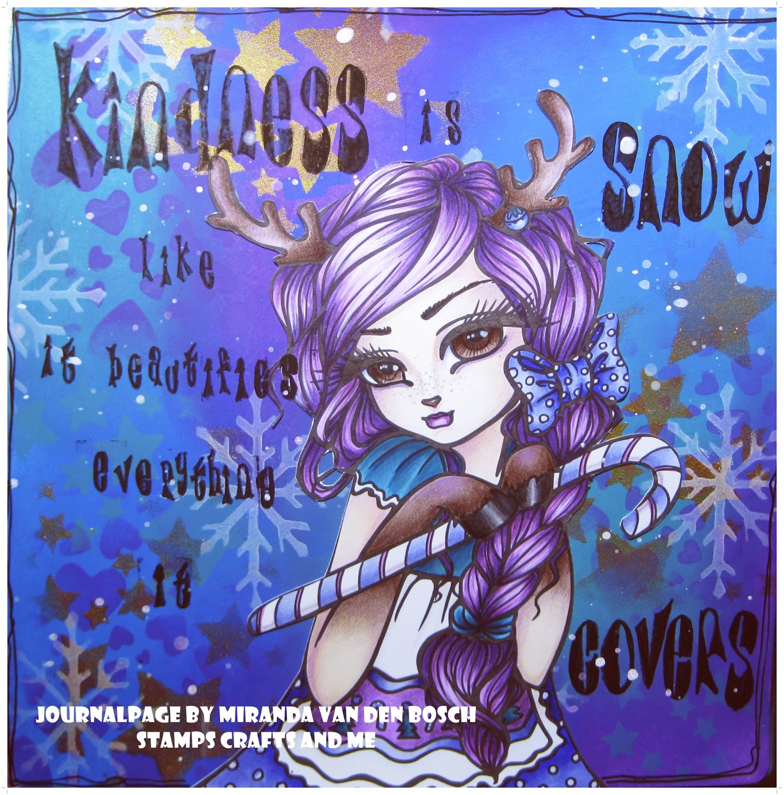
kindness is like snow

KINDNESS IS LIKE SNOW. IT BEAUTIFIES EVERYTHING IT COVERS...

I found this quote on the internet and I think it is absolutely true, don't you think so too?

Allthough it is cold outside I just love the wintertime, because it also means warm sweaters, hot cocoa, candles , hot soup, gloves and scarfs, fireplaces, roasted chestnuts, iceskating (if we are lucky)...yeah the wintertime is a great time.

For my background I've used just cool colours, like blue, purple and phthalogreen. 


The image I've used is by Hannah Lynn for Crafts and Me.


The image is coloured with Copic markers. The colours I've used are:
Antlers and paws E70, 74, 77,79, C3, 100
Bloue BG02, 05, 07, 09
Skirt B63, 66, 69 
Hair V04, 05, 06, 09 
Skin E50, 51, 00, 0000, BV01, W1 


and this is my finished art journalpage

wish you all a wonderful Christmas and a happy and creative 2017

Miranda

Wednesday, November 2, 2016

dare to fall

the bird who dares to fall, is the bird who learns to fly

Quite recently I bought some lovely images by Tanya Bond. Her drawings have cute animals in it and they are great for colouring with Copic Markers. 

So I had a lot of fun colouring this girl and her hummingbirds. After I had finished colouring this image I made an art journalbackground with paints and stencils and found this great quote about birds on the internet.  


I always start colouring the skin first. When that doesn't turn out right I will start all over again. 
For the skin I used E50, 51, 00, 000, 0000. For shading I used W1 and 3, BV000 and 00 and a tiny bit of BG0000.

For the eyes I used B39, 37, 34, 32 and for shading inside her eyes the BV0000 and W1. 
And for the lips, E93, R20 and 22.


YR23, 18, 16,14, 21 and E09 were used for the hair. I normally start with adding the darkest colour first working my way back to the lightest one. With all these layers the darkest colours tend to turn out a little lighter than usual, so I go back to the darkest colour to enhence it a bit more. 

For the leafs in the background, in her dress and in her hair I have used YG06, 17 and 67. 
In her dress there is as well BV000, 00 and 02. 

I have used quite a few colours for colouring the hummingbirds
 and the flowers.
Flowers: V04, 05, 06, YR23, 18, 16 and 15
Birds: V04, 05, 06, YR23, 18, 16 ,15  BV000, 00 and 02.

if you have any question about this creation  please pop me a message on FB

have a wonderful day and see you next month

Miranda


Sunday, October 2, 2016

the bunnykeeper

A few of my favourite things are art journalling, colouring and animals. And this time I was able to combine the 3 of them.
I used this wonderful image by Tanya Bond called the Bunnykeeper.


I always start colouring the skin first. If I get that right  the rest will follow...
I started with the E50 and add a thin layer on all the skin parts of this image. 


For the 2nd layer I used the E51 to add some shading. I do not worry about the marker stripes you see in the photograph. I will add many many more layers and in the end I will blend all the layers together. 


After the E50 and 51 I used my BV000 for some more shading especially where the eyesockets are , under the nose and on the chin and on both sides of the face and the neck. 

More shading under the nose with the W3. I used the W3 for the neck and the eyes as well.


To add some more warmth to the skin I add a thin layer of E00 and now it is time to blend all layers together with the E0000. 


I thought it would be nice to give the bunnykeeper purple hair and eyes. 
I used BV01, 02, 04, 08 and V17.


This is how the bunnykeeper looks with purple hair and eyes and I like it a lot. 


Now it's time to colour the bunnies. For the purple one I used the same colours as for the hair, BV01, 02, 04, 08 and V17.
For the blue bunny I used B12, 14, 16, 18. And for the golden-yellow bunny I used Y21,26,28, 35 and E08.


I used the image in my square art journal on a Dylusions background. 


I had to add some doodling too of course...

have a fabulous day
Miranda


Friday, September 2, 2016

Lettering with Copics

Copic has some great products for lettering like the Copic Markers,  Copic Multiliners and the new Copic Gasenfude.

 I've tested the gasenfude and I just love this new brushmarker.


The gasenfude has a wonderful brush and can be used in combination with all your copic markers. 


The nylon brush makes lettering easy


The gasenfude is perfect for doodling too.


From left to right I increased the pressure on the brush and as you can see, you can make either a very thin line or very thick one. This is very convenient with lettering also.


Some more doodles, just playing with thick and thin lines.


Because I love playing with different markers I decided to play some more and make this little card. I used the gasenfude, copic markers and copic multiliners. And a wonderful quote by Katherine Hepburn.

I added a few thin pencil lines to guide me a little and wrote down the words using different kind of markers. 


I coloured some of the words with Copic Markers.


used the  BG05, YG06, FRV1, FY1 andY38 for colouring the words.


Thought it needed a little extra so I added some flowers and swirls too.


For the background I used some aquamarkers and because all the Copic Makers, Multiliners and the 
Gasenfude are waterproof you don't need to worry about smudging your project. 

have a creative day
see you next time

Miranda