

Hi Everyone, it’s Sandra from Portugal.
Today I am showing a card I made to send to my best friend who’s in China. (Shh, don’t tell her, it’s going to be a surprise!) She is one of the women I admire the most. She is smart, caring, adventurous and sassy, and she has always been there for me, even at a great distance. I feel very blessed to have her in my life! 💗
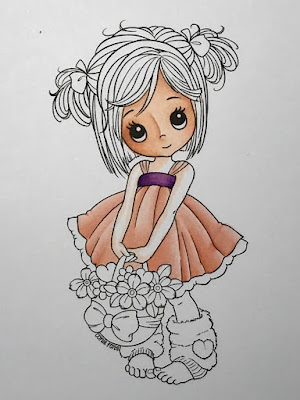
I chose one of Conie Fong’s digi stamps: “Molly’s basket of love”. I love Conie’s drawings: I find her folds and pleats very easy to colour, everything falls in the right place and no mismatched folds, if you know what I mean.
My favourite skin combination is E000/00/11/21/93 and I started by mapping the shadows with the lightest marker, assuming a light source from the upper right.

I thought my mapping made sense so I went over it with the darkest colour E11 and blended it with E21. And blended again with E00 and finally E000 leaving the nose cane lighter. Finally some E93 on the cheeks and Molly’s make up was all done ;)


I thought my mapping made sense so I went over it with the darkest colour E11 and blended it with E21. And blended again with E00 and finally E000 leaving the nose cane lighter. Finally some E93 on the cheeks and Molly’s make up was all done ;)


I couldn’t decide which colour for the dress, peach or green, and after bugging everyone around the house, I ended up picking my oldest son (and mine) favourite combination – peach.
Once again I coloured dark to light, mapping the shadows first.


Colouring dark to light happens to work best for me because I tend to overblend and usually my highlight is gone in the blink of an eye. This helps me not to overextend shadows. Even so, as you can easily notice, I overextended the right fold shadowing. This was supposed to be lighter as it was closest to the light source. I later retouched it with R0000. I know lots of people grab their 0 marker for lightening colours when needed, but you will find you’ll get better results if you use the lightest marker available in that colour family instead. I reserve my Colourless Blender for texturing and pushing in strokes that fall outside the drawing lines.
Peach is such a soft colour, and so close to the skin tone I chose, that I decided to pick a complimentary one for the dress ribbon. I went with V12 /15 /17 because they are an easy and clean blend. Picking complimentary colours (which are colours opposite on the colour wheel) will pop the colours of any project and make it more visually appealing.


I then finished colouring the skin, once again dark to light.


At this point I was still colouring two images at the same time – the green and the peach - and “team green” was stronger, so I was colouring the peach as extra fun (because it was my favourite) and went along without step by step pictures, thinking I would take them on the “green Molly”.


So, sorry for not showing a step by step of the basket and the leg warmers.

I shadowed the white skirt pleats with N0. I used E31/33/35/37 for the basket and some light warm greys for the leg warmers. To get the fluffy and comfy look on the leg warmers I used a technique called dotting or stippling, colouring really tiny dots with the tip of the marker. Be careful not to ruin your nib when you do this, and don’t forget to have dots of different colours and sizes to create a 3D look – darker dots where the shadows are supposed to be and lighter and smaller for transitioning to the highlights.

I shadowed the white skirt pleats with N0. I used E31/33/35/37 for the basket and some light warm greys for the leg warmers. To get the fluffy and comfy look on the leg warmers I used a technique called dotting or stippling, colouring really tiny dots with the tip of the marker. Be careful not to ruin your nib when you do this, and don’t forget to have dots of different colours and sizes to create a 3D look – darker dots where the shadows are supposed to be and lighter and smaller for transitioning to the highlights.
I coloured the basket bow and moved to the hair.

Conie’s drawings usually have pretty defined hair strands. I like to colour each one of them with one or two single thin lines of colour ranging from dark, light to dark.

Conie’s drawings usually have pretty defined hair strands. I like to colour each one of them with one or two single thin lines of colour ranging from dark, light to dark.
I start with the darker closer to the hair roots and pigtails.

And then extend it progressively into lighter, trying to have it very light where highlights are supposed to be.

And then extend it progressively into lighter, trying to have it very light where highlights are supposed to be.


It’s very time consuming and requires your nib to be clean and sharp. I usually have a cotton swab with alcohol by my side to keep cleaning the pigment that builds on the nib tips. But the result is usually awesome (I think). And if your nib (not you) happens to make a bolder smudgy line, it will still be ok in the end.
See?


After using my Colourless Blender to clean some out of place colouring, I coloured the pigtail ribbons and the headband.
And then, all that was left to colour was flowers, leaves and hearts.
I coloured some flowers with the feather blending technique to have two-toned petals.

Finally, I placed some cast shadows. Cast shadows are not my “forte”, I know they need to be there but I am always afraid of ruining my work. :p

I then assembled the card.

Dress: R 00/ 01 / 11/ 12 and N0 for shading white
Ribbons: V12 /15 /17
Skin: E 000/ 00/ 11 / 21 and 93 for cheeks
Hair: E49/57/ 55 / 53
Flowers: Y 06 /08 / 35 /38 and G000/00 BV000/ 00 R 20/21
Leaves: G20/40 and YG11
Basket: E31 / 33 /35 / 37
Hearts: R 20 / 21 / 22
Leg warmers: W00 / 0 / 1 /2 and V 000 / 000 / 01
Cast shadows: W00 / 0 / 1 /2
I hope you like it!
I will put this in the mail next week, I don’t know how long it will take to Beijing, but I am sure my friend will be quite touched to get it. She values handmade things!😍
Hugs Sandra x
1 comment:
Beautiful colouring Sandra and such a pretty card...
Love from Sue...xxx
Post a Comment