
Good morning everyone,
It's Sue here today.

I thought I would share some tips with you about colouring on Kraft card as this is a great alternative to colouring on white card and you can get some lovely results.
There are a few things that are handy to know about colouring on Kraft card as the Copic ink behaves quite differently to how it does on white card.
Here are the main points to consider...
- Copic ink is translucent (see through) so the result you see on your card will be different depending on the colour of card you are using.
- Just like white card there are many different types of Kraft card available. It is a good idea to try a few and see which works best with your colouring style. For this tutorial I have used Neenah Desert Storm.
- Kraft card absorbs the ink in a different way to white card so before you start colouring it is a good idea to test the colours you want to use first.
- Be prepared to use darker colours than usual as the translucent Copic ink allows the Kraft card to show through and you may need to use a darker colour ink to provide some contrast.
- Kraft card takes a lot of the brightness out of the ink. In a pleasant way it dulls the colour down and this can look really effective. Colouring on Kraft will give you the chance to use brighter Copic colours than you might usually - which is fun!
- When you colour onto Kraft card the ink will look quite dark at first - don't panic! it will lighten as it dries out.


Before I started colouring my stamped image, I created some colour conversion tags to show how the colour looks different on the card, this helps to choose colours that would work well on Kraft.

I also tested the colour combinations I had chosen to make sure they blended nicely on Kraft card. It is important to remember to use the side of nib on the Copic Marker to make sure you are creating a smooth blend between the light, medium and dark tones.

Here I have coloured the skin on the stamped images on both Kraft and White card so you can get an idea of how different they look.

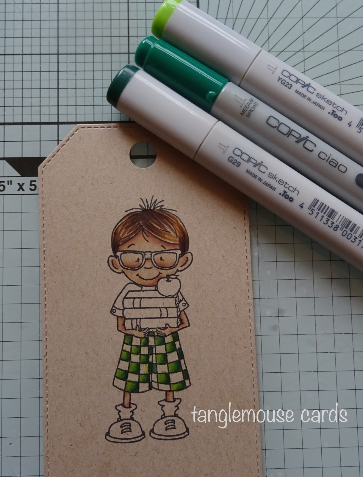


I then carried on colouring the image.
I prefer to work from dark to light, always starting with my medium colour and putting that where the darkest parts of the image are, and then going back to that dark part and building up the colour by blending from dark to light.

I thought this would make a perfect book mark for someone going back to school this week!
Ingredients
Neenah Desert Storm Kraft Card
MFT Die-Namics Stitched Tag Die
Memento Ink pad in Tuxedo Black
Smarty Pants Clear Stamp by Kraftin' Kimmie
Copic Markers as above
FaDoodles Stamps by our very own Faye Wynn-Jones for Whimsy Stamps
Natural Twine and Apple Charm

Thank you for popping by.
Happy Copic Colouring...
From Sue ...xxx


