
Hi girls!
Helen here, hoping to inspire you all today to color that Halloween card you might haven´t done yet.
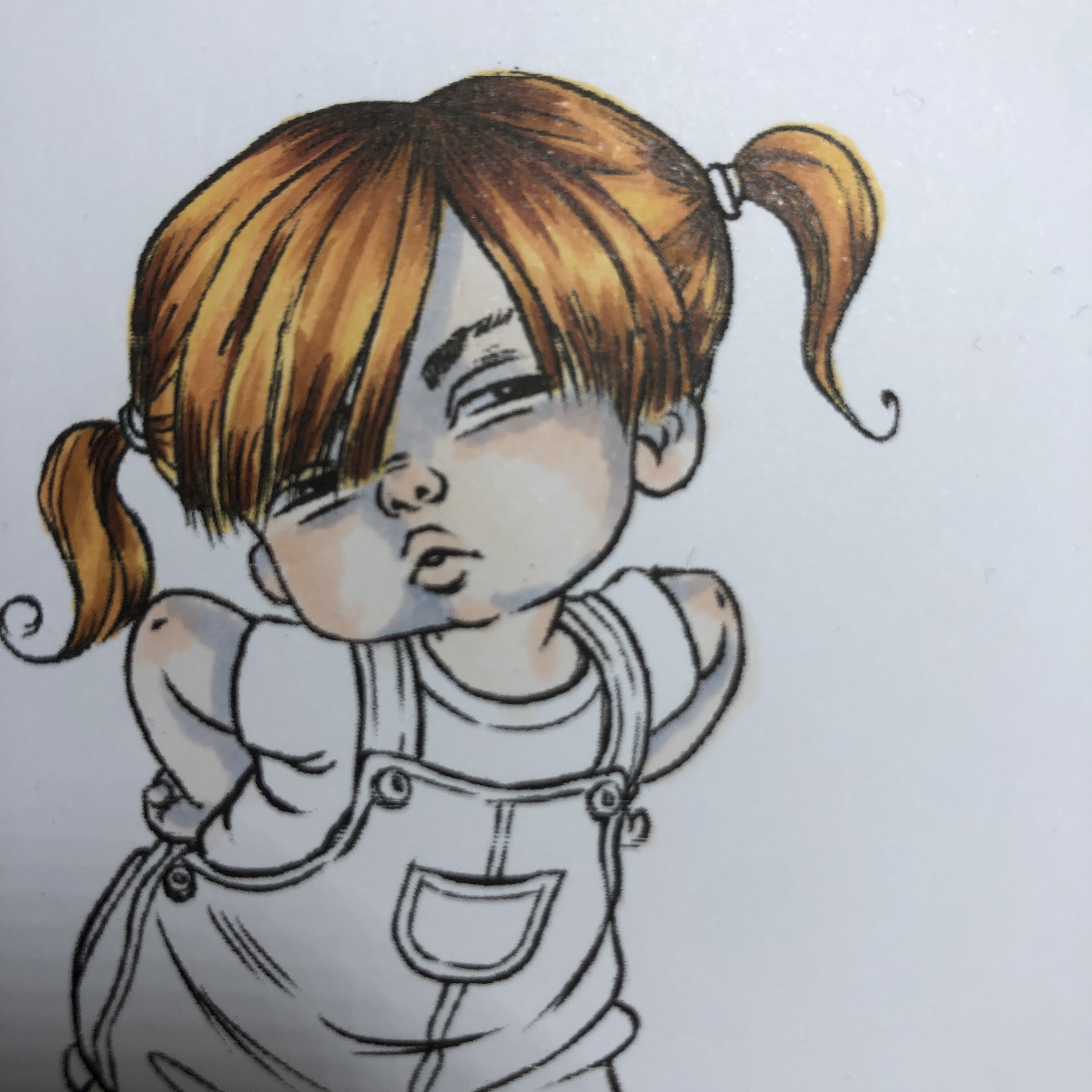
I don´t have a Halloween image, but I got inspired by this image and used orange, purple and green to get the feeling for the holiday. It mustn´t be scary, it can be sweet as well, the feeling comes with the colors.
The image, Sassy, is from Mo Manning and it is stamped on Perfect Coloring Paper with Memento ink.

Helen here, hoping to inspire you all today to color that Halloween card you might haven´t done yet.
I don´t have a Halloween image, but I got inspired by this image and used orange, purple and green to get the feeling for the holiday. It mustn´t be scary, it can be sweet as well, the feeling comes with the colors.
The image, Sassy, is from Mo Manning and it is stamped on Perfect Coloring Paper with Memento ink.

I started on another paper but I didn´t get the cheeks right, so when I started again, I started with the hair, and of course I forgot to take photos of each step.

For the hair I used: YR21 - E97 - E99 - E18

This time I colored in a different way. I use to start with my lightest shade and cover the whole area, but this time I started with the parts I wanted a red tint on, used R00.


On top of the R00 I went in with E000 and covered all skinparts.


Then I used BV20 for the deepest shadows.

On top of the BV20 I went in with E53.
The purple will end up with a nice contrast to the skincolor and when you wash it with another E-color on top, the blueness tends to disapear, and you end up with a nice deapth in your shades.
Right now the contrast is hard, but I know that when I´m finish I will have a nice shade and not so much contrast.


Blending with E50.


Blending with E0000.
And her lips got R00 - E04
And her lips got R00 - E04


I really don´t like the color purple. So there are very few shades in my stash.
I wanted three shades but as I put down RV95 I realised that I wouldn´t blent it together with V17 for my satisfaction.
So, I have covered the t-shirt with a layer of RV95 and on top of it I went in with V17 and covered that up. For some shades I used V09. The white piece got some C3 on it.
I wanted three shades but as I put down RV95 I realised that I wouldn´t blent it together with V17 for my satisfaction.
So, I have covered the t-shirt with a layer of RV95 and on top of it I went in with V17 and covered that up. For some shades I used V09. The white piece got some C3 on it.

For her pants I started with YR21.

My darkest tone is YR07 and my midtone is YR14, and some shading with Y26.
The details on the pants has YG61 - YG63.
Shoes: C5 - C7
Socks: W00 - W1 - W3
The details on the pants has YG61 - YG63.
Shoes: C5 - C7
Socks: W00 - W1 - W3

The grass is: YG11 - YG61 - YG63 - YG67.
And some airdetails; BG70 - BG72.
And some airdetails; BG70 - BG72.

Hope you enjoyed it.
Wishing you a sweet Hallloween!
Love Helen
Wishing you a sweet Hallloween!
Love Helen
No comments:
Post a Comment