Home

Sunday, January 28, 2018

Bookmark

Hi there Copic loversElena F here from Scrap-lanak Ganbaran.

I made a bookmark with a Some Odd Girl clear stamp coloured using the No Lines Colouring Technique and stamped with Memento London Fog Grey Ink.

The bookmark has an elastic band so you can use inside or outside the book.


I will show you in pictures how important it is to colour at least two times when we colour to get more contrast and depth, even when we are using markers that aren't so full.

Skin colours: E0000, 00, 21, 11, 13, 95


Hair colours: E51, 53, 23


.....and of course the use of the Multiliners helps soooooo much in the colouring process too.
Here is the image re-touched with grey and black in the eyes and sepia in the hair:
Sweater colours: YR31, Y35, YR24, E15
Eye colours: BV000, 23, 25, 29


Bow and shirt colours: BG90, 93, 96

The list of markers I've used to colour the image:

Skin: E0000, 00, 21, 11, 13, E95
Hair: E51, 53, 23
Sweater: YR31, Y35, YR24, E15
Greens: BG90, 93, 96
Eyes: BV000, 23, 25, 29

I hope you found this post inspiring.
Thanks for sticking with me to the end!


Friday, January 26, 2018

art journalpage


Hi everyone, I have been working on this journal page for the last few days. 
All the images on my page are coloured with Copic Markers. 

 I start with a thin layer of E50. The E50 is a cool beige and perfect for skin tones. 
After the E50 I use the BV00 for shadows. Next layer will be E00. Normally you shouldn't blend a yellow with purple, but in case of the E50 and BV00 you will get a very good skin tone. 
Blend all layers together with E000.


For the eyes I use YG13 . Add some YG17 and YG67 for more depth. I also use the greens for eyeshadow. Add all the colours in layers first and blend them together with YG13.


I use a lovely pink for the lips. I start with RV02. For the upperlip I use RV04. make some more shadow with RV06 and RV09. Blend all layers together again with the RV02.


I use the same pinks for the roses. Start with RV02. Use RV04 for the darker parts of the roses. And give more depth using the RV06 and RV09. Blend all layers together with RV02. 


For the orange flowers I use
YR15, YR16 and YR18.
Blend the layers together with YR15.


For the yellow flower I use Y13, Y15 and Y17. 
As you can see I do not colour very carefully, but I will cut out the images anyway, so it doesn't matter.  But with Copic Markers you can make little corrections quite easily. 


For the stems and leaves I use YG13, YG17 and YG67. 


I wanted to keep the bird white, so I only use some BV00 and W1 for shadowing. 


In the butterfly wings I used all the pinks, yellows and oranges I have used for the other images as well. 

And this is the end result, see you next month.

Miranda


Thursday, January 25, 2018

Colouring A Strawberry

Hi Friends.
Cicci here today, showing you a step by step tutorial about coloring strawberries.

Copic Markers Used:

Strawberry: YR07 R35 14 C03 R29
Leaves; G43 40 49 Y02 G29
Skin: E50 51 53 04 R20 E92
Dress: BG72 78 09 B000 B34 37 39
Hair: E70 71 77 79 E19
Grass: YG03 06 00 G29
Wings: B000 00 RV00 RV000 Y00 E43
I also use a White Sakura Gel Pen.

I have used an image from Mo Manning, called Berry Fairy Aliz


Step 1 
I start to colour with YR07, over almost the whole strawberry, leaving some white areas.

Step 2 
Add some C3 for shadows.

Step 3 
Add R14 over YR07.


Step 4 
Add R35 over the same area.

Step 5 
Now I blend out all the colours with YR07.

Step 6 
Here I colour and blend with Y21 over the whole area.

 Step 7 
Blend with the YR07 again over the whole Strawberry.

 Step 8
Add and blend some R35 on the top and lower side of the strawberry. I don't colour in the middle.

Step 9 
Here I have added small circles around the seeds with R29 and after that I have blend over the whole strawberry with YR07.

Step 10
Blend with Y21 over the whole strawberry.

Step 11
I make some small dots into the seeds with a white gel pen.

Step12
After that I just continue to add some white colour with the 
gel pen.


DONE!


Heres another Strawberry I have coloured
I draw this and then coloured with copic Markers
The only different with this is that I I coloured the Seed with YR23 and E19


Big Smiles and Hugs from Copic Europa!!

 See you next Month 

Cicci

Saturday, January 20, 2018

Colour in Cool Greys!


Hello everyone! It's Delphine here today to share Black and White inspiration! It's sometimes difficult to know which markers to buy when you start your Copic collection - there are so many to choose from! - but I think buying Grey markers is always a great investment since you can use them for shading and for monochrome images. My C markers were the ones I bought very early and I never regretted that choice, I use them a lot! 

For today's post, I have chosen an image from Make it Crafty called Primrose. 


With black and white, I always try to alternate between light and dark areas so that a light colour will be next to a dark area - not too many dark areas next to each other otherwise you sometimes cannot see the drawing very well. 

So first I coloured the skin, choosing my lightest colours - I used C00, 0, 1, 2. 


Next I coloured the hair with my darkest markers - 100, C5, 7, 9. I even let a very few spots white for highlights.


The flowers were done in a light colour because most of them were next to the black hair, using C1 and C4. For the leaves, I used C5, 7, 9. 
I also added touches of light grey to the banner in C00, 0, 1 - because white is never just white and needs colouring too.


I stamped a sentiment in the banner, added a little heart chipboard and used black Bo Bunny DPs for my base. And voilĂ ! 

Thank you very much for your visit, have a fab day! Hugs,
Delphine xx

Friday, January 12, 2018

Happy Day!


Good morning!

I am Cristina Valenzuela, after a time of rest I have returned to the Copic Europe Blog.
Today I have a little spring card for the tones and the flowers, I want to go cold ... and you?

I will leave here a small sample of my step by step.
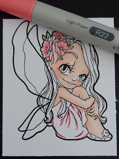
I have coloured this stamp from Some Odd Girl in soft red tones ... I explain how I do it ...


First I start with my intermediate tone, here I used R22.
I worked with the design paper, so I knew exactly what colour I wanted.
I add shadows and make the folds.


Blend out the previous colour, I used R11.
I colour the entire dress, except for the lightest part, I leave it blank.


Once I have the base, I use red.
For this I used R35, I love this colour!
I add shadows and folds, again, but now in red.


Blend out the previous one with my intermediate colour, R22.


And I end up blending the above with my lighter colour, R11.
Dress finished!


As this little fairy has transparent wings, I thought of teaching how to colour this, today in a simple way.

First I colour the hair, which is under the wings and can be seen through them, I have coloured normally.
Then I add my colours for the wings, first BG32.


Blend this colour with BG11.


And finally blend with BG10 leaving the exteriors of the upper wings in white to make a separation.

And that's all!


Coloured with these Copic:
Skin: E11, E00, E000, E02, E13.
Hair: E57, E55.
Dress: R11, R22, R35.
Wings: BG10, BG11, BG32.
Flowers: R20, R81, R35, R22.
Floor: N1, N3.
Green: G82, YG63.

I hope you liked it, see you soon!

Monday, January 8, 2018

46 shades of grey...

Hello everyone,
It's Sue here today.
I thought it would be good idea to talk to you all about Copic greys!

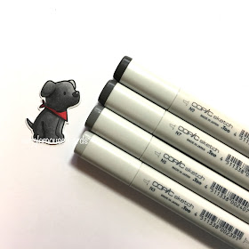
Copic make 46 different shades of grey in four colour families - Cool, Neutral, Warm and Toner. 
To show you how different each grey looks I have coloured four very cute little dogs, one in each of the copic grey colour groups.
Each colour of grey brings its own tone and feel to a picture.  You can see here how different they are.
Cool Grey (C)
Cool grey has a slight blue tint to it which makes it ideal for colouring snow and anything white.
Neutral Grey (N)
Neutral grey is actually a true neutral grey.
Warm Grey (W)
Warm grey has a hint of brown.
Toner Grey (N)
Toner grey is halfway between neutral and warm.
Copic Greys really are a very useful addition to your Copic collection!
They can be used on their own to create the colour grey or they can used over the top of more vibrant colours to soften them or create shade.

If you are n't sure which colour grey to use for your project then it will help you if you think of the colour wheel and use Warm Greys with warm colours and Cool Greys with cool colours.
I have used the little dogs I coloured in grey to make a very quick and easy card.
The red accessories are coloured with Copic R59, R37, R43.

The dogs are a Mama Elephant Stamp and Die Set called Playful Pups.
Thank you for popping by.
Happy Copic colouring

from Sue...xxx