Home

Thursday, April 30, 2015

Colorful envelope for best vacation - Daria Myagkikh

Hi everybody,

Today I would like to show you some non-traditional project. :) 
Couple of days ago I received very interesting order.
The story is that one man decided to give his wife a present. She is turning 40 in a week. Huge anniversary, don't you think?! 
So as a present he chose a splendid trip to Montenegro...and he needed a beautiful.... ENVELOPE,
where he can put all documents (map, tickets, etc).

So here what I came up with:


I decided to make a shacker-envelope with a real sand inside. :) Difficult part was required size - 240X140 sm. But I handled it :)))) 
I used splendid image from Mo Manning - To the Beach! - and a real photo of the sea s a background. Colored girl, added ranger stickles on sneakers, swimsuit, details of the bag and flower.
Die-cut "Always" panel - colored it with BV0000,BV00,BV02. Decorate with sentiment and rhinestones. and vuala!


I really hope that customer will enjoy it. Anyway...


The key numbers for image are:

Skin  - E000, E01, E11, R11(for blush)
Hair - E34, E44, E47, E49
Clothes, Towel, Sneakers
BV0000,BV00,BV02,BV08,
Y00,Y11,Y19,Y32, 
V0000, V000, V01,

G40 (for leaves)


Wishing you a great day and very creative mood!

Tuesday, April 28, 2015

music speaks....

At the beginning of this month we had a fabulous craftfair in the Netherlands, called Art Specially. This fair is a real treat and I bought myself a few nice stamps and stencils....and I couldn't wait to get home again to play with my new goodies. 


At first I made myself a background using the airbrush and my copic markers and some stencils (Dutch Doobadoo, Carabella and Designs by Ryn). The tree was originally indigo blue but I thought it look better in black so I used my copic multiliners to make it black.
The multiliners are wonderful markers for lettering and doodling on your artwork. I used the multiliners for colouring the faery and writing the quote. 
The faery and toadstools are by lavinia stamps and the small ones in the background by Carabella. 

I coloured the toadstools and wings with the same colours as I used  in the background.
I have chosen a limited colourpalette, because I wanted a scenery at sunset

The colours I used are:
B 29,39
BV 08
V 17, 05 , 04
YG 07


 The multiliners come in all of different nib sizes and in different colours too.

have a wonderful day and see you next month

Miranda

Sunday, April 26, 2015

Smooshy Backgrounds


Hi Everyone :)

It's Faye here, and today, I am sharing a Tutorial on some of the smooshy backgrounds I create.

Before we get started, there are some things to remember... 

Generally, I colour my image first, unless I am also colouring the background. In which case, I do the background first. Why? I don't want to accidentally pick up any colour from the image and drag it into the background. If it's a lighter colour, I may be able to correct it. But if I pull brown, grey, or, shock, horror, red, into my background, (especially after spending time colouring the whole image) I'll be crying. Unless the background is supposed to be any of those darker colours with strong pigment!

This technique works really well with colours that are close to each other in number, but when you look at them, there is a big jump in colour and they aren't always easy to blend. Think BG70 and BG72 (which is what I am using here), or to give another example, E81 and E84.  

So, let's start!

 I have decided to colour one of my favourite images from Tiddly Inks... Fairy Fae Catches a Star. I want to make her look like she is floating in the air.

I am going to be messy. No smooth colouring here. The Marker strokes look like this:


Firstly, I am going to give the whole background area a base layer of BG70, using the smooshy, messy strokes:


Next, I want to begin adding some depth of colour to the background using BG72. As I mentioned, although BG70 and BG72 live next door to each other, they don't always play nicely! If I added BG72 directly to the card, it would take a lot of blending to get a smooth transition. 

So, I am going to use the Tip to Tip Technique, picking up BG72 on my BG70, keeping the darker BG72 close to my image, and allowing the colour to fade out, as I come away from the image. 

I don't want to pick up too much colour on my BG70, typically, my Marker looks like this:


Ahem! Oh dear. Normally my Markers are much cleaner than this!! ;)

I don't worry if I think I've picked up too much colour, I can dab some off onto a piece of scrap paper, which I have nearby.

Now, I begin to add a layer of BG72, using the messy strokes, keeping near to the image, and moving away, as the colour fades:


I continue to work my way around the whole image:


I would like to make some areas of the background (behind Fairy Fae) darker, so I add a second layer of colour:


I still think I could take the area behind Fairy Fae a little darker, so I add a few more touches:


Finally, I colour in the rest of Fairy Fae:


Markers Used...
Background: BG70, BG72
Skin/ Wings: YR000, YR00, E11, E04
Stars: YR30, Y23, YR31, Y35
Dress/ Shoes: RV10, R81, R83, R85

Before I disappear for my breakfast, I thought I would share some other samples of images using this technique. 

I also used BG70 and BG72 on this image, but I added many more layers of colour:


I used W1, W3 and W5 on this sample, W1 was the pen which I used to carry the darker colour, and it was almost running dry. It has made the smooshy background look very different:


On this final image, my Markers (B66, B69, B79) were very full and wet:


I hope you have enjoyed my Tutorial and give this Smooshy, Tip to Tip Technique a try.

Thanks so much for stopping by... have a wonderful day.

Faye x

Saturday, April 25, 2015

Dark hair and skin

Hello all copic fans.
Today, it is I, Rozzan from Sweden who hope to inspire you.

Often it will be the same color I use to skin, but now I wanted to try some new combination.
This digi-stamps from Saturated Canary,
 is well quite naturally to color with dark hair and dark skin.


When I color the hair, I have used the confetti technique, which are dots of various sizes.
Hair: E31,34,35,57,59,49 
Skin: E31,11,13,15
Eyes: E43,44 and lips: E08


The skin and the dress I have used the technique tip to tip. Sometimes it can be difficult to get the colors to come together, then I think tip to tip is ideal to use.
Dress color: Y11,15,17, E15
 I also tried to color with the same combination of skin and hair at this stamps from Bildmålarna.


This card I showed last week in the Swedish copic blog.


Skin: E31,11,13,15
Hair: E31,34,35,57,59,49
Pants:: E81,84,87
Dress and stockings: E01,93,97,99
Paint Can: C,1,3,5 and BV20,23,29


Hugs from Rozzan

Thursday, April 23, 2015

Jem and the Holograms, by Suki Manga

Dear Copic friends! How are you? 
Today I will show you my fan art dedicated to "JEM"

Jem, also known as Jem and the Holograms, is an American animated television series that ran from 1985 to 1988 in U.S The series is about a music company owner Jerrica Benton, her singer alter-ego Jem, her band the Holograms, and their adventures.

I love this animated serie so much, so I decided to create a manga style look for Jem.


To create this fan art I used the following Copic colors:

Skin: E000 - E00 - E21
Eyes and make up: B00 - B12 - RV04 - C3
Clothes: RV10 - C3 - RV04 - R29 - B00 - B12 - V12
Hair: RV04 - R29
Background and microphone: Blender - C5 - C7 - 100 - B12 - Y11 - B00 - E50 (yes, there is no green colours there ^___^ I mixed blue and yellow colors)

I also used a white ink pen for little shiny effects

I hope you like it!

See you soon, bye! (^____^)/

Suki Manga Art


Tuesday, April 21, 2015

Simple Spring Scene


Hello everyone! It's Delphine here today to share a CAS spring scene card using digis by Make It Crafty.


The character I used is Jena Blue Bird from the Meadow Girls Collection. I wanted to make a one layer card with a little something at the top so decided to use Flower Tree Branch by Make It Crafty too, which I pasted several times and sometimes rotated to create the little branch border. I added the Smile sentiment, a digital sentiment by Make It Crafty, then printed my scene and coloured it in Copics. 


Skin: E000, 00, 01, 13, 70
Hair: E31, Y32, YR21, 24, 27
Eyes: BG000, E31
Dress: B0000, 000, 00, RV14
Flowers: RV11, 14, 17, Y19
Branches: E33, 59, G21, 24, 28, RV17, 19
Ground: E81, 84
Birds: B93, W0, 1, 3


Thank you very much for your visit, have a lovely day! Hugs,
Delphine xx

Saturday, April 18, 2015

I treasure your friendship

Hi Copic Friends, 

Today I have a friendship card to show you. 
I kept the decorating pretty simple to let the image be the main focus on the front of the card. I used papers by Pion Design, flowers by WOK and Hobbykunst, Butterfly by iamroses, dies by Memorybox and the rest is from my stash.

 I used this cute Saturated Canary image called Sisters and colored with the no-lines coloring technique.  As you probably know by now I love this technique! Here's a work in progress image for you. I love how the characters pop from the page in the process. 


Copic colors used: 
Skin: E000-21-11-13-15, R20-22
Hair 1: E29-27-23-21, Hair 2: E49-47-44-43-
Hair 3: E59-57-55-53-51
Eyes: B91-95-97, E23-25-27, G21-82-94
Green: YG95-93-91
Purple: V28-25-22-20
Grey: W7-5-3-1-00
Blue: B99-97-93-91
I used W3 and W5 to retrace the details around the eyes.

Here's the inside of the card. It's a fun fold with lots of layers.
 I used a tutorial made by Cathrine Sandvik for the card base. 

I used Stempelglede sentiment stamps on the first layer. The inside of the card has room for a message.  


Hope you like my inspiration post today,  
Wishing you a colorful day! 

See you soon! 
hugs, 
Elizabeth 


Friday, April 17, 2015

Winner challenge 38: spring!

Hello dear Copic Fans,

It's me again, Deborah, with the announcement of the winner from challenge 38

"Spring", it is....

Laila

 and this is her wonderful creation!


Congratulations, Laila! Please send us an email to copiceurope@gmail.com

with your request for 3 Copic Sketch markers.


Hugs

Deborah

Thursday, April 16, 2015

Every Day Love


Good morning!
I'm Cristina Valenzuela, and this is my blog card for Copic Europe.

The background is colored with Copic, mixing various shades more than once until they form part of each other. It's entertaining, but the result is beautiful.

My papers are in black and white and colored the stamp has much color, are from Prima Marketing, and the image of Saturated Canary.

I hope you like my card, see you soon again here.


Copic colors I used:
Skin: E50, E51, E02, E000.
Hair: C1, C3, C5, C7.
Tree: E47, E31, E33, E35.
Flowers: RV52, RV55, C3.
Lips: R83, R81.
Kimono: Y28, YR23, Y26, YR31, Y23 // V20, V25.
Obi, bow and skirt: RV99, RV95, RV93, RV91, RV00.
Background: BG18, YG11, YG17, BG11, BG72.

Hugs and Kisses!

Wednesday, April 15, 2015

Challenge #39: Feathers or fur

Hi everyone!

Deborah here for you with the super fun NEW challenge!

Thank you for all who participated to our latest challenge, it will be a hard time to choose a winner!
There are so many great entries!
The winner will be announced on the 17th of April.

Back to the new challenge.
I'm a real animal lover, especially cats. Are you enjoining to colour animals?
So our new challenge is: 

 "Feathers or fur"

Let us see your cards with animals!!!

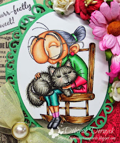
I've used a rubber stamp from Kraftin' Kimmie Stamps "Young at heart". It was so much fun to colour!


I've used the papers from Echo Park "Jack & Jill" because it was so old looking and perfect for the old lady.

These are the colours I've used:
skin: E13, E11, E00, E000
hair: C7, C5, C3, C1
chair: E59, E37, E35, E33, E31
cat: W7, W5, W3, W1/ RV11
green: G28, G07, G05, G02, G00
pink: RV29, RV25, RV23, RV21
blue: BG09, BG05, BG01, BG000
socks: RV55, RV52, RV10
ground: W7, W5, W3, W1


I hope you liked my card!

Now it's your turn!

Please be aware that only entries from those living in Europe, North Africa and the Middle East are possible. 

To enter visit our Challenge page and enter your link in Mr Linky
before the end of May 26.

The winner will be announced on May 29.

We are looking forward to see your creations!
Hugs
Deborah

Tuesday, April 14, 2015

Clean and simple

Hi everyone, Åsa here today with some new inspiration for you all.


Im showing a clean and simple card today.
I like to let the image take focus on the card.


As you can see I have used very light colors in my coloring.
BUT even if I want a very light end delicate feeling of the image, I also use the darker colors too when I color! Elizabeth made a very good tutorial on this, showing the difference. So, even if you want a very light look, don´t forget to use the darker colors too, just to get the depth. But don´t use them as much as the lighter ones.

I have used the following colors:
Skin: E13-11-00-000-R20
Hair: E44-43-42-41
Lilac: V95-93-91-00
Turquoise: BG72-01-0000
Beige: E43-42-41

Hope you all like it.

Sunday, April 12, 2015

Colouring Crimped and Ethnic Hair

Hello everybody!
Franz here with a little tutorial for you all today :)
 
 
I chosen a pair of lovely Mo Manning's images to talk about the way I colour curly hair.
There are three different kinds of curly hair in my opinion: Curly, Crimped and Ethnic.
Today I want to have a look to the "Crimped" and the "Ethnic" ones.
 
Here is an image that shows you how I use the marker on these three differes cases:
 
 
***
 
To colour these two images I used about the same colour combo, but in different ways, so you can also see that you can use the same markers to obtain different effects.
 
The first image I chosen is Summer Fairy Finna.
 
First of all I couloured her skin up, since I think it's difficult to colour the hair without colouring skin first.
Finna has lovely crimped hair and I decided to colour them in light brown/blond tones.
 
 
1 - I started with a medium tone since I don't want the hair too dark:


2-  I added the darkest colour to give a little bit of depth:


3 - I blended with E15 again leaving some white spaces between the strokes for the highlights:


4-  Now I coloured the highlights with the lightest marker:


5 - Now I started with E18 again to add some more depth:


6- I blended with E15:
 
 
7- I added a little bit of colour to the highlights too:


8- Finally I added some more depth again on the darkest zones with a darker mark (E29):
 
 
10- Here is all the hair coloured up:
 
 
***
 
Now I have Fairy Tabia and her Ethnic Hair
 
I used the same technique (from dark to light) but starting with a darker colour since I want to have very dark hair for her.
 
 
1- I started with E18:
 
 
 2 - I blended with E15:
 

3- I blended a little bit again with E13 leaving some spaces between strokes to have some highlights:


4- I coloured the highlights with the lightest marker:


5- I started from the begin again to add some more depth...E18:


6- Blend with E15:


 7 - E13 and a little bit of E11 for the highlights:


 8 - Here I added some more depth with a darker marker, E29:


Thank you for your attention and sorry if I used too many pics :)
I hope this little tutorial can help you!
 
 
A big hug everybody,
Franz