I've been asked so many times "how did you colour this or that"
and I've always given the same answer - I don't really know how to explain it,
I just feel the things and don't follow any certain rules.
The truth is there are some rules and the main is to look and to realize what we see.
In many cases helps the painting (in this case - the colouring) while looking at a real object.
As today I'm going to colour an apple, I went to the near grocery store
and bought some apples for inspiration:
The image with an apple I chose is Mo's Harvest Fairy Apple, an extremely cute fairy:
After I coloured the other parts there comes the apple's turn.
My favourite combination in the red range of colours is R32, R35, R37, and R39, with little help from RV99:
I start with the brightest tone:
Then comes the darkest one:
And the next brighter ones:
The brightest spot I carefully "wash up" with the Colorless Blender:
Now comes the time to return to the first picture in the post, this with the real apples.
Do you notice that all over the covering of the apple there are tiny little spots, like dots?
On the green and yellow apples these spots are more brownish.
To do them I use a white ball point gel pen:
As the white dots are unrealistically contrastive,
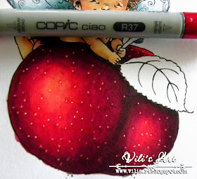
I gently repeat them with a red marker but really carefully
because the alcoholic markers blend the white ink:
And the picture is ready:
Here is the ready card:
and bought some apples for inspiration:
The image with an apple I chose is Mo's Harvest Fairy Apple, an extremely cute fairy:
After I coloured the other parts there comes the apple's turn.
My favourite combination in the red range of colours is R32, R35, R37, and R39, with little help from RV99:
I start with the brightest tone:
Then comes the darkest one:
And the next brighter ones:
The brightest spot I carefully "wash up" with the Colorless Blender:
Now comes the time to return to the first picture in the post, this with the real apples.
Do you notice that all over the covering of the apple there are tiny little spots, like dots?
On the green and yellow apples these spots are more brownish.
To do them I use a white ball point gel pen:
As the white dots are unrealistically contrastive,
I gently repeat them with a red marker but really carefully
because the alcoholic markers blend the white ink:
After I colour the leaf, too, I make a contour on the outher side,
as I showed how the previous time:
And the picture is ready:
There is nothing difficult, isn't there?
The most important thing is to look and really see every particular detail :)
Copics used:
Skin: E11, E50, E51
Hair: E31, E33, E35, E37, E49
Hair: E31, E33, E35, E37, E49
Apple: R32, R35, R37, R39, RV99
Leaf: BG90, BG93, BG96, BG99
Have a nice day and thanks for stoping by!
Hugs, Vili xxxx


this awesome, beautiful done
ReplyDeleteWow! Super!
ReplyDeleteWhat an awesome card and awesome image which you colored beautifully.
ReplyDeleteWow what a tutorial!!! Thank you so much!!
ReplyDeletesuper tutorial. I will post my apple this week, it works very well. Thank you Vili
ReplyDeleteOh Vili,
ReplyDeletean interesting tutorial,love it!
Thank you very much for this.
I´ve no copics,but I want to try it with my Distess Markers,yeah.
What do you think about this?
Your card looks gorgeous and the image is adorable,like the beautiful paper you used and your great layout,
hugs die waldfee
Wow! That apple looks sooooo great!
ReplyDeleteHugs,
Eemeli