

Hello Copic fans - it's also time for my very first post here on this new blog... And to start with something sweet I used this cute image by Lili of the Valley.
***
Hallo Copic-Fans - nun darf auch ich meinen ersten Post auf diesem neuen Blog machen. Und um mit etwas Süßem zu starten, habe ich dieses süße Motiv von Lili of the Valley ausgesucht.
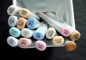
I wanted to be the main parts light, only have a good contrast on the areas that are in the shadow. So I went with these Copics to color the image in and added some C2 to the darkest areas. I prefer to put several layers on top of each other instead of using a darker C-shade that might be too dark...
***
Ich wollte das Motiv eher hell coloriert aber trotzdem einen guten Kontrast zu den Bereichen im Schatten haben. Also habe ich mit diesen Copics coloriert und dann C2 benutzt, um die Schattenbereiche zusätzich abzudunkeln. Ich nehme hierfür lieber einen helleren Ton und setze mehrere Lagen davon übereinander anstatt einen dunkleren C-Ton zu wählen, der dann evtl. ZU dunkel ist...
Skin/Haut: E11, E51, E000, E0000
Cheaks/Backen: R20
Hair/Haare: E 35, E31, E30
Blues/Blautöne: B21, B41, B0000
Pink/Rosatöne: R 83, R 81
Hat/Kochmütze: C2, C0, Blender Pen
Papers are by Magnolia and gcd, saying by Stampin'Up (mix of 2 stamps). The chipboard letters were covered with some Glossy Accents.
***
Die Papiere sind von Magnolia und gcd, der Text von Stampin'Up (zwei verschiedene Stempel zusammen verwendet). Die Chipboard-Buchstaben haben noch eine Schicht Glossy Accents bekommen.
Have a wonderful day everyone!
***
Habt alle einen wunderbaren Tag!
***
Hallo Copic-Fans - nun darf auch ich meinen ersten Post auf diesem neuen Blog machen. Und um mit etwas Süßem zu starten, habe ich dieses süße Motiv von Lili of the Valley ausgesucht.
I wanted to be the main parts light, only have a good contrast on the areas that are in the shadow. So I went with these Copics to color the image in and added some C2 to the darkest areas. I prefer to put several layers on top of each other instead of using a darker C-shade that might be too dark...
***
Ich wollte das Motiv eher hell coloriert aber trotzdem einen guten Kontrast zu den Bereichen im Schatten haben. Also habe ich mit diesen Copics coloriert und dann C2 benutzt, um die Schattenbereiche zusätzich abzudunkeln. Ich nehme hierfür lieber einen helleren Ton und setze mehrere Lagen davon übereinander anstatt einen dunkleren C-Ton zu wählen, der dann evtl. ZU dunkel ist...
Skin/Haut: E11, E51, E000, E0000
Cheaks/Backen: R20
Hair/Haare: E 35, E31, E30
Blues/Blautöne: B21, B41, B0000
Pink/Rosatöne: R 83, R 81
Hat/Kochmütze: C2, C0, Blender Pen

Papers are by Magnolia and gcd, saying by Stampin'Up (mix of 2 stamps). The chipboard letters were covered with some Glossy Accents.
***
Die Papiere sind von Magnolia und gcd, der Text von Stampin'Up (zwei verschiedene Stempel zusammen verwendet). Die Chipboard-Buchstaben haben noch eine Schicht Glossy Accents bekommen.
Have a wonderful day everyone!
***
Habt alle einen wunderbaren Tag!

Das sieht wirklich wunderschön aus.
ReplyDeleteUnd Lily off the valley ist auch toll.
Liebe Gruße
Erna
Really nice card ! I like the contrast between the light and darker shadows a lot.
ReplyDeleteWow, this is beautyful. Gorgeous colors.
ReplyDeleteLove Aartje
Hallo Kathrin, nice coloring, good shading with a lot of contrast. You did a good job again. Are you coloring the edges with a white acrylic paint or the crackle paint van TH?
ReplyDeletethis is totally cute image and loving the coloring too ... also the embossing at the edges -great effect!
ReplyDeletehallo kathrin
ReplyDeletewat een geweldig mooie kaart zo met de zachte kleuren,TOPPY!
groetjes van corry
very beautiful card katrin.
ReplyDeletegreetings karin
thanks for all your kind words!
ReplyDelete@ Diny: I used the Distress Crackle Paint by Tim Holtz - my acrylic paint tends to become kind of transparent.LOL
Hugs,
Kathrin aka Kruemel
Stunning card Kathrin !!!
ReplyDeleteWonderful card, great coloring and i really lover your edges
ReplyDeleteEine tolle Karte. Du hast wunderschöne Farben gewählt.
ReplyDeleteLieben Gruß
Ingrid
Wow.....eine wunderschoene Karte!!!!!
ReplyDeleteWhat a beautiful card - the colouring is lovely and I just love how you have used the buttons to spell 'woof'
ReplyDeleteToni xx
Ganz reizend!
ReplyDeletejolie carte ,j'aime beaucoup amitié
ReplyDeleteIsabelle France
Gorgeous Kathrin, love the image and your colouring is outstanding as always. Hugs Tracy x
ReplyDeleteEine typische Kathrin-Karte, wunderschön wie immer! Ich mag deinen Stil sehr, du hast einen hohen Wiedererkennungswert!
ReplyDelete