Home

Monday, November 30, 2015

Tilda and Frosty

Hi!

It's time for me, Christina, to inspire you and I do it with a Christmas card. It's almost time to send them. A couple of weeks more and then they are off! 
I just love to do Christmas cards and I'm usually finished by now because the past years I have made 1-2 card a month but not this year. 

Not only do I love Christmas cards, I love doing them clean and simple.


Here is Tilda with Frosty the Snowman wishing Merry Christmans or God Jul in Swedish.

Don´t you just love coloring in red? I know most of you think it´s difficult but I think if you practice and practice you will come to love it! 

Here are the pens I have used:

Skin E04-11-02-YR00-000
Här E51-53-99
Red T5-E19-08-R27
Dark Grey C8-6-4
Mittens/hat C4-2-1
Shadow C2-0

Have a wonderful day!

hugs 
Christina


Saturday, November 28, 2015

For the love of art

 Hi Copic friends.
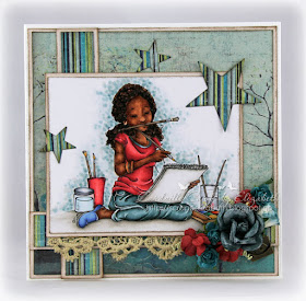
I took a break from the Christmas card making to make this card. One of my favorite images, actually. I find it difficult to colour dark skin, but I think it turned out okay :) 

I wanted to let the image be the main focus on this card. Besides the papers I used a couple of die cut stars, some lace, and flowers.


The image is Jaqui Painting by Mo's Digital Pencil/Mo Manning.
Copic colours used:
Skin: E27-25-23-21
Hair: E49-29-25-23-21
Reds: RV29, R59-27-24-22-20, W5
Pants: BG75-72-71 (homemade)70, W7
Shoe: B34-32-23-21
Dotted background: BG73-1-70, W1-00, C1-00
Floor: W7-5-3-1-00
Water: B000, Pencils and details: E35-31-30


Here's a peek at the inside of the card too.

Hope you like it!

Thanks for stopping by today,


Hugs, Elizabeth 

Thursday, November 26, 2015

Almost time to start decorating your trees

It's that time of year again - Christmas.....well, almost!

Anyway here are some adorable penguins helping out with the decorations......

For such a simple image there were quite a few challenges......

Primarily colouring black and white!
In order to obtain the depth and dimension on the penguins I opted for shades of grey rather than black on their bodies whilst their tummies are a combination of pale blue and very pale grey.

As always I chose to stamp out my image using Memento Angel Pink to give my finished piece a softer no-lines look.

The upper background was created using my trusty YR30, a small natural sponge and some Isopropyl.
I coloured the chosen area with the copic marker, then sprayed the sponge with Isopropyl, dabbing it on some waste card to remove the excess before dabbing it onto the marker. As you can see it gives a lovely mottled texture to the background.  Once dry I then coloured the ground before moving on to the penguins themselves, enhancing some of the finer details with coloured pencils.

Image: Stamping Bella - Christmas Penguins
Sentiment: Happy Christmas set by CC Designs
Memento - Angel Pink and London Fog
Copic colours:
Ground - W00, W0, W1, W2, W3, YR30
Penguins - YR20, YR21, E31, C00, C0, C1, C2, C3, C4, C6, C8, YR31, E33, E34, R32, R56, R59
Bells - YR21, YR24, YR27
Coloured pencil
DP & Mulberry paper from stash

Happy Crafting

Wednesday, November 25, 2015

Thinking of you


Good Morning Everyone, this is Sarit here.

Most of the cards we make are to put a smile on someones face, 
But sometimes it's just to give a hug and say "I'm thinking of you"

I found this lovely image at Wikipedia, (when I want to colour flowers this is the best place to find a beautiful line art flower)

I started colouring with the petals, as they take most of the attention.
  
Mostly when we colour small area we colour from dark to light. 
trying to be very gentle with the dark red colour. 
Don't  want the paper to absorb a lot of ink otherwise the red colour will expand outside the line.
And the red colour cannot be wiped off with the blender.

Don't  be afraid to use reds, just pay more attention when you colour it in small area.

Here are the Copics I used:
R24,R27,R29,R59
YG93, YG95, YG97, YG99
N5, N7

Big Hugs

Tuesday, November 24, 2015

Glitter Background Tutorial


Hi! I'm Cristina Valenzuela, from Spain.
And it's my turn to provide a Copic Tutorial.

This time I decided to teach how to make a background with glitter.
It's applicable to anything coloured with Copics.

Here, I put glitter in the background, but this can be done on any portion of an image, or all over it.


This is useful to make your glitter any colour you wish.
You will need Copic ink, glue, glitter and brush.


Use a container to mix everything.
Add "glossy accents", a type of glue highly recommended to do this.


My glitter is special "fairy dust", transparent and very bright.


And finally I add my Copic Ink, I used BG000. My background is already lightly coloured with this shade. This is means there is no differences between areas with, and areas without glitter, especially near the drawing, or small areas.

Mix glitter, ink and Glossy Accents with brush.


I add this glitter mixture around my image.


This is finished!
My beautiful image is from Tiddly Inks, she could take shine anywhere in the wings or dress, 
I chose the background.

The Copic colours I have used are:
Skin: E00, E000, E11, E02, E21.
Hair: E43, E53, E55, E57, E51.
Wings: W3, W1.
Dress: C1, C0, C3, T1.


And this is my shiny card.
I hope you like it and you make much use of this little recipe.

See you soon.. Hugs!

Monday, November 23, 2015

Fireflies


Hi Everyone, it's Faye here today :)

I thought with Christmas now so close, I would completely ignore it and make a cute card for a little boy...


The image is called Swings n Slides Fireflies from Little Miss Muffet Stamps. I just adore those little fireflies. They were so fun to colour up... I used the Confetti Technique, perfect for those little critters!


Copics Used... 
Skin; E0000, E000, E00, E01, E11, E71
Hair; E50, E51, E53, E55
Jar; BG000, BG0
Turquoise; BG01, BG53, BG57
Yellow; Y13, Y15, Y35, Y38
White; C0, C1, C3
Orange; YR14, YR18, E09
Green; YG03, YG63, YG67 

Thanks so much for stopping by, have a great day.

Sunday, November 22, 2015

The good life........


Hi everybody,
Luxurious 3D cards by Studio Light can easily be combined with cute images like the one I used here.

For this first card I used a brand new stamp by Magnolia called Pizza Tilda from the Little Italy line.

 Here are the colours I used:
Skin: E000, 000, 00, 04 and 11 
Hair: YR23, 27
Purple shades: V000, 000, 09, 12, 15 and 17
Green shades: G40, 43 and 46
Browns shades: E41, 42, 43, 44 and 47
I have made some breadcrumbs using the brown foam clay by Craft Emotions


For the second card I used another brand new stamp by Magnolia called Italian Speedy Tilda from the Little Italy line.


Here are the colours I used for the second Magnolia:
Skin: E000, 000, 00, 04, 11 and R20
Hair: E21, 25 and 29
Purple shades: V, 09, 12, 15 and 17
Green/Blue shades: BG11, 13, 15 and 18
Grey shades: C1, 3, 5, 7 and 9
Yellow shades: YR23 , Y 15
I have created a road using the brown floam clay by Craft Emotions again.
Thank you very much for your visit, have a great day! Hugs,

Saturday, November 21, 2015

Bronte wants it!

Hello everybody!

Franz again today with a lovely image from Mo Manning.
I loved this cutie pie at first sight, she's too lovely and funny, isn't she?


I created a birthday card using different, bright coloured papers since the image inspired me to create a colorful and lively project 


Here is the complete list of Copic Markers I've used:

Skin: E0000, E000, E00, E11
Hair: E000, E13, E15, E18
Outfit/Green: G12, G24, YG000, YG63, YG69
Outfit/Pink: RV000, R81, R83, R85, R89
Floor: W1, W2, W3, W5, W7
 
 
 Thanks for stopping by,
 I hope you all are having a lovely week-end!
Franz.

Saturday, November 14, 2015

Fredrika 8

Hello!

How are you this lovely Saturday? It's time for me, Christina, to visit you all here on the Blog. 

This time I have a Birthday card for you. Or for Fredrika to be correct. I got my hands on this beauty from the former Swedish company hÄnglar & stÄnglar. I think this image is perfect for a girl about to turn 8.


I have used soft beige and pink colours for this card, both the image and the patterned papers. All papers are from Maja Design.

Close up:


The more I worked on this card the more I came to love her name - Fredrika. So romantic!

Well - back to reality...you want to know what pens I used?

Skin E04-11-02-YR00-000
Hair E51-53-23
Beige E43-41-40
Shoes/hat/bag E79-77-74-71-70
Blue B95-93-91
Pink R85-83-81

Have a great weekend!

Hugs
Christina

Thursday, November 12, 2015

making the simple look complicated...

making the simple look complicated is commonplace
making the complicated simple is creativity...

I found this fab quote on the internet, don't you just love it. Well I do!!

 This month's creation is a journalpage using one of the fabulous images by The East Wind...
I love colouring those images because there is a lot of colouring to do, I can spend hours on the face and hair alone....with my favorite Copic Markers off course

This time I made a background with glitter and pearly inksprays by Lindy AStamp Gang, Colorwash, and Distress sprays. Using some masks en stencils by Pronty and Dylusions.


I took a close-up photograph for more details on the colouring.
I have been using the following Copic Markers:

face: E0000, 000, 01, 02, 11, 21, R20, BV00
hair: V01, 04,12, 15, 17, 22, 91
dress: BV0000, 00, 02, 23, 25, 29, 31, 34
rope and flowers: V05, 09, 25, 28, R 20, 21, 83, 85 RV 04, 34
sloth: E42, 44, 47, 49, R20

have a creative day


Miranda

Tuesday, November 10, 2015

Colouring Fur Tutorial


Hi Everyone, it's Faye here :)

Today, I'm sharing a Tutorial on how I colour Fur. But, before I get to that, I wanted to talk about Copic Marker Housework. You know how when you get a new Marker, it's lovely and clean, full and juicy, and colours really well? Oh, I love Markers when they're like that! So, I make a point of keeping my Copics as clean, and full as possible. Especially some of my tricky friends. Yes, I'm talking about you, E11, E04, E29, R85. You know who you are.

Recently, I've been a little busy, and my Copic Marker Housework has seriously lapsed. (Slap my wrist.) I was already thinking I was lucky to be getting away with it. And then I started my Tutorial on colouring fur. I got three steps in, and my Copics went on strike. No more playing nicely. They wanted a drink, and they wanted a bath. So, when you're Markers start going patchy, shiny, and won't blend, this is what they're trying to tell you!


Now all my T Greys are happy, although I was a bit grumpy I had to start again! The image I have used is an adorable monkey, called Under the Weather Chester, from Little Miss Muffet Stamps.

When I colour fur, I like to dab on layers of colour, working from dark to light and then again, to give lots of texture. No smooth colouring at all. Let's make a start...

 T3

T1

T3

T0

Colourless Blender

T1 and T3

T0

Repeat if you want :)

But I can't leave Chester half coloured, he's sad enough already...


I wasn't happy with this card and thought it needed something more. So I stamped a second cloud, added a few extra dots of grey, and popped it up on foam pads. Much better...


Copics Used...

Fur: T0, T1, T3
Eyes; C0, C1
Fence/ Boots: T3, T5, T7
White Stripes on T-shirt and Boot Trim: T0, T1
Dark Stripes on T-shirt: T7, T9
Grass: T0, T1
Clouds: C0, C1


Thank you so much for stopping by, have a great day.

Monday, November 9, 2015

Which one is your favorite

 When I started with Copic I thought it was hard to choose which colour of W, T, N, and C to start with. So today I will show the same motif and what the difference actually is in the pens. But I have not showed N since I do not have it myself, but it is most similar to T, I would say. For those of you who may already have some of them maybe I can inspire to start collecting on any of the others.
In a small area it can be hard to see what colour suits you best. The differences can be seen obviously much more on larger surfaces, so I have chosen to use a subject with a reindeer where the body is the biggest surface.
I have also stamped with black ink pad in two subjects and the third subject I chose to use a brown pad.
All designs I coloured with Distress Technique, which is not so much colour and then dark on the edges and then brighter and brighter toward the center. Hope you understand what I mean ....


Here I have used the brown ink pad and reindeer are coloured with W in different shades.
W is a warm color that goes well with the Browns.


Reindeer : W0,1,3,5,7    Nose: R00,30  Horn:100
Bag: E81,84,87
Green: YG91,93,95,97
Flower: E02,08,09

This motifs is stamped in black ink pad and coloured with C which is a very cool shade of black.


Reineer: C0,1,3,5,7  Nose:R00,3  Horn:100
Bag: E41.42,44,47
Pink: RV10,63,66,69
Green: G40,82,85

This motif is also stamped with black ink pad and coloured with T which is my favourite when I'm colouring black.


Reineer:T0,1,3,6,8    Nose:R00,30     Horn: 100
Bag: E21,23,25,27,29
Green: BG90,93,96,99
Flower: E02,08,09


Here you see all subjects next to each other in order to see the differences clearly, W,T and C. What is or will be your favorite?


Have a nice week!
Hugs / Rozzan