Home

Tuesday, March 31, 2015

smile on a rainy day

I can hardly believe it, but it's already the last day of March again...time flies by so quickly...


 I have another art journalpage to share
 I used an older digi by the Emerald fairie garden called Pip for my page but I decided to use a totally different colourscheme this month. I normally love to use purples, blues and pinks, but this time I used greens, browns and oranges, And I really love it, allthough it can be a bit tricky because orange and green can blend to a mucky brown if you are not careful. 


This is the complete page.The background is made with Dylusions ink and stamps. The raindrops are a stamp by Ryn Design. 


This is a close up of the image. For colouring I used the following copic markers:

Face : E000, 00, 11, 21, R20, 13
hair: E09, YR07, 09, 14, 16, 61
sweater and wings:  YR07, 09, 14, 16, 61
leaf  and shoes: YG03, 17, 23, 61, 67, G94
falling raindrops: BG0000, B39
top and trousers: YG03, 17, 23, 61, 67, E71, 74, 77, 79

to get some depth into the raindrops I used a sharpie white and a white stabilo watercolourpencil

have a lot fun and see you next month


Miranda

Monday, March 30, 2015

Frog Tag

Good morning everyone!!!
this is Sarit, and I am so happy to be here today
with Beach baby Jayme digi stamp tag
this beautiful free digi stamp was made have a special story behind it.
it was made by Whimsy Stamp especially for Jayme. 
in 2010 Jayme was diagnosed with terminal lung cancer and her sister Lisa hold a special event to help brighten the remainder of the time she has left.

I love to color it and use it again and again.
this time I made it as a tag.

I colored the frog with olive greens (from the YG family) and for the texture on the skin I didn't use the blender as it wouldn't give a realistic look.
for more realistic look I used a lighter color from the same family 


Marker Used.....

Body: YG93, YG95, YG97, YG11
Lips: R22
Swimsuit: YR01, YR02, YR04
B24, B28
RV13, RV14
Y02, Y15
Umbrella: BV25, BV29
BV01,BV02,BV04
E31, W3

Have a wonderful day
Hugs, Sarit 


Sunday, March 29, 2015

Tutorial: Adding darker colors to an image to create depth

Hi copic friends,
I remember when I first started coloring, I was so afraid to use the darker colors . I bought them...lol...but I rarely used them. So afraid to ruin my image.

So I thought I would show you what a difference it makes to get some contrast in the image to create depth. If you are a beginner you can easily find the darker matching color by looking at the copic color wheel and choosing a higher spesific value in the same color family and color group (the last number on the marker). For example if you use R81 you can add R83- R85- R89.


On this image by Saturated Canary I used two or three markers in each blending group. Only the lighter ones.

Some people prefer the lighter colors, and thats okay if you do. But what happends if you add the darker colors?

First I added E49 to the hair to define the deepest shadows. And more E44 to blend. Finally I went over with E40 to smothen it up. 
+

Next the face. I had colored using E000 and E21 and E93 for the cheeks and lips.
Here I added E13- E11and R20 for the cheeks and lips. The face looks a lot less flat than before.
(And by the way a tip is to color the face before the hair, it is so easy to drag some of the darker browns into the face and ruin your image - learning the hard way...lol) 
+

Originally I used R81 and V000 for the pinks.
I added E89-85-83 ont the flowers, t-shirt and skirt. 
                      
 +

I used E41 and 43 for the apron and parts of the skirt. Here I added E47 and 44, and some more E43, E42 and E41 for a good blend. 
 +
 On the basket I originally used E33-E31 and E30
I added E37 and E35, and used the other three again to blend. 
 +

For the gloves and legs I used C1 and C00.
I added C7- C5 and C3 for deeper shadows and used C1 and C00 again. 

               
 +
 On the leaves I originally used G43 and G40.
I added G99 and G46 and G43 and G40 again. 
                
 +


Here are the two images. Look how different they are.

And here is my finished card: 
Papers are Pion Design. Flowers are by WOC and Kort og Godt. Butterfly by Magnolia. 
Sentiment stamps by Norsk Stempelblad AS.

And here's the inside of my book card.

Hope you'll challenge yourself to try!

Hugs, Elizabeth

Saturday, March 28, 2015

Аround the World


Hello, everyone, Vili's here with a new card!

I deeply and truly believe that the world has become so accessible lately, that using one of the modern communicative technologies you can travel everywhere you want without even leaving your home. Diving into the world of books and surfing the Web can give you a huge amount of information.


With today's card I wanted to pay the earned attention to the books which give us the opportunity to visit every place on earth. I used Mo's Janny Texting and some new cutting dies and elements, too.


Copics used:
Skin: E50, E51, Е53, E93
Hair: E30, E31, E33, E35, E37, E29
Clothes: B32, B34, B37, B39, E40, E43, E44, R32, R35, R37, R59

Papers: Graphic 45
Dies: Frantic Stamper
MFT - World Traveler and Cute Cameras


Thursday, March 26, 2015

New Classes in Italy and Spain

Hello, 
their are new classes heduled in Italy and in Spain. Want to follow the populair ECCP classes, here is your chance.


Pampered with Daria Myagkikh

Hi everybody,

Daria here with something very girly :) 

8th of March is traditional woman's day in Russia. I decided to celebrate it with my daughters in very special way...SPA party!!! What can be better?
I prepared a lot of fun stuff (including towel robes that I sewed by myself; present bags with sea salt, creams, etc) - more details at my blog over here.

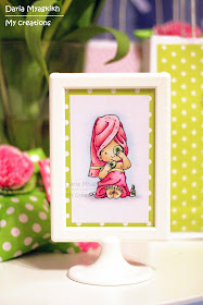
One of the decoration that I made were frames with invitations. I used new stamps from Mo Manning (Girl time and Pampered).


The key numbers for image are:

Skin  - E000, E01, E11, R11(for blush)

Clothes - R0000, RV02,RV11, RV21,R32, YG0000,YG00,01
Cucumber - G40, G82, G85
Background - B000, C00, C1, C2


Here is close up of the second frame:


Wishing you a great day and very creative mood!


Tuesday, March 24, 2015

Waiting For You


Hi Everyone :)

It's Faye here, with the cutest little bear, he's called Waiting For You, from Funky Kits. Doesn't he just tug at your heart strings?!


I chose this image as I enjoy colouring fur, (remember, no smooth colouring here and lots of layers of colour) but I also like playing around with adding texture to wood. On this occasion, I have used W3 and W5 to the E's I used, to add shadow and some depth to the wood. You could also add some touches of green, if you wanted to make the wood look old and a bit grubby.

I always have a mini battle when I try to colour a balloon... maybe I've got it right at last!


Markers Used...
Fur: E50, E51, E53, E55, W3, W5
Bench; E31, E33, E35, W3, W5
Grass; YG05, YG17, YG67, G99
Balloon; R24, R27, R29, E09

Thanks so much for stopping by today... have a wonderful day.
Faye xx

Monday, March 23, 2015

Coloring Letters

Hi everyone,

It's Sarit here.....
Today I want to show you a fun way to practice on your feathering blending.

I start with drawing the letters I want to color. I wrote the word "baby" 
When I'm o.k. with the result, I go over it with Copic Multi Liner
here I used 0.5
 Choosing the colors..... sometimes its takes lots of time.......
One important thing! try the colors on a piece of paper before you start to color
If something doesn't blend well try a different combo.
Arrange the colors by the coloring order in front of me, that way I cant make lots of mistakes
Now I start to work from blue on top until I get to the yellow in the bottom of the letter.
 Here is the finish card... (its fun to write a name and color it that way)

                                                           Markers Used...
B28, B24, B14, B02, BG13, YG07, YG05, YG11, YG01, Y02
On the letter "Y" I add Y04 & Y06
Around the letters I used: BV31, C3, C0,C00 & 0
Distress ink

Hope you like it.
Hugs, Sarit

Sunday, March 22, 2015

The horse in the spring

Today it's my turn, Rozzan from Sweden, to inspire you.

 I love horses, and why wouldn't I color something I love? 
Probably because I think it is difficult... :)
Usually when I color I pick a stamp that many other are using.
 But now I've found a wonderful sweet horse in the Coloring Pages for Kids. 

It has a lot of muscles and is very much alive. How should I color it? Just to start ...


I started with the horse and continued with the background.
 The background is made up of many shades of green (not fifty shades of grey!)


The first "living" horse ready ..


I chose to put black paper and layering around the image instead of patterned paper.
I hope I inspire you to "dare" to try any design that you do not usually colour. 
Have a fun time coloring!


Copic Markers I have used:
Green shades: BG90,93,96,99
                       YG91,93,95,99
             YG91,97
                     YG93,G94,99
Sky: B0000,000,00,C0
Body:E31,34,35,37      Horse mane: E50,51
                           Horse hoof: E42, 44      White: C0,2 + Blender                      

Saturday, March 21, 2015

Cygnus Hyoga, bronze Saint by Suki Manga Art

Dear Copic friends, this time I would like to show you my fan art of Hyoga.

He is one of the main characters of Saint Seiya, a Masami Kurumada's manga. He is the Bronze Saint of the Cygnus constellation.


This is the list of Copic colours that I used to create it:

Skin and eyes: E000 - E00 - E11 - B00 - B05
Hair: Y08 - Y06 - E35
Flower: R27 - RV04 - R59 - BG09 - G17 - YG06
Armour and clothes: C1 - C3 - C5 - C7 - B00 - B60 - B29 - B05
Background: 100 - Blender - B00 - BG09 - B05 - B29

For little details I used a white ink pen

I hope you like it
See you soon!

(^____^)/  bye

Suki Manga Art